Hengshi Documentation
Table of Contents generated with DocToc
- Create Charts
- Left Data Column
- Upper Right Tool Bar
- Middle Tool Bar
- Appendix: Summary of Various Chart Types
The charts in SENSE gather various types of visualization methods and provide a wealth of tools and convenient interactions, helping data staff to explore and process data instantly, and more efficiently discover the information hidden in the data.
This section will introduce its interactions and tools around the chart interface of SENSE:
Create Charts
In the created dataset, you can choose the chart type you want to create based on the need.
According to the requirements of different category charts, select dimensions, measure fields, and the system automatically generates charts.
HENGSHI SENSE supports sharing and collaborating on charts between colleagues. You can directly use or modify and use the charts under the application.
Left Data Column
Data
Select the created dataset and use the data in this dataset to create the required chart, and the datasets with relations will be connected by lines.
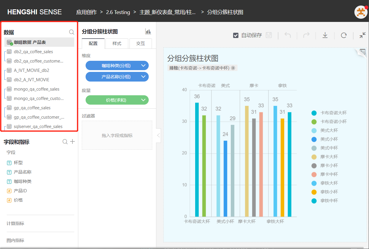
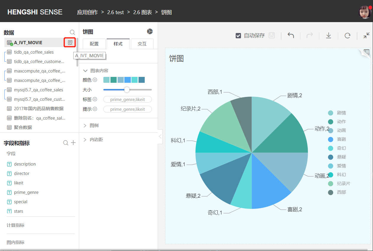
Click the search icon on the right side of the dataset to jump directly to the dataset's management page.
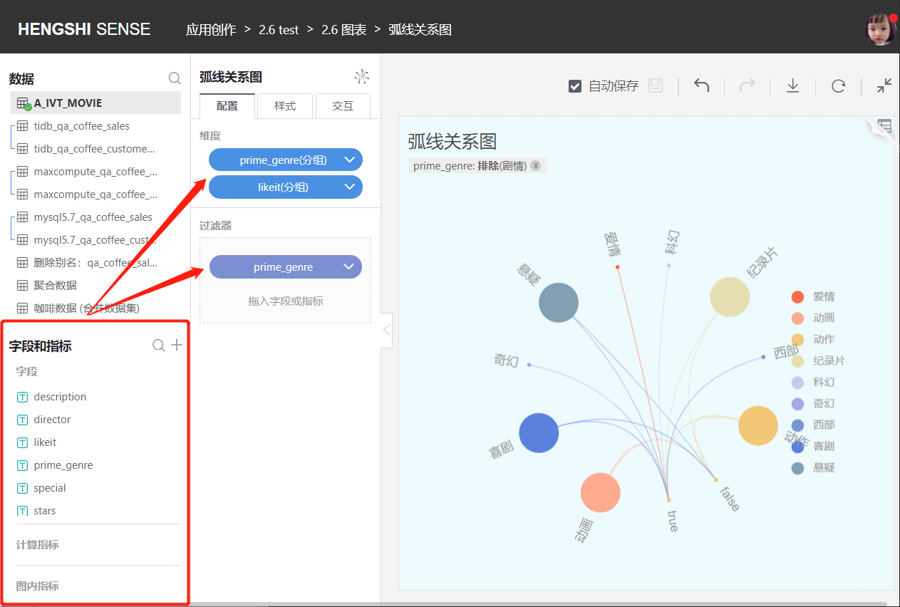
Fields and Indicators
Fields:
All original fields and new columns of the current dataset.Calculation Indicators:
All indicators newly added depending on this dataset.In-chart indicators:
Dimensions and measure fields within the chart.
Drag and drop fields into the dimensions and measures in the configuration.
Create New Field
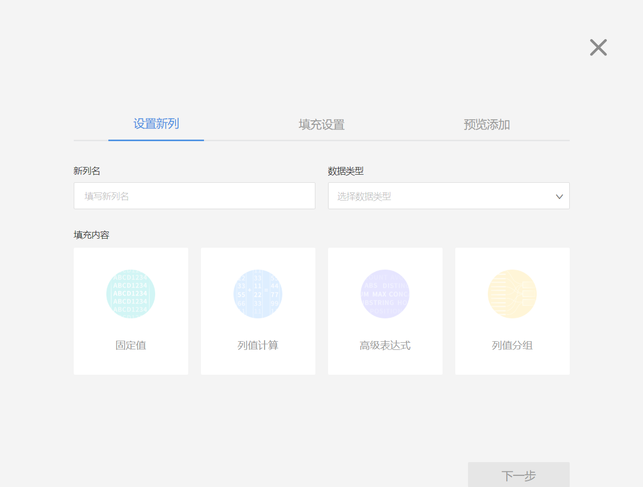
Fields of text, date, and number types can be added through column value calculations, advanced expressions, and column value grouping.
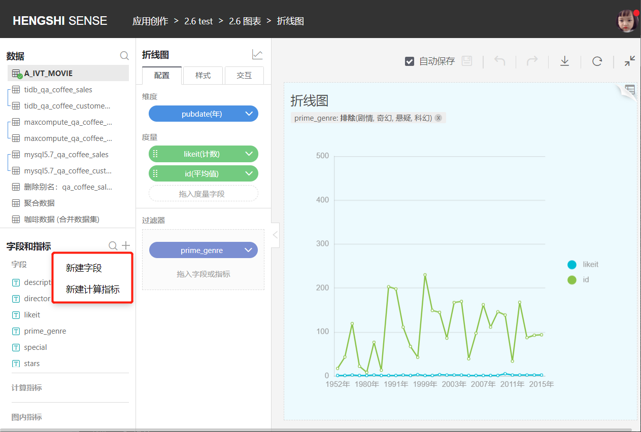
Create New Calculation Indicator
Fields of text, date, and number types can be added through column value calculations, advanced expressions, and column value grouping. Non-aggregate indicators are not allowed.
Upper Right Tool Bar
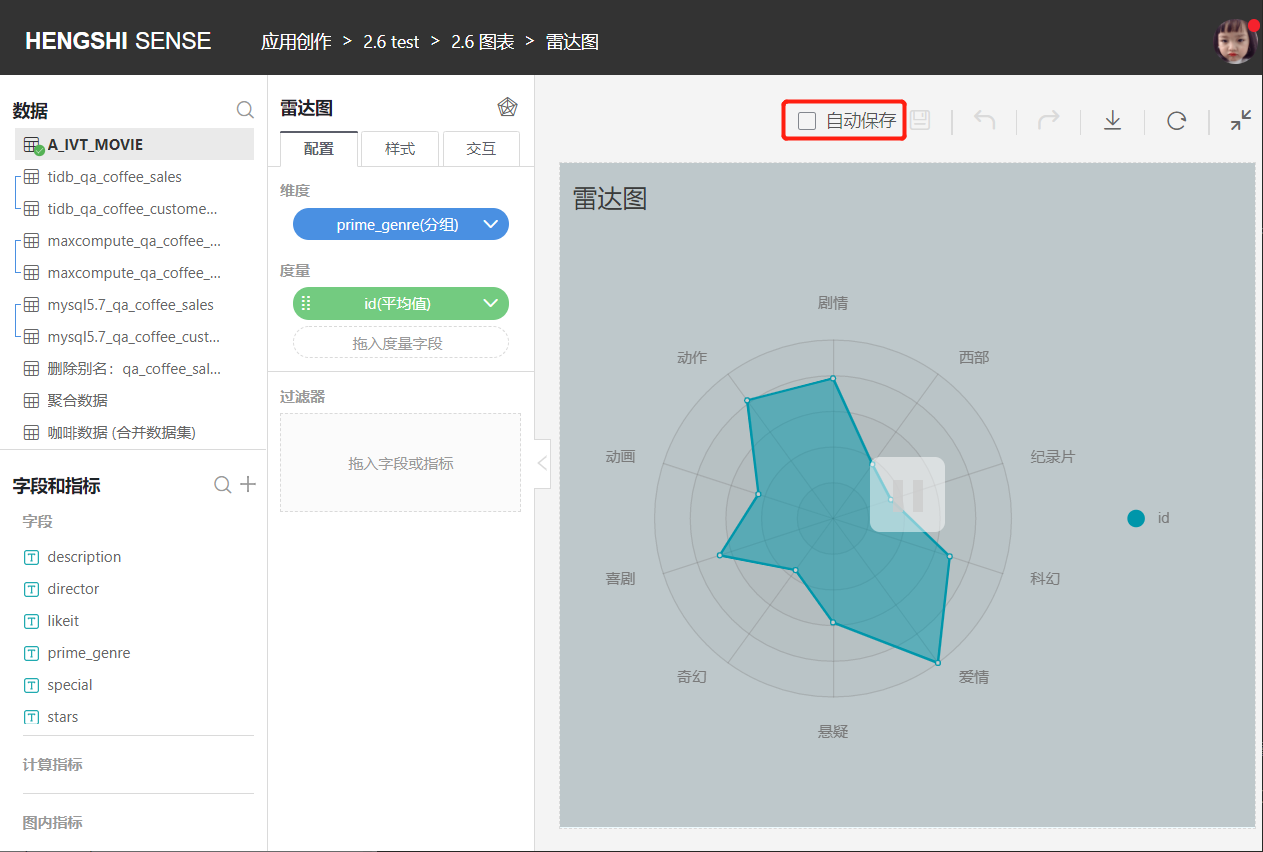
Auto Save
Undo and redo operations do not affect auto-save.
Auto Save is checked by default. After the user unchecks auto-save, each time the chart is configured, no request will be sent. Only when Auto Save is checked or the Save button is clicked will a request be sent and the chart will be re-rendered.
When unchecking Auto Save:
- A pause overlay appears on the chart interface;
- Users cannot edit fields/indicators;
- Current drill-downs will be canceled;
- Already opened detailed data pop-ups will be closed.
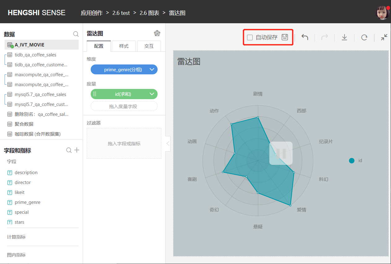
Save
When Auto Save is unchecked, the user can click the Save button to save after operating on the chart. The pause overlay still exists, and the chart reloads.
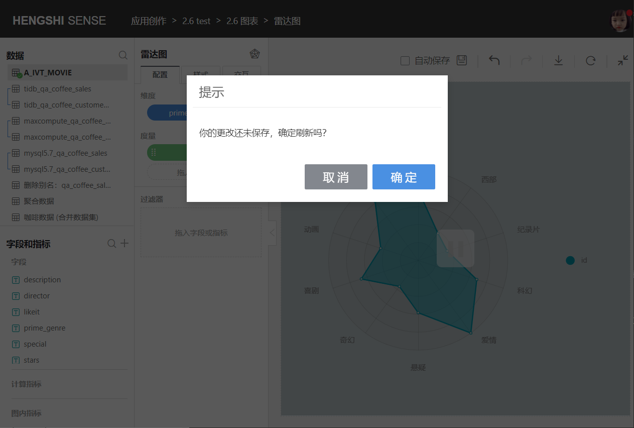
If the user doesn't click the Save button after operating on the chart and directly clicks Refresh or refreshes the page, a prompt "Your changes have not been saved, are you sure you want to refresh?" will appear.
Undo
Allows undoing previous operations.
Redo
Redoes the undone operations.
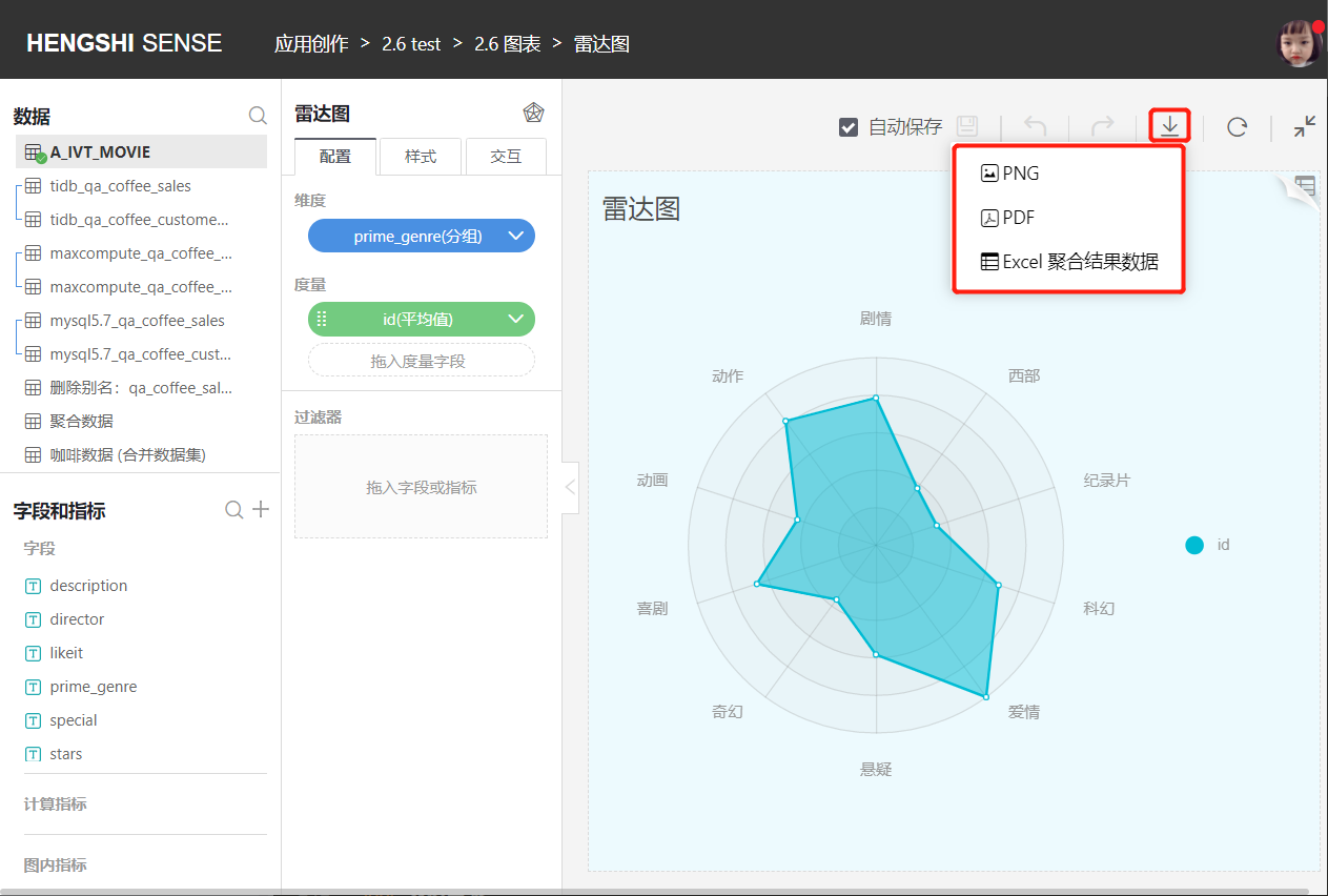
Export
It is possible to export charts in PNG, PDF, or Excel aggregated result data formats.
Refresh
Refresh the chart data without using cached data.
Return
Return to the dashboard page.
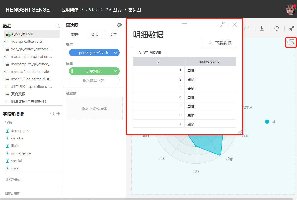
View Data
View the original data for the current chart.
Middle Tool Bar
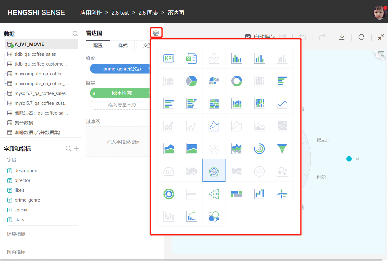
Switch Charts
Users can switch to different types of charts based on needs. Color icons can be switched directly without re-configuration; grey icons require users to reconfigure dimensions and measures after switching.
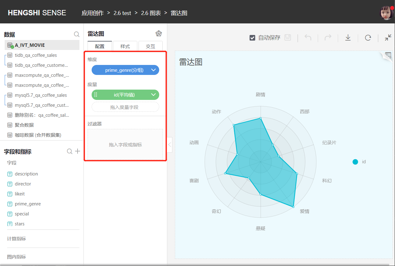
Configuration
Select Configuration from the middle navigation bar to perform the following configurations according to your needs to optimize the complete chart:
- Dimensions
- Measures
- Filters
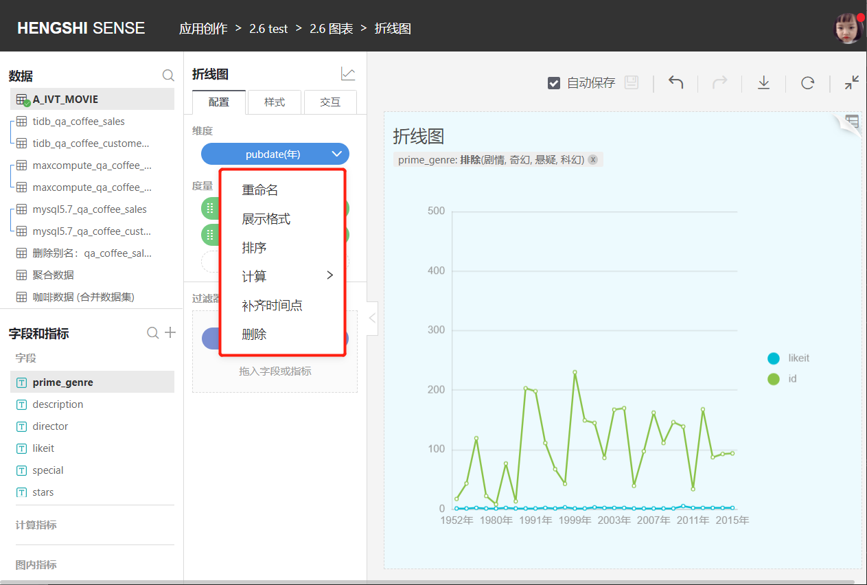
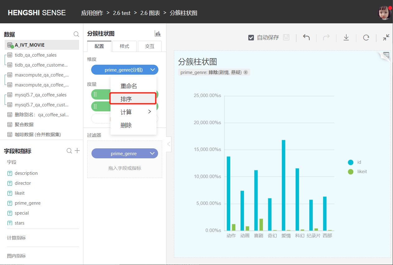
Dimension Tools
Dimension tools include:
- Rename:
Modify the dimension name to make the content in the chart more business-relevant. - Display Format
- Sorting
- Calculation:
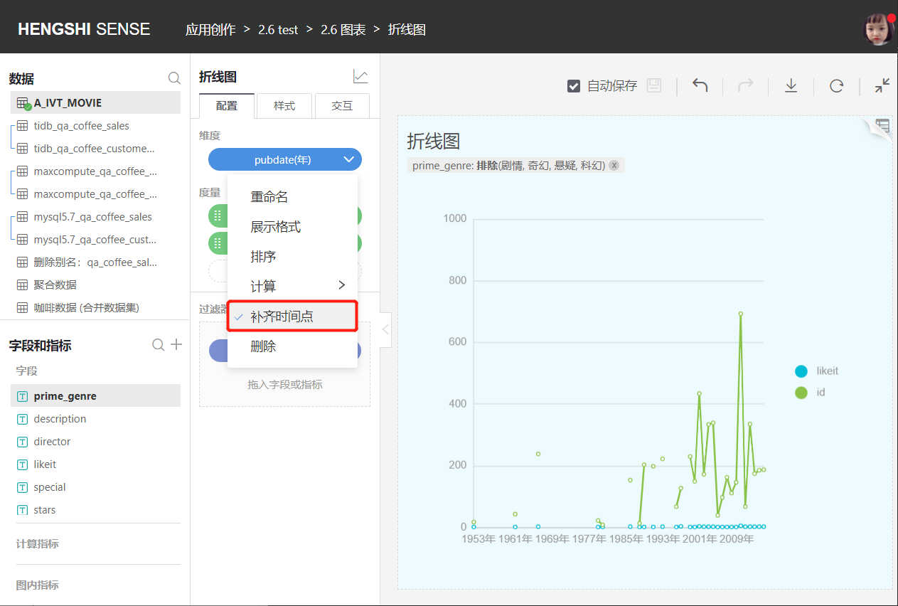
Dimension aggregation method. - Fill Missing Time Points:
The option to fill missing time points will appear when choosing a time dimension. - Delete:
Remove the current dimension.
Display Format
The display format for the number type is as follows, and you can customize the number display format:
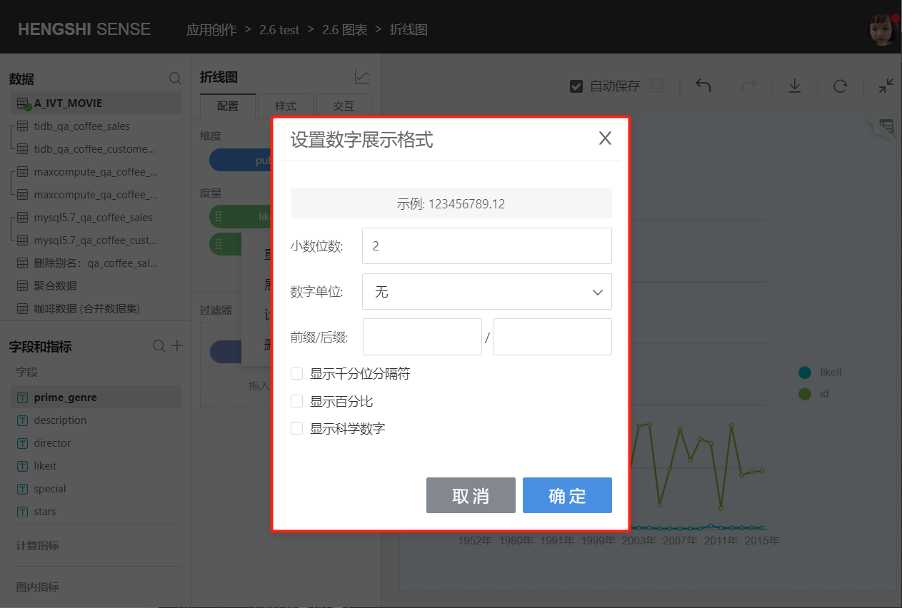
- Decimal Places:
By default, it shows as 2 decimal places; you can customize the number of decimal places. - Number Unit:
The default display is none; you can custom set the number unit: automatic, hundred million, ten million, million, ten thousand, thousand, hundred, M, K. - Prefix/Suffix:
The default display is none; you can customize setting prefix/suffix. - Display Thousands Separator:
Not checked by default; users can customize it as per actual conditions. - Show Percentage:
Not checked by default; users can customize it as per actual conditions. - Show Scientific Notation:
Not checked by default; users can customize it as per actual conditions.
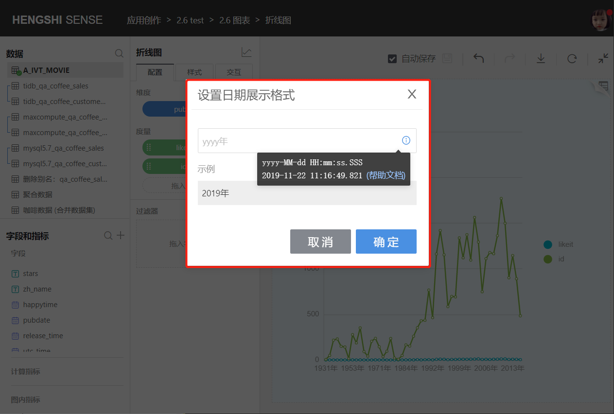
The display format for the date type is as follows, and you can customize the date display format:
Sorting
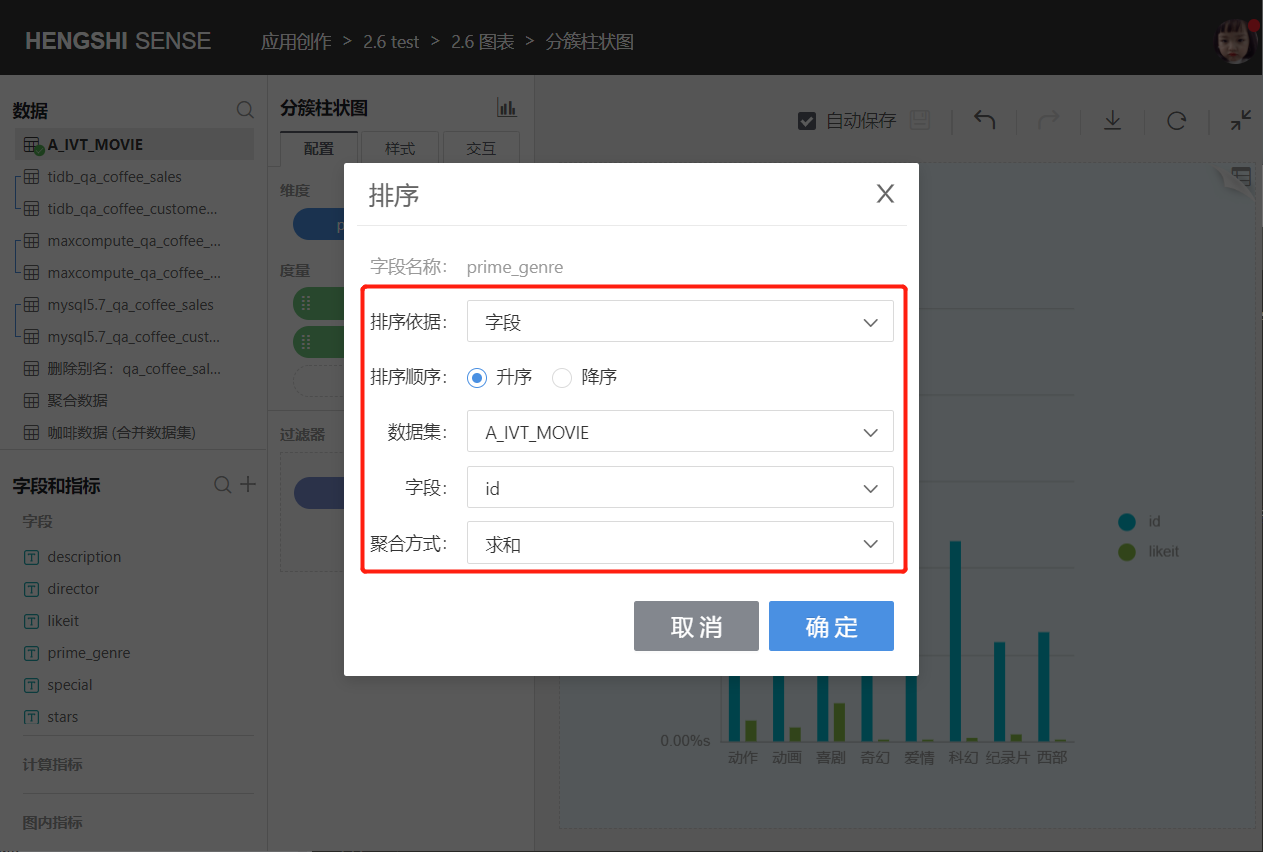
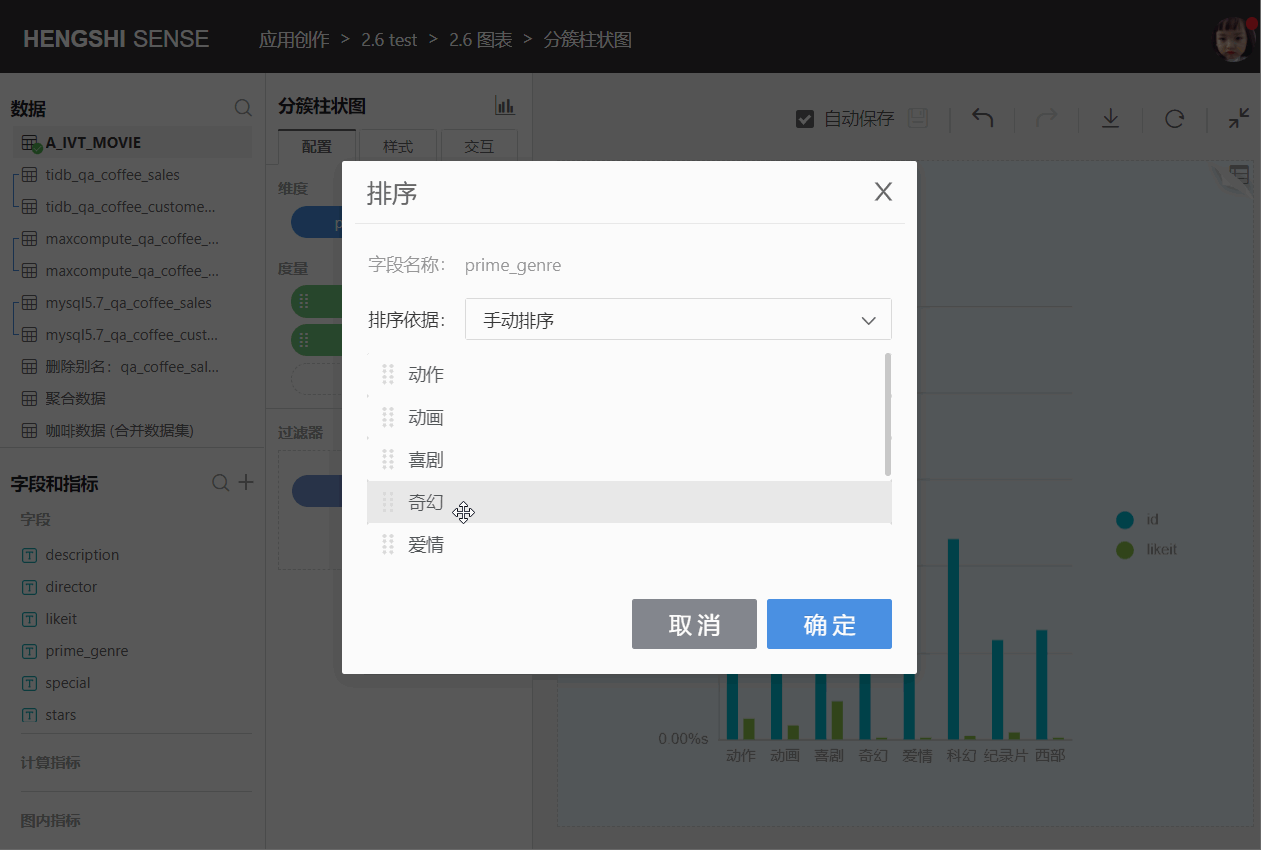
Dimension sorting is based on: data source sorting, alphabet, fields, and manual sorting.
Click the drop-down box on the right side of the dimension field, pop up the menu, click sorting.
Data Source Sorting:
Sort dimensions based on the storage position of the data in the database.

Alphabet:
Sort dimensions in alphabetical order A-Z; currently, only Oracle, MySQL, SQL Server, PostgreSQL, GreenPlum, and Engine support alphabet sorting.Date and number type dimension fields do not have alphabetical sorting.
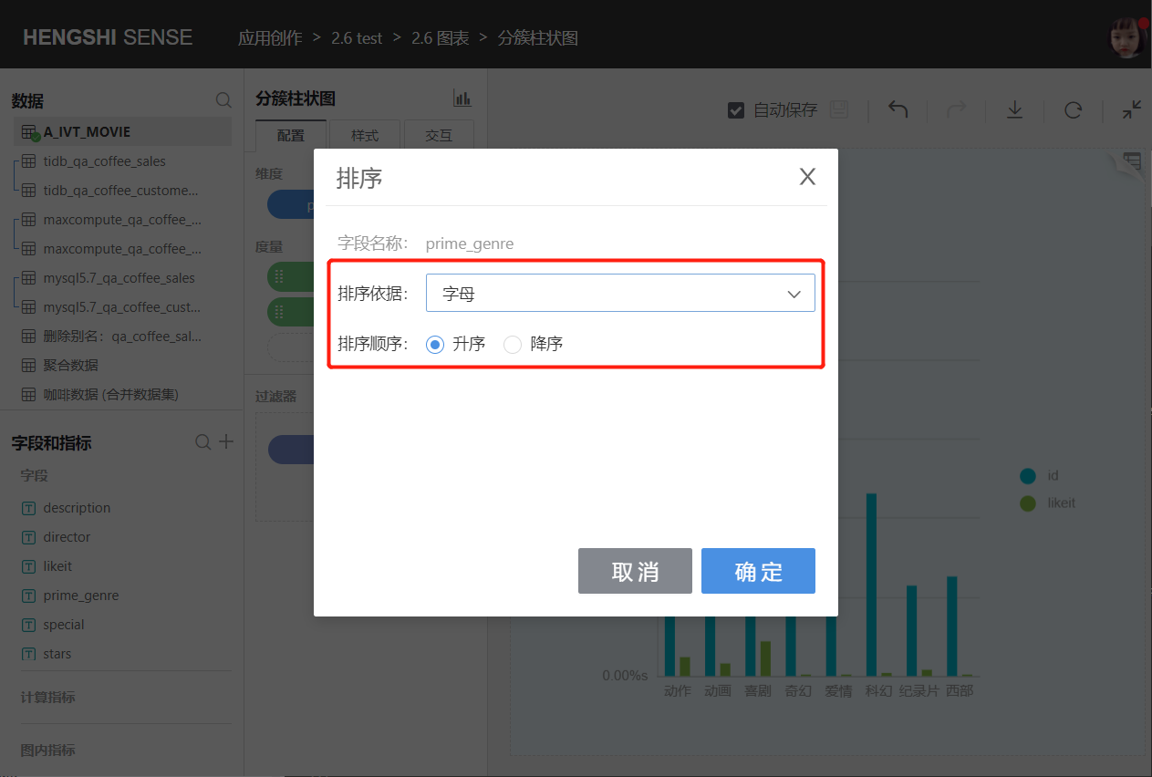
Field:
You can select fields from the same dataset or related datasets, specify the aggregation method, and sort dimensions based on the aggregated results.
Manual Sorting
You can manually adjust the order of dimension groups.
The sorting of comparison dimensions includes: default, ascending, descending, and custom.
Click the drop-down box on the right side of the comparison dimension, and pop up the menu to click sorting.
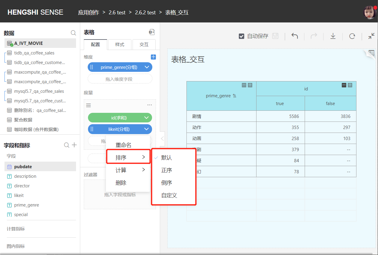
Default
By default, it is unordered; if the comparison dimension selects the same field as the dimension, it will sort according to the arrangement order of the dimension field.Ascending/Descending
For text type fields, sort in alphabetical order A-Z; for number type fields, sort by value size, and for date type fields, sort by date sequence.Custom Sorting
You can manually adjust the order of comparison dimension groups.
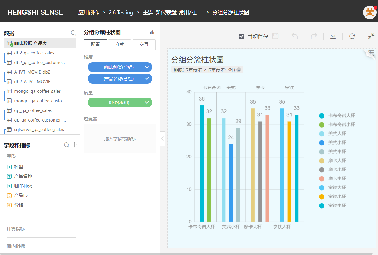
Only tables support comparison dimensions.
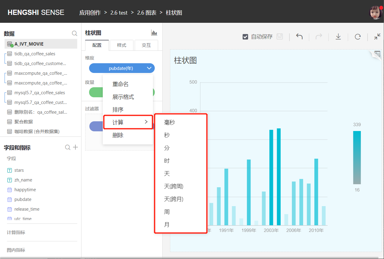
Calculation
The aggregation method for non-time dimensions is grouping, and the aggregation methods for time dimensions are:
- Millisecond
- Second
- Minute
- Hour
- Day
- Day (cross-week)
- Day (cross-month)
- Week
- Month
- Month (cross-year)
- Quarter
- Quarter (cross-year)
- Year
Fill Missing Time Points
Currently, charts that support filling missing time points include:
- Line Chart
- Grouped Line Chart
- Line Bar Combination Chart
- Area Chart
- Grouped Area Chart
- Stack Area Chart
- River Area Chart
- Grouped Stack Area Chart
- Percentage Stack Area Chart
- Percentage Grouped Stack Area Chart
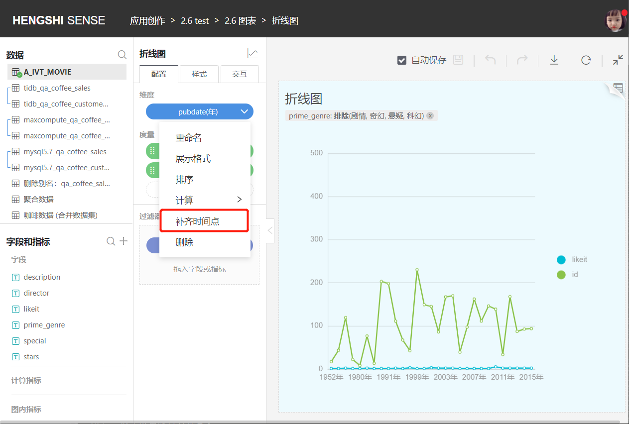
Charts filling missing time points are shown as follows: