Hengshi Documentation
Table of Contents generated with DocToc
- Dashboard
Dashboard
Dashboard List
Below is the main interface of the dashboard. In the main interface, all dashboards within the application are listed, including ones created by yourself and those created by collaborating users after the application collaboration.
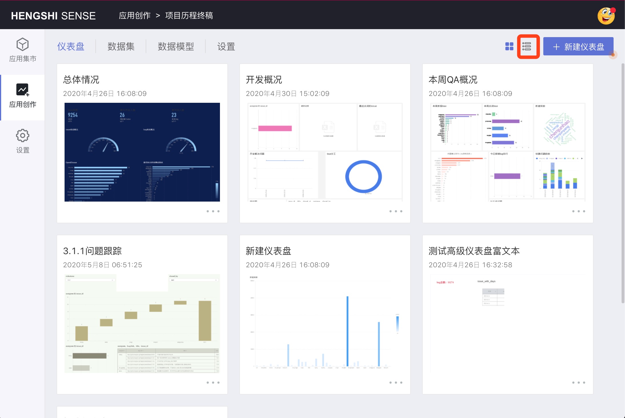
The default card-style list is displayed. Clicking on the list icon in the figure will switch to a list view. You can click on the sort icon in the table header fields to sort in ascending/descending order.
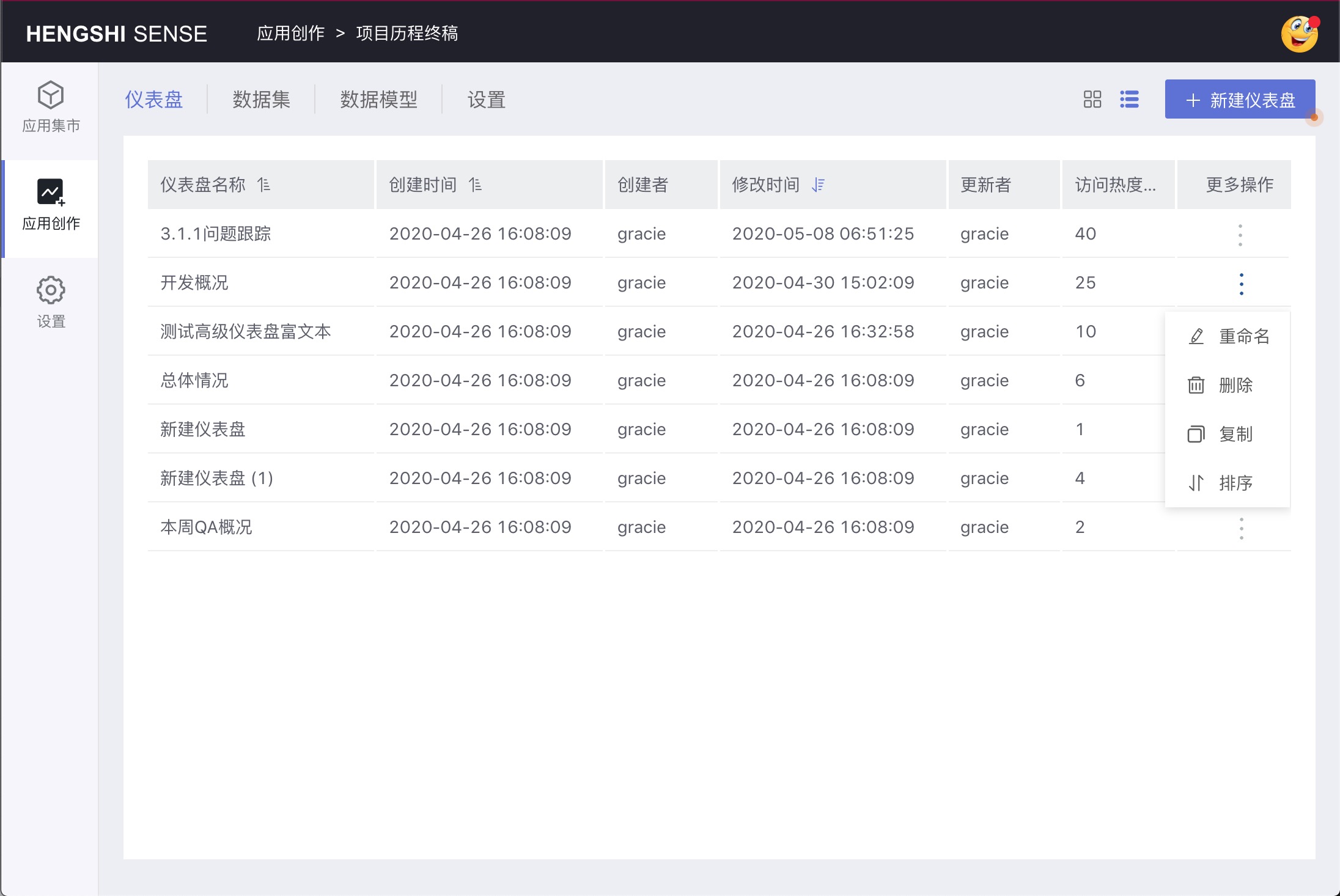
In the dashboard list, you can click the three-dot menu at the bottom right corner of the dashboard to pop up the operation menu:
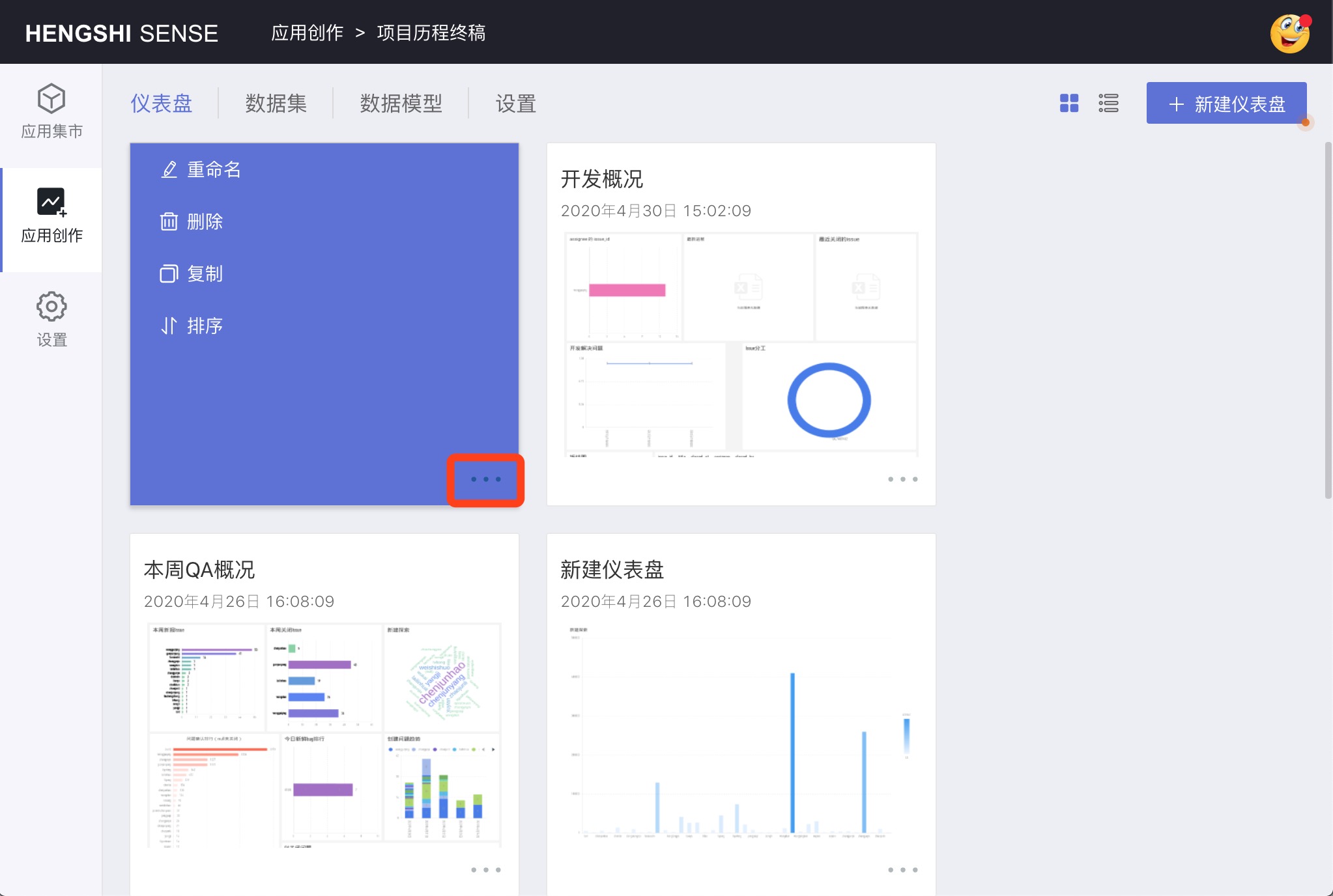
- Rename
- Delete
- Duplicate
- Sort
Rename Dashboard
Click the Rename button to pop up a dialog. Enter the dashboard name and click OK to complete the renaming of the dashboard.
Delete Dashboard
You can perform deletion operations on the dashboard. When deleting the dashboard, the charts within the dashboard will also be deleted.
Duplicate Dashboard
Click the Duplicate button to complete the copying of the dashboard, including all charts in the dashboard. The duplicated dashboard appears at the end of the current application.
Sort Dashboard
The system defaults to sorting according to the order you created the dashboard, with the most recently created dashboard at the end.
You can click the three-dot menu at the bottom right corner of the dashboard and select sorting to carry out custom sorting, as shown in the figure.
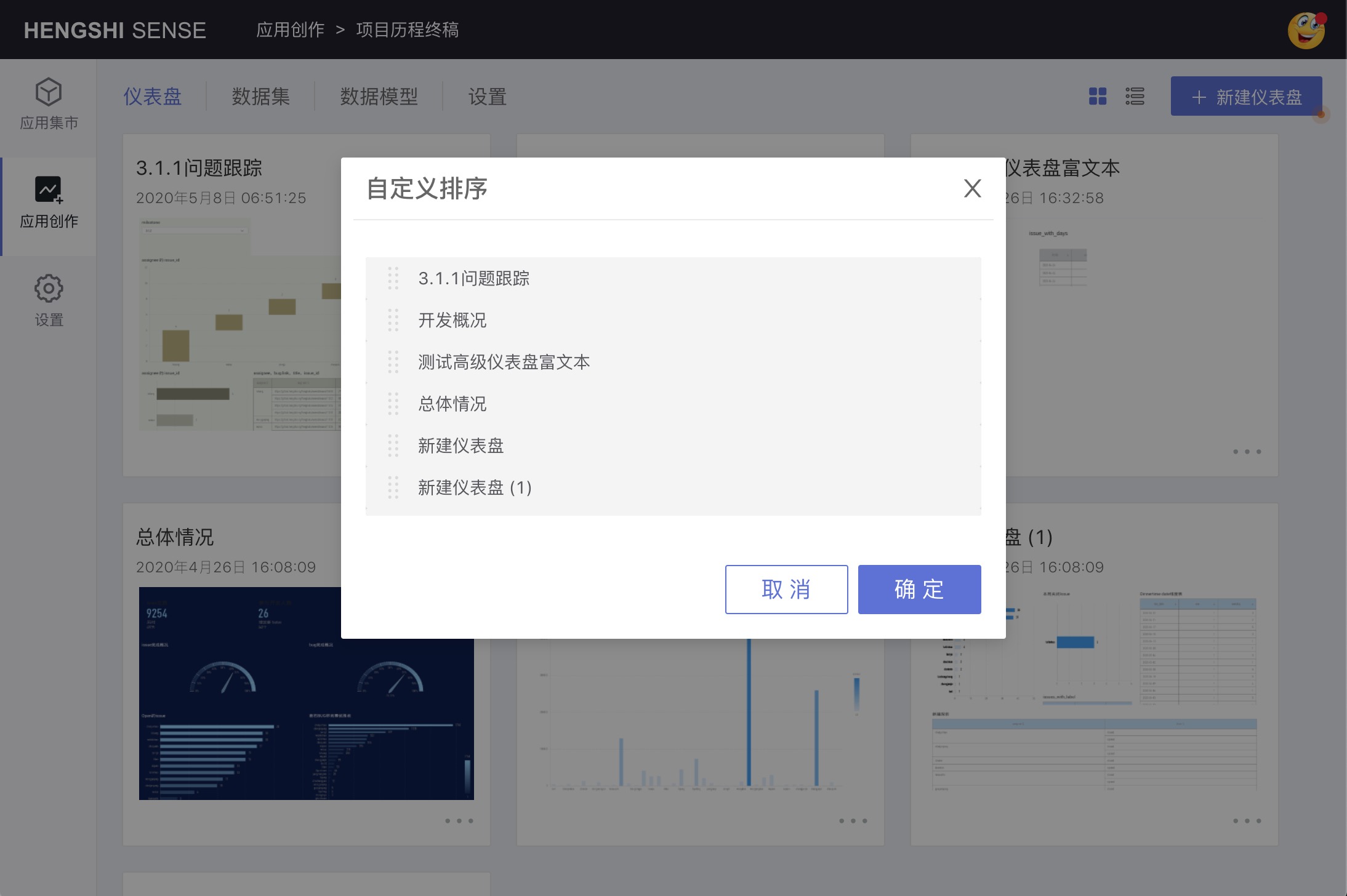
Complete custom sorting by dragging.
Dashboard Operations
Chart List
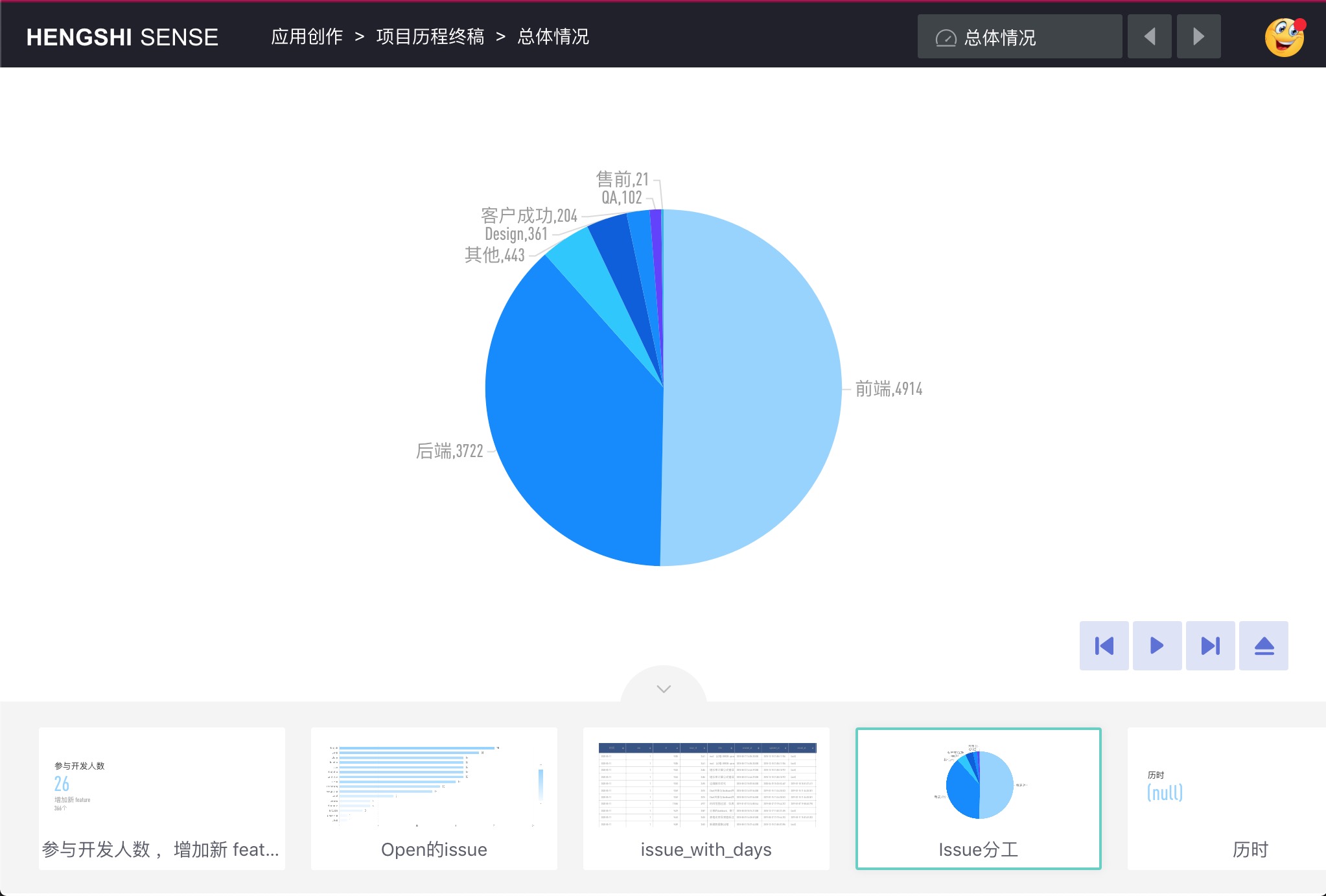
After opening the dashboard, you will see all the charts in the dashboard.
Adjust Chart Layout
Move the mouse over the chart to adjust the position by dragging the chart, drag the bottom right corner of the chart to modify the size.
Top Left Menu
The menu in the top-left corner of the dashboard is as shown below:
In order:
- Create Chart
- Add Filter
- Play Slideshow
- Refresh
- Fullscreen
- Embed
- Export Dashboard
Create Chart
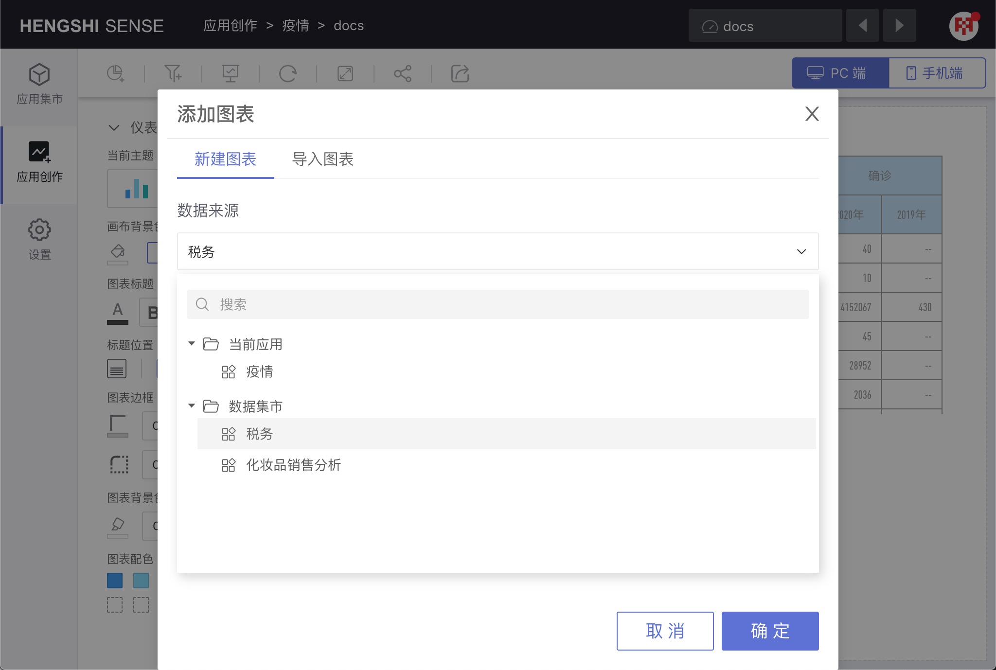
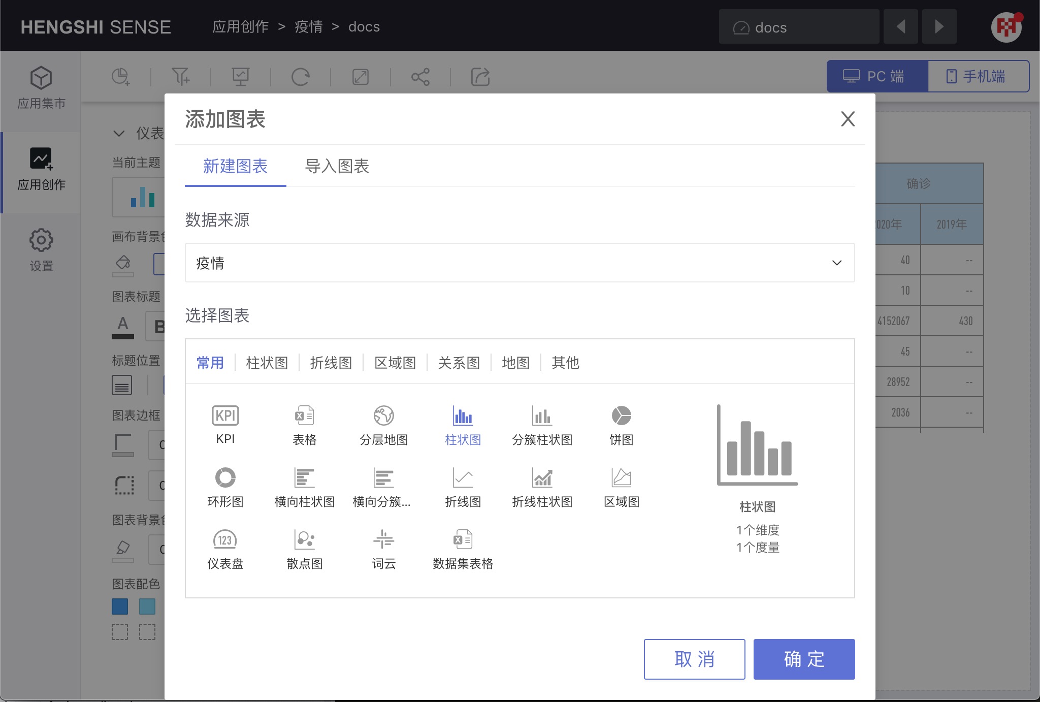
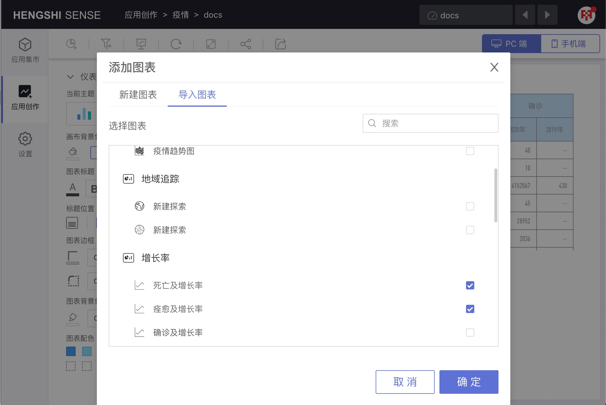
Click the Create Chart button to add charts to the dashboard. When creating charts, there are two ways: Create Chart and Import Chart.
Create Chart
When creating a chart, select the data source from the
Data Sourcedropdown list. Here, you can choose data packets from the data market.Then, in the chart type, select the chart type you need to create and click OK.
Import Chart
When switching the method of creating charts to import charts, the window lists all the dashboards in the application as well as the charts under the dashboard. After checking the charts to be imported, click OK and the chart import is successful. If there are too many charts in the current application, you can use the search function. Search supports dashboard and chart name search.
Add Filter
Click the Add Filter button, the system will create a new filter in the dashboard layout. See Dashboard Filter for details.
Play Slideshow
Click the Play Slideshow button to enter the chart playback interface.
The menu at the bottom right corner during slideshow playback, in order:
- Previous
- Play/Pause
- Next
- Close Slideshow
After the table rolls up/drills down and then plays a slideshow, the data in the table in the slideshow is after the rollup/drilldown, and changing the rollup/drilldown state in the dashboard is not allowed during the slideshow presentation.
Refresh

The refresh function is used to clear the cache and recalculate the chart data.
The difference from the browser's own refresh button is:
- For various appearance elements of the dashboard, such as titles and layout, if two people are adjusting a dashboard at the same time, using the browser's own refresh, other people's modifications to the appearance will be immediately applied to the current interface, while the dashboard's own refresh function will not apply these modifications.
- In terms of data, because the Hengshi system caches the results of chart data, browser refresh may not necessarily update the data, while the dashboard's own refresh is specially used to update chart data. Using the dashboard refresh will resubmit the query request to the data source and reload the latest data.
Fullscreen
Fullscreen displays the entire dashboard to achieve a preview effect.
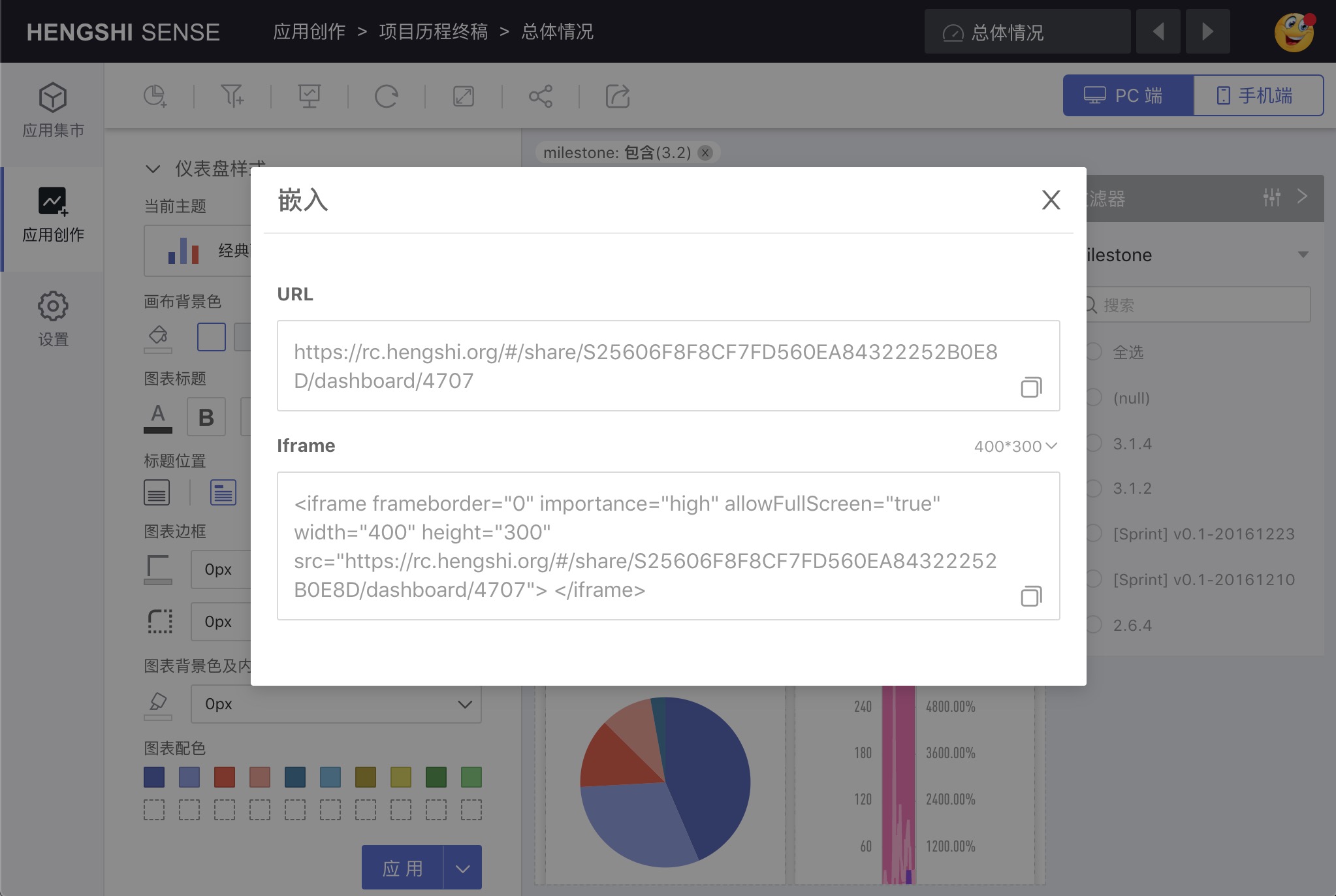
Embed
Click Embed to choose to embed this application or this dashboard.
Export Dashboard

Export dashboard supports two formats: PNG, PDF.
- The PNG function will generate a PNG image of all the charts in the current dashboard according to the current layout and download it to the local machine.
- The PDF function is similar to the PNG function, only the file format is different.
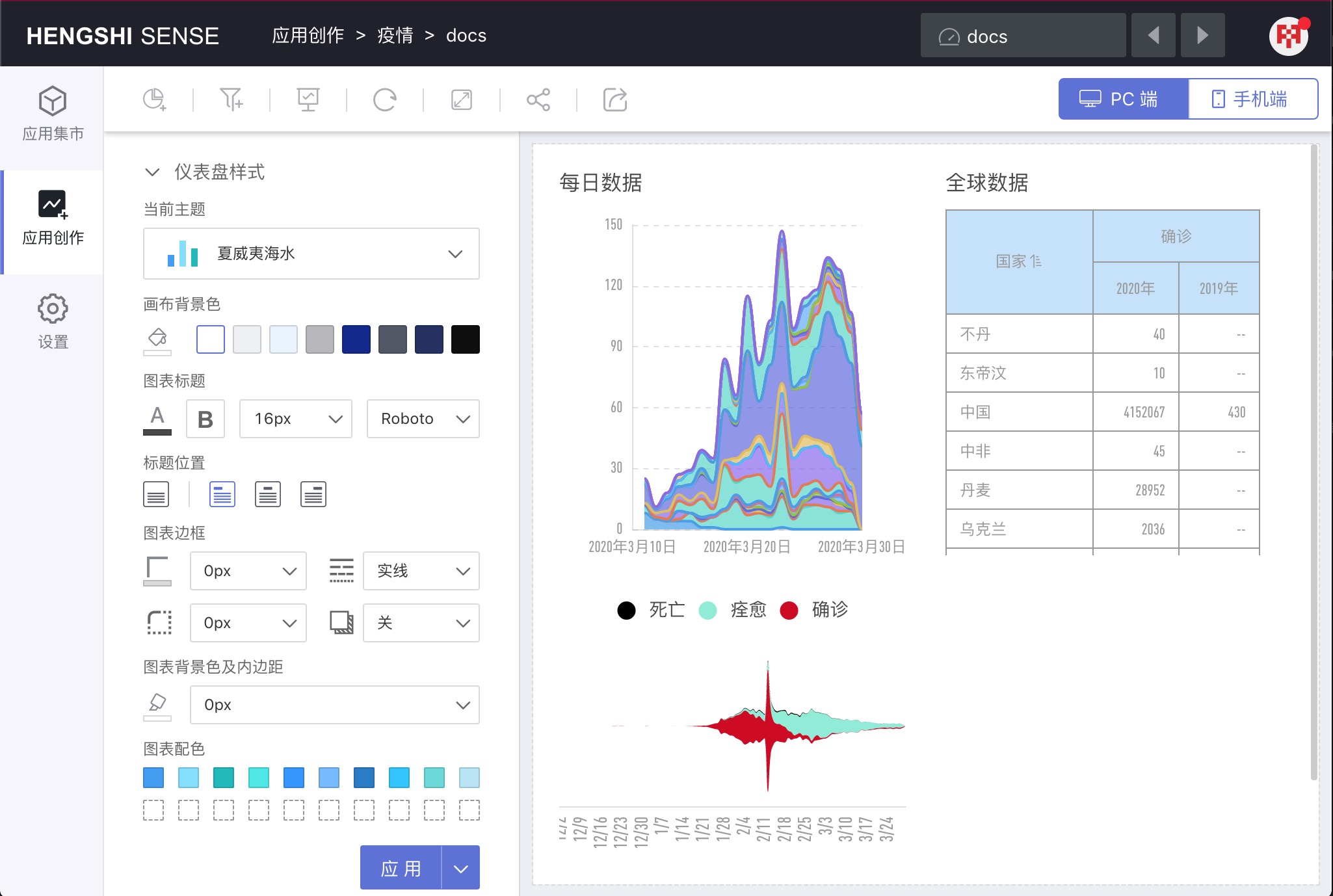
Theme
Clicking the drop-down list under Current Theme, you can see all the themes, including Custom Themes and Built-in Themes.
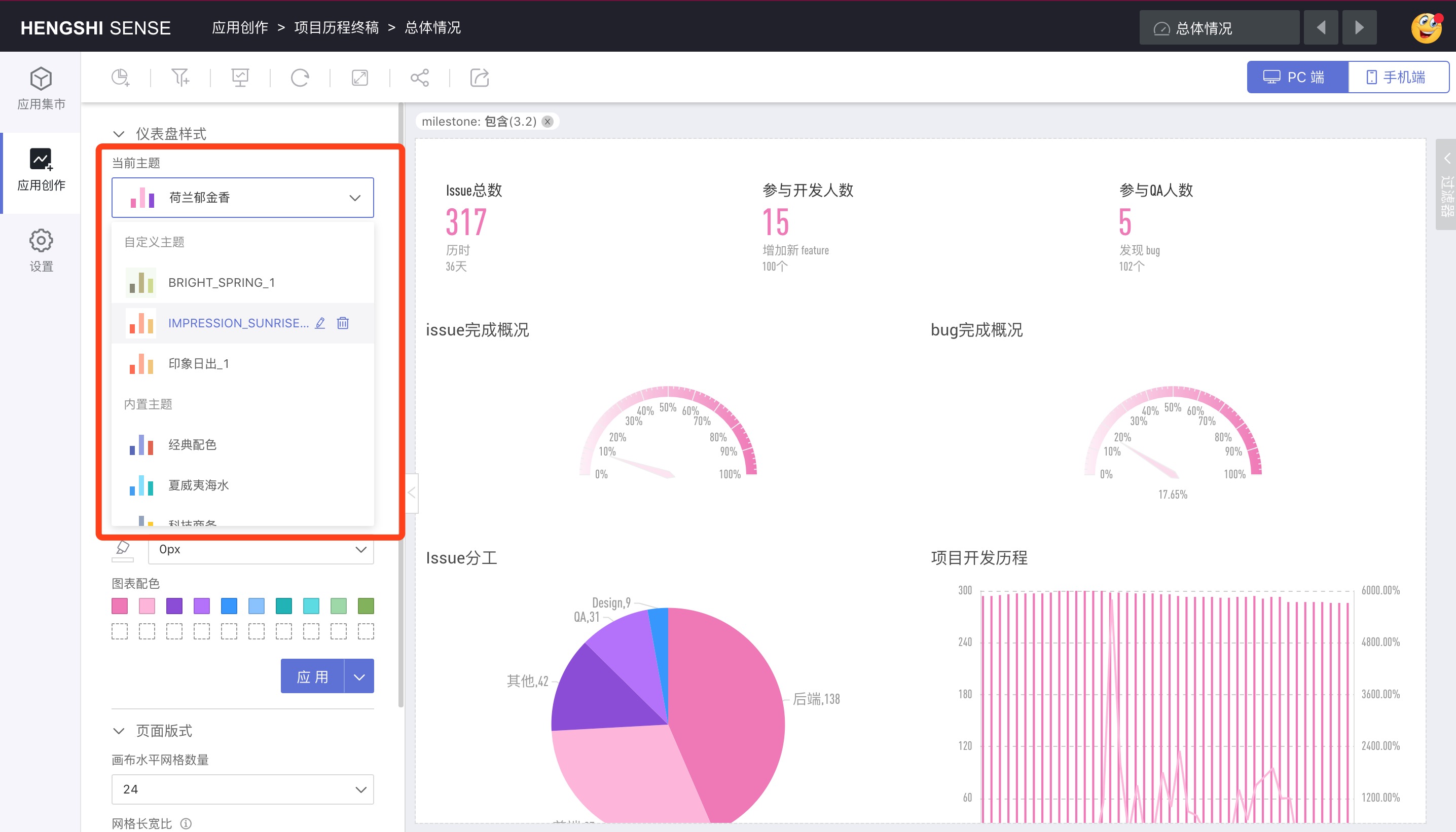
Current Theme
Current Theme indicates the theme currently used by the dashboard.
When creating a new dashboard, the current theme defaults to Classic Colors.
When opening an old dashboard, the default current theme is: "No theme set".
Built-in Themes
Built-in themes include: Classic Colors, Hawaiian Sea, Tech Business, Dutch Tulips, Monet's Lily Pond, Impression, Sunrise, Bright Spring, Mystic Sky, Blue Sandstone, Evening Breeze, Van Gogh's Starry Night, etc.
Custom Themes
After setting various styles in the dashboard content, users can save the current settings. The saved theme is the custom theme.
Canvas Background Color
You can click the color picker to choose a color, or you can choose the commonly used background colors provided on the right.
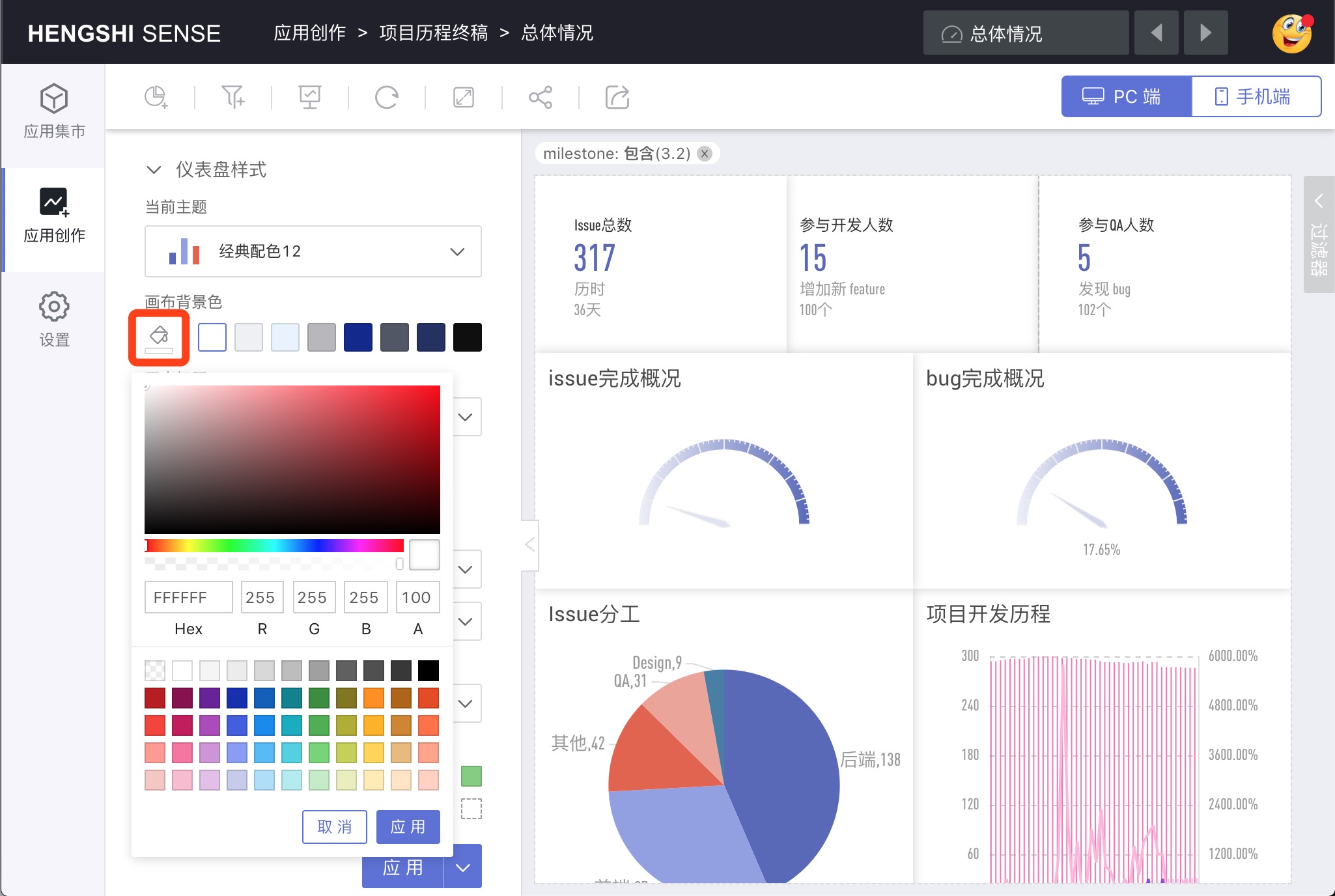
Chart Title
Uniformly set the chart title color, whether bold, size, and font.
Title Position
Uniformly set whether the chart title is displayed, and when displayed, the display position: left, center, right.
Chart Border
Set the chart border's:
- Color
- Line thickness
- Line Type
- Corner radius
- Border shadow
Chart Background Color and Padding
Choose the chart background color with the color picker and set the padding size for the chart.
Example of a dashboard set with chart borders and chart background:
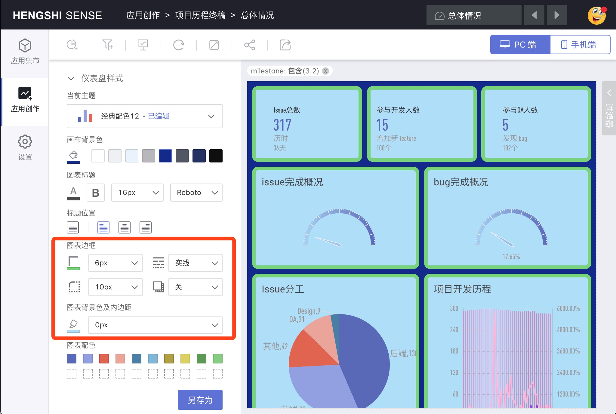
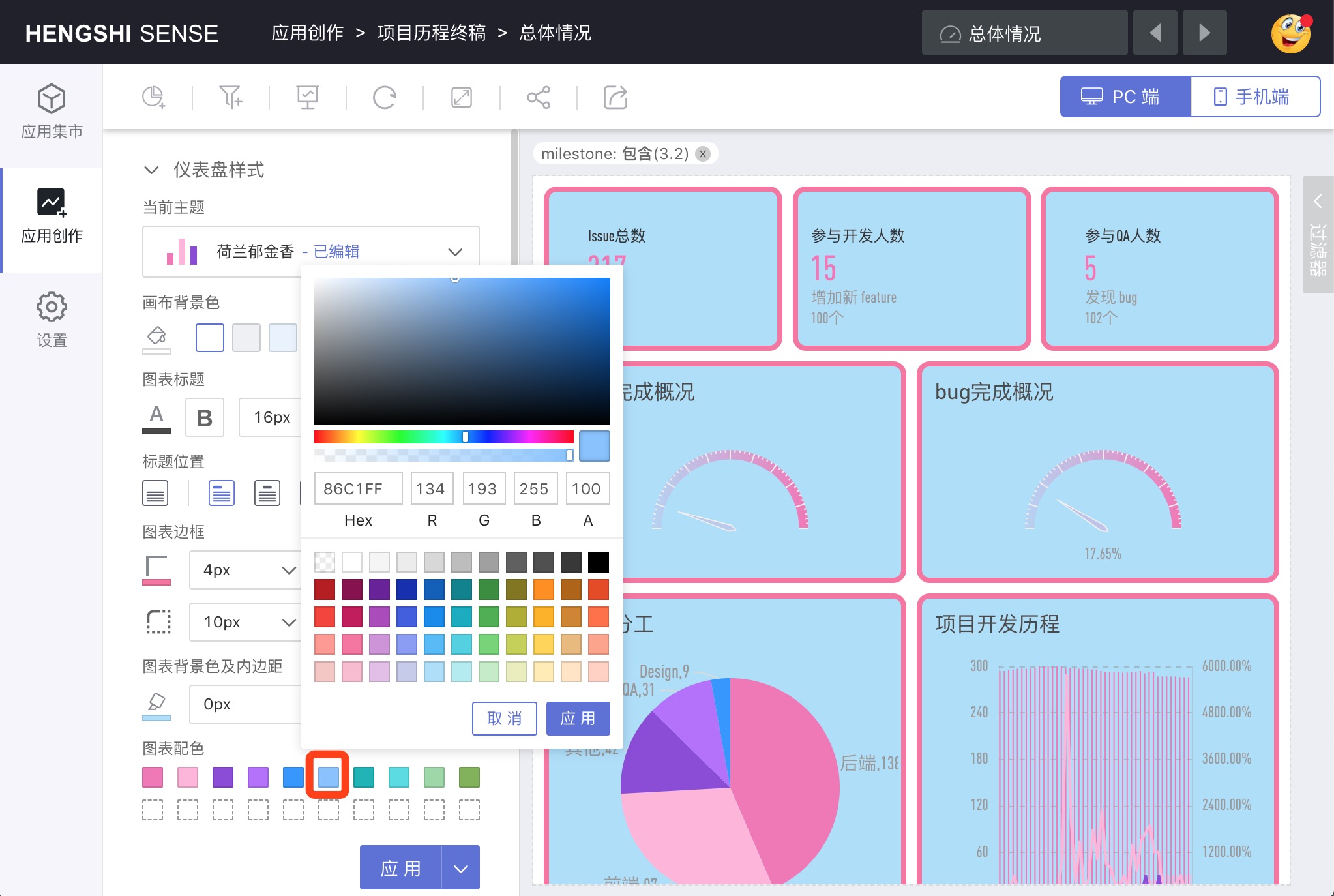
Chart Color Scheme
Click each color in the theme to pop up a color picker, thereby modifying the color in the theme series.
Save Theme
Whether it is a built-in or custom theme, if the user has edited it, clicking Apply will pop up the Save Theme dialog. After clicking Save, the current style will be saved as a new theme, while also applying the new theme.

Save As
If the user only wants to save the current style but does not want to apply it to the current dashboard, they can click Save As under apply to save the theme.

Apply
Users can drop down to select the theme they want. After selection, preview in the chart area, if they are satisfied with the current effect, click Apply to apply the theme style to the chart or dashboard filter.
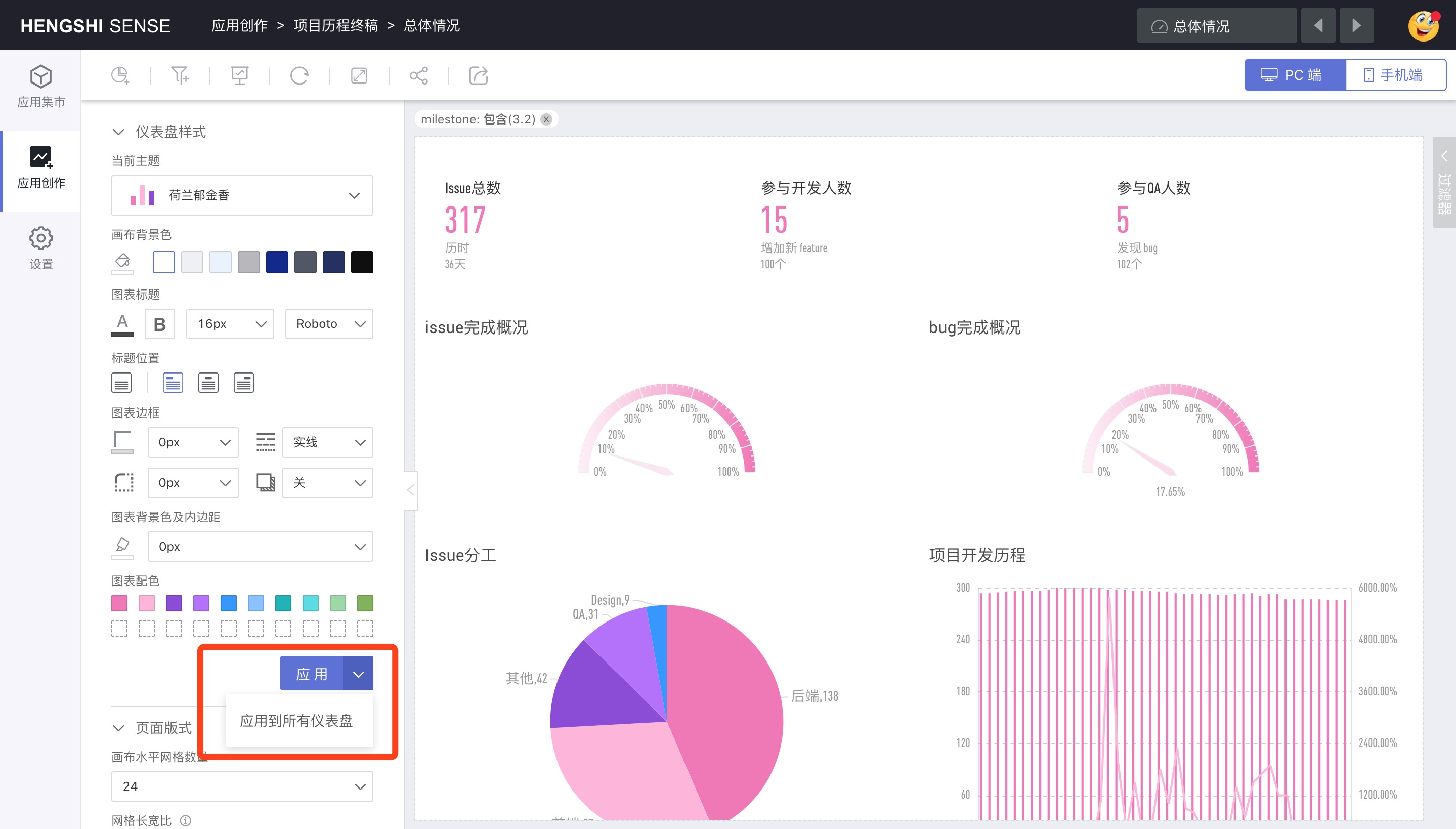
Apply to All Dashboards
Click the drop-down menu for Apply, select Apply to All Dashboards, and the currently selected theme will be applied to the styles of all the dashboards in the current application.
Chart Linkage
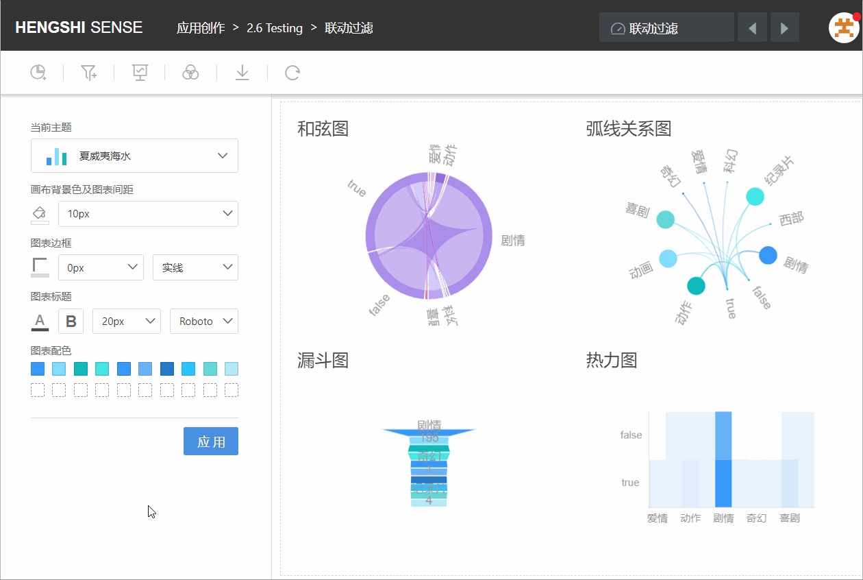
During the chart view process, a chart can be used as a filter. Click on a dimension group in the chart (e.g., a bar in a bar chart, a sector in a pie chart) to update the charts from the same dataset or charts with dataset associations accordingly, displaying filtered results based on the selected group. Click the same group again to cancel the linkage effect.
As shown in the figure, after clicking on "Documentary" in the chart "Arc Relation Graph", all charts only display the data of the documentary.
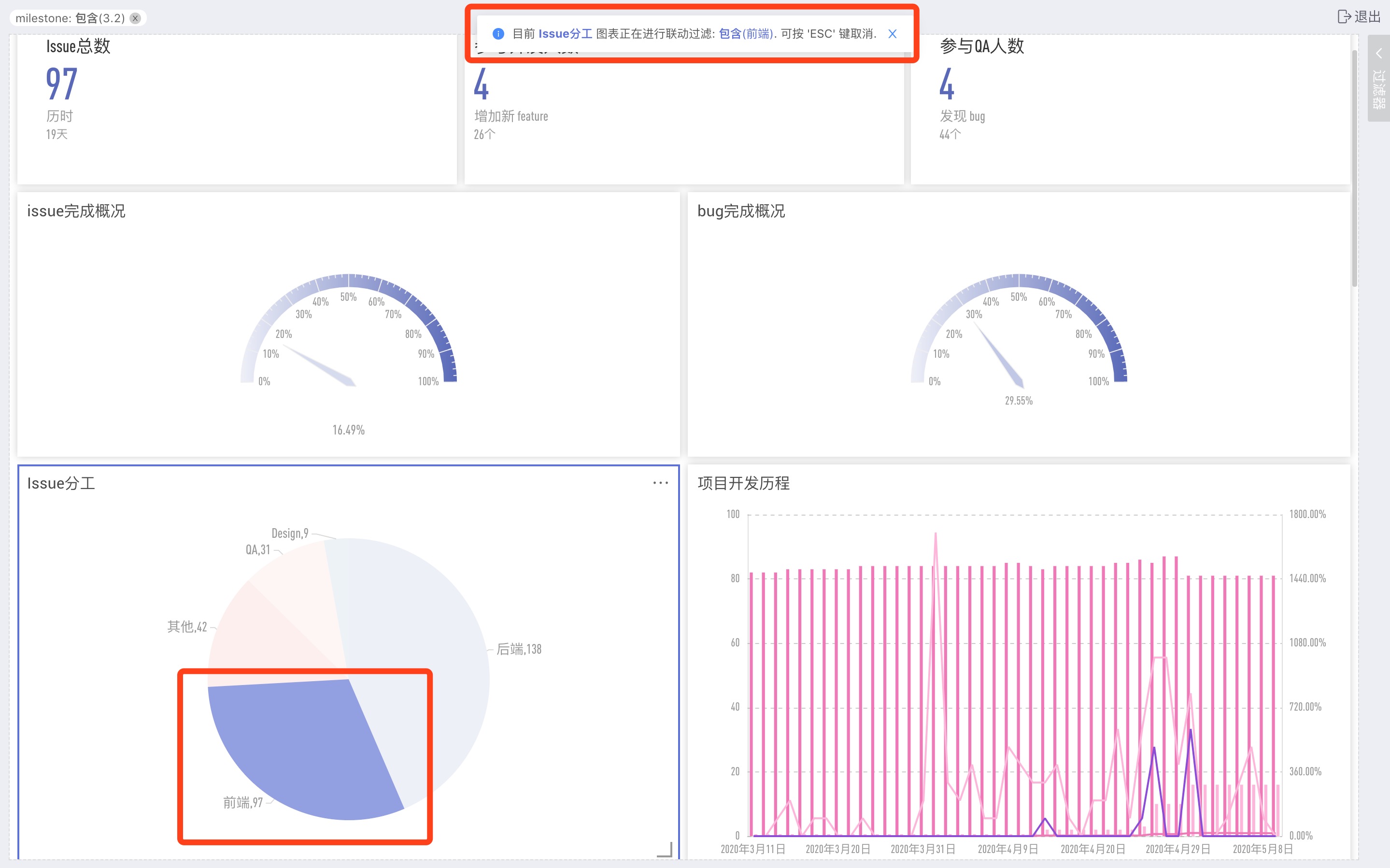
Chart Operations
In the dashboard, when you hover over the chart thumbnail, you can view the menu on the chart:
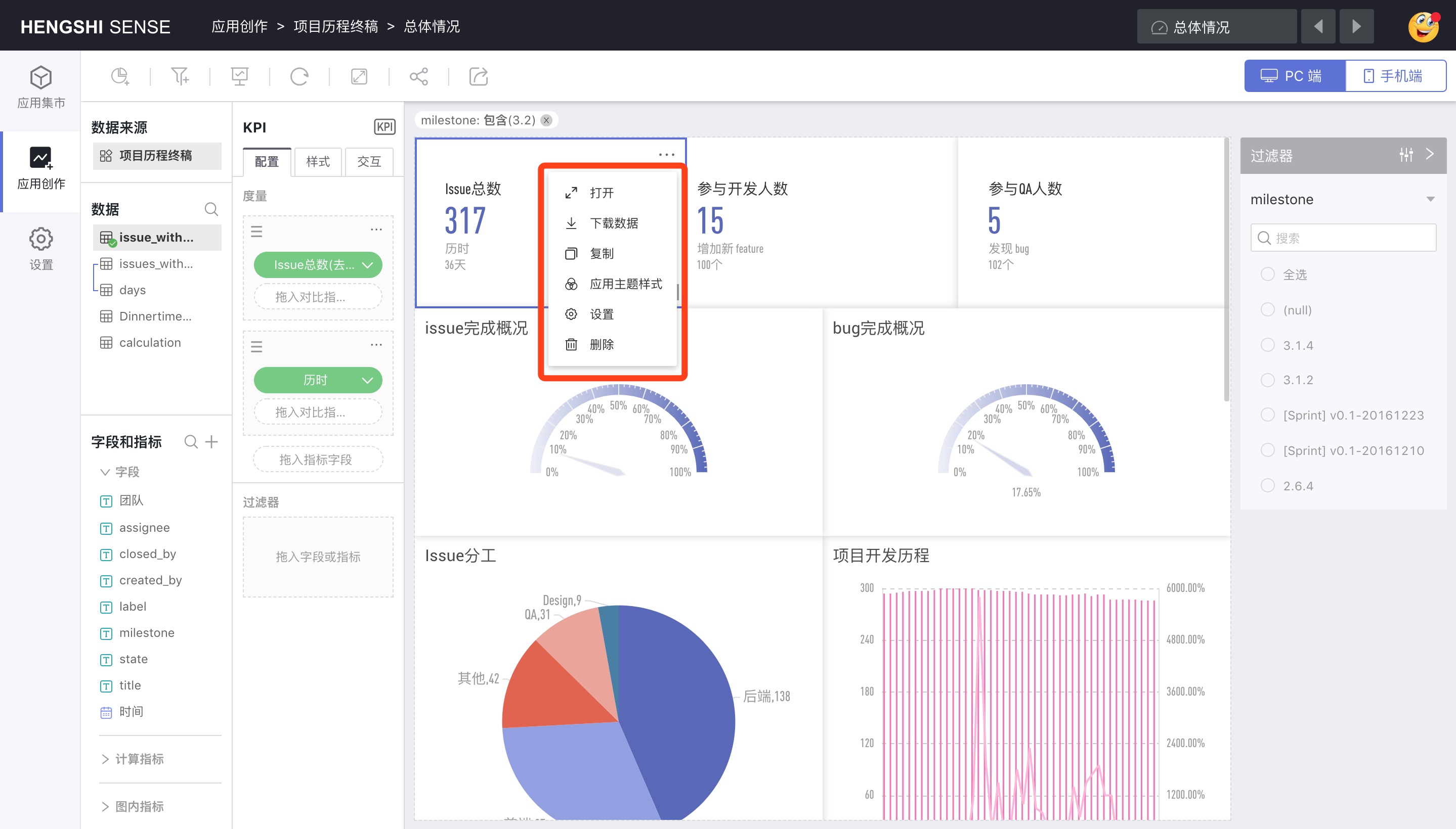
In order:
- Open
- Download Data
- Copy
- Apply Theme Style
- Settings
- Delete
Open
Enter the chart editing page.
Download Data
Click Download Data to export the aggregated result data from the chart to an Excel file.
The downloaded Excel file contains data filtered by the dashboard filter.
Apply Theme Style
If the chart color is reset inside the chart, charts in the dashboard must click Apply Theme Style to be displayed according to the set theme.
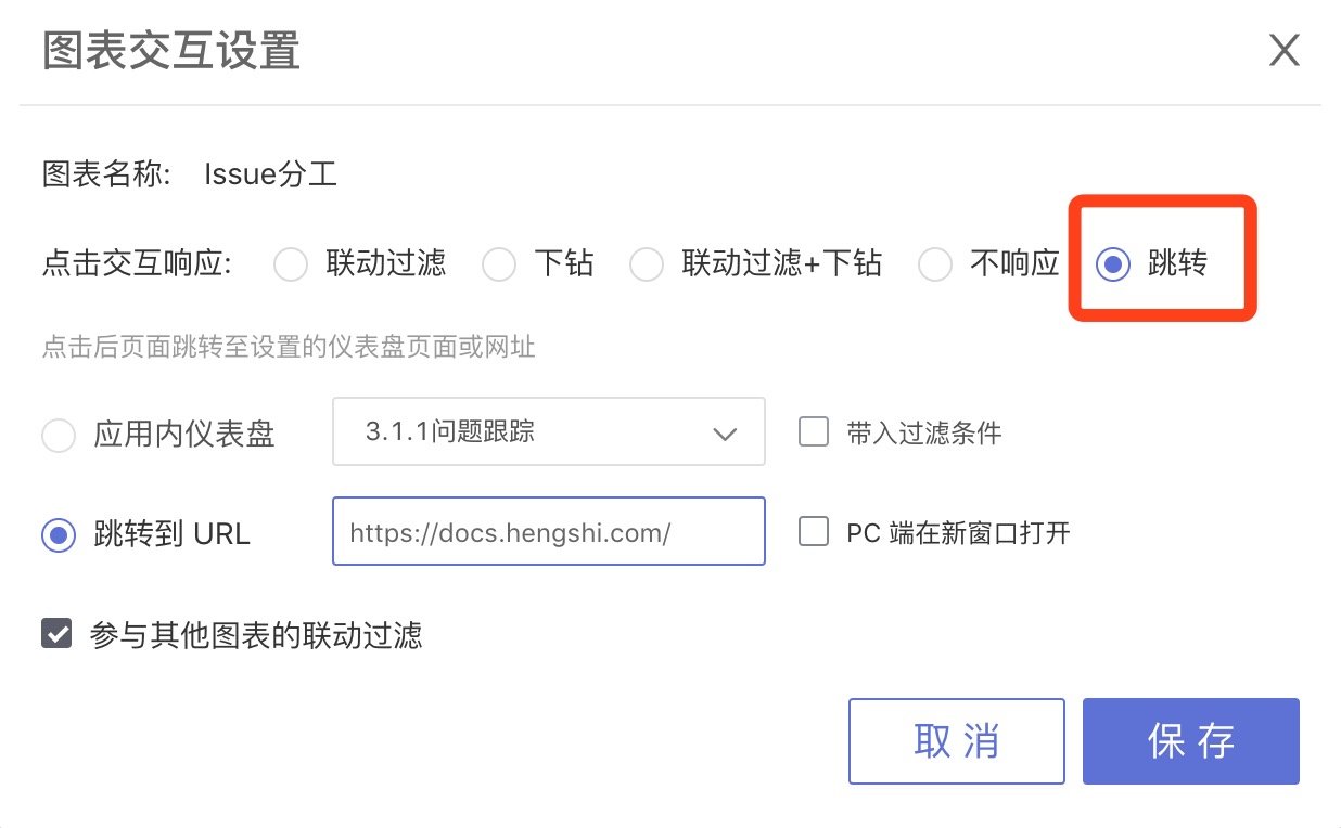
Settings
Click Settings to pop up the Chart Interaction Settings window, where you can set the chart's click interaction response method.
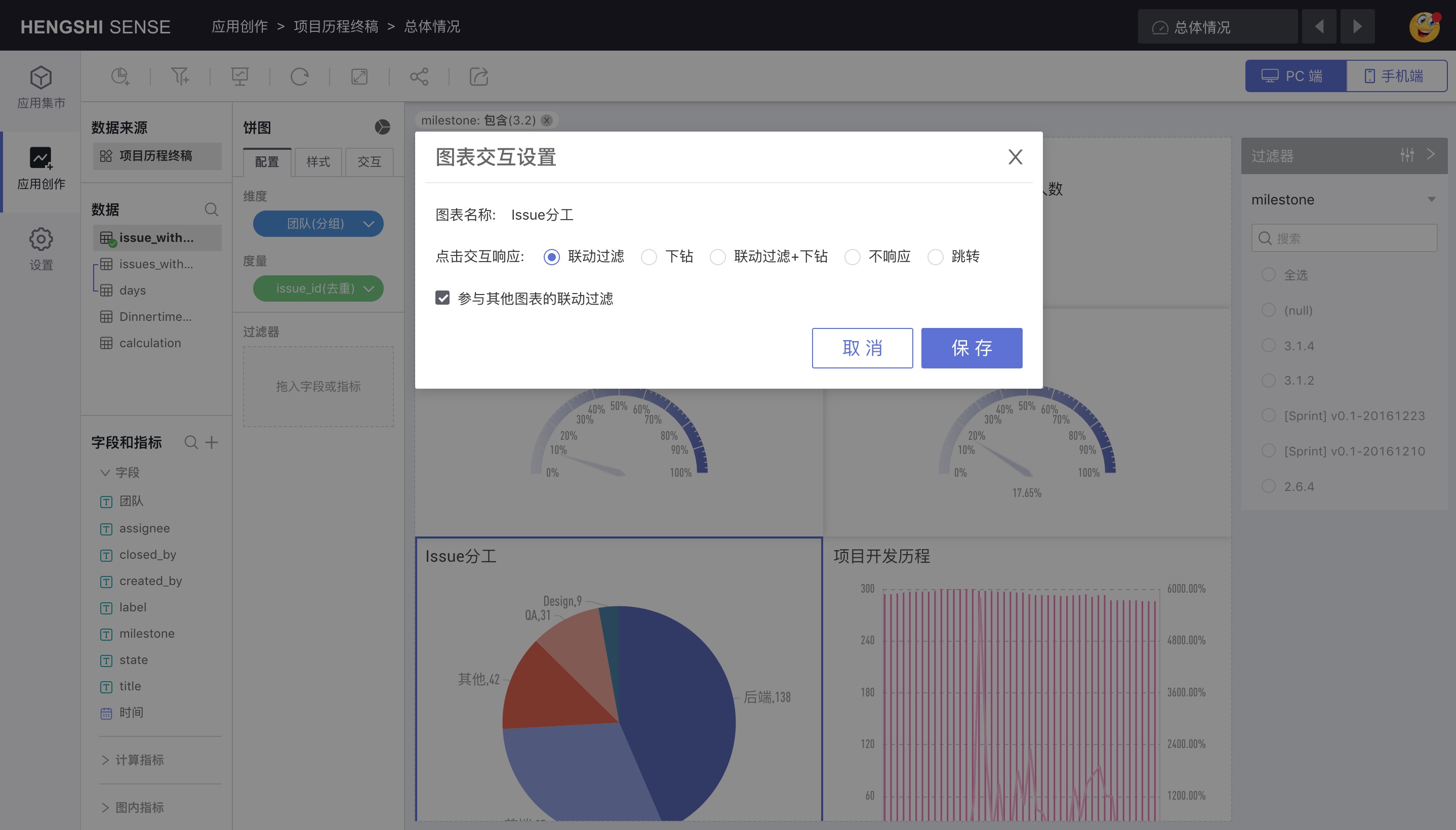
Click Interaction Response
This option is checked by default to Linkage Filter, which can be changed to Drill Down, Linkage Filter + Drill Down, No Response, and Jump.
Linkage Filter
When the Linkage Filter is checked, clicking on a data item in the chart will make the chart perform linkage filtering. See Chart Linkage for details.
Drill Down
Setting the chart's click interaction response to Drill Down means that clicking on a data item in the chart will display the chart with the set drill-down path according to the set path, and charts without a drill-down path set will not respond.
Linkage Filter + Drill Down
Setting the chart's click interaction response to Linkage Filter + Drill Down means that clicking on a data item in the chart will drill down the chart with the set drill-down path while filtering in linkage with other charts, and charts without a drill-down path set will only perform linkage filtering.
No Response
Setting the chart's click interaction response to No Response means that clicking on a data item in the chart will not produce any response in the chart.
Jump
You can set it to jump to other dashboards or to a specified URL, and you can specify whether to open a new window when jumping on the PC.
After setting, clicking the chart will jump according to the specified settings.
Participate in Linkage Filtering of Other Charts
By default, it is in a selected state: Participate in the linkage filtering of other charts.
When clicking on the chart from the same dataset or with dataset relations within the current dashboard, the chart will be filtered according to the selected data item;
Unchecking "Participate in Linkage Filtering of Other Charts" means not participating in the linkage filtering of other charts. When clicking a data item in the chart from the same dataset within the same dashboard, the current chart will not be filtered according to the selected data item.
Delete
Click the Delete button on the chart to delete the chart.
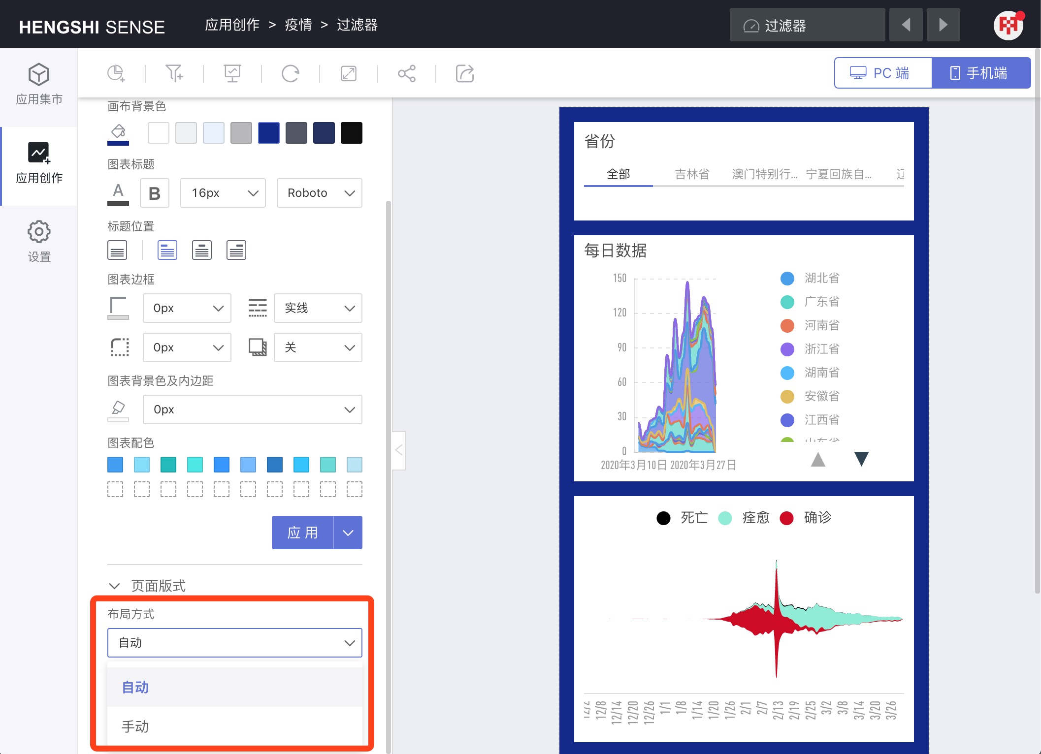
Page Layout
Desktop and Mobile allow users to set the layout separately for desktop and mobile.
Desktop
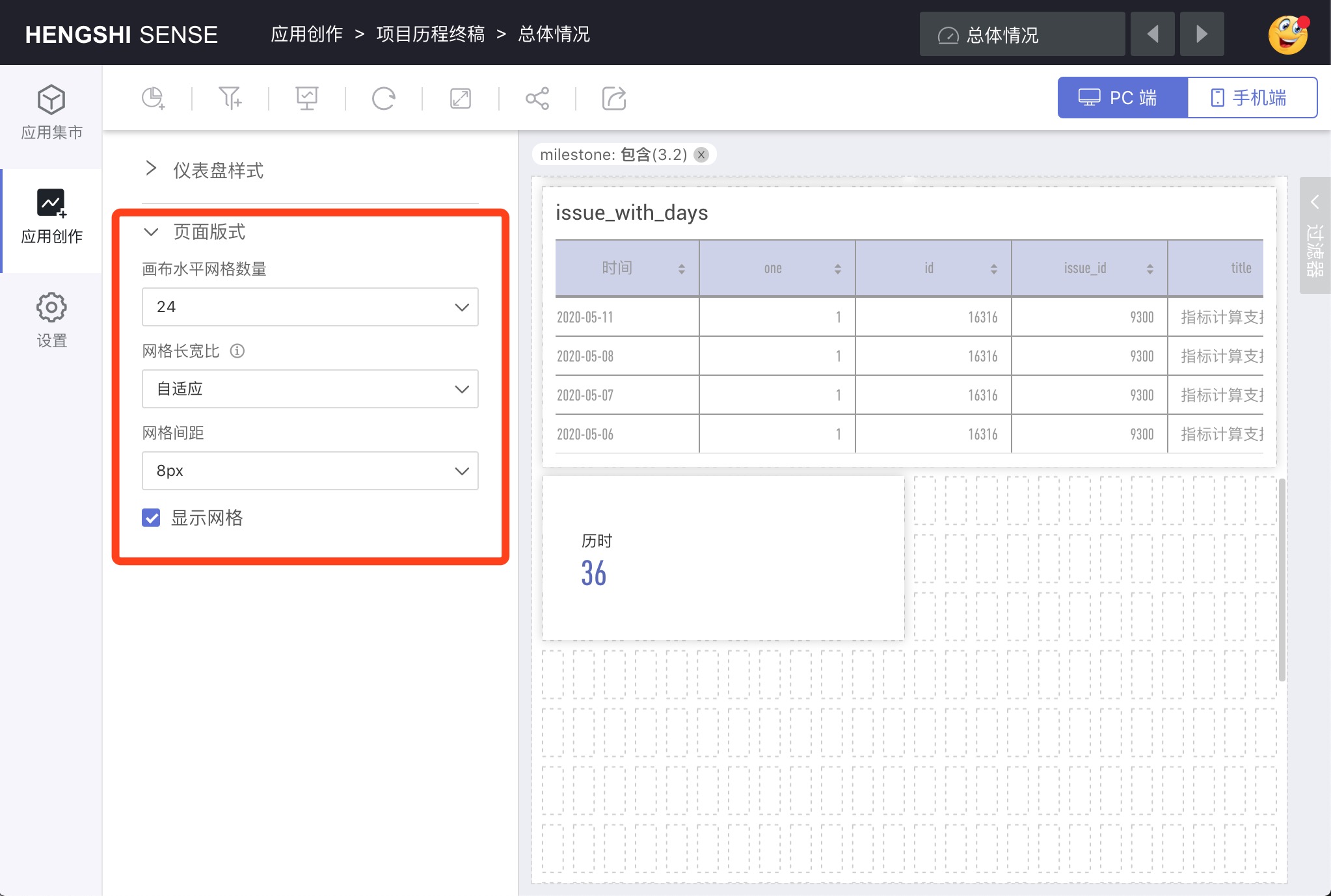
Canvas Horizontal Grid Number
Grid Aspect Ratio
Grid Spacing
Display Grid
When selected, it is convenient to adjust the page layout according to the number of cells.
Mobile
When switching from the desktop layout to the mobile layout, the Layout Mode defaults to Automatic, during which you cannot manually adjust the page layout and chart sizes.
After changing the layout mode from Automatic to Manual, you can freely set the page layout.