Hengshi Documentation
Table of Contents generated with DocToc
- Combined Charts
- X-axis/Y-axis
- Shapes
- Bars
- Lines
- Areas
- Circles
- Rings
- Shapes
- Color
- Monochrome
- Discrete Colors
- Continuous Colors
- Size
- Labels
- Tooltips
- Symbols
- Metric Operations
- Creating Copies
- Convert to Group
- Join Group
- Exit Group
- Add Filters
- Metric Sorting
- Subdimensions
- Sub-metrics
- Layer Group Menu
- Rename
- Creating Copies
- Merge Mode
- Stacking Settings
- Join Group
- Ungroup
- Delete
- Layer Group Sorting
Combined Charts
Combined charts are a new type of chart introduced in HENGSHI SENSE 3.2. In combined charts, you can:
- Add any number of axes
- Set the position and direction of axes
- Freely add geometric elements in a Cartesian coordinate system
- Lines, bars, and areas support custom stacking
- Use metrics outside of the elements to control chart labels and tooltips
- Use any dimension/metric to control chart colors
X-axis/Y-axis
In combined charts, you can set which metric controls the X-axis and Y-axis, thus creating horizontal or vertical charts as needed.
Shapes
In combined charts, you can choose the shape each metric displays in the area above each metric section. Currently, the following shapes are supported:
- Bars
- Lines
- Areas
- Circles
- Rings
- Shapes
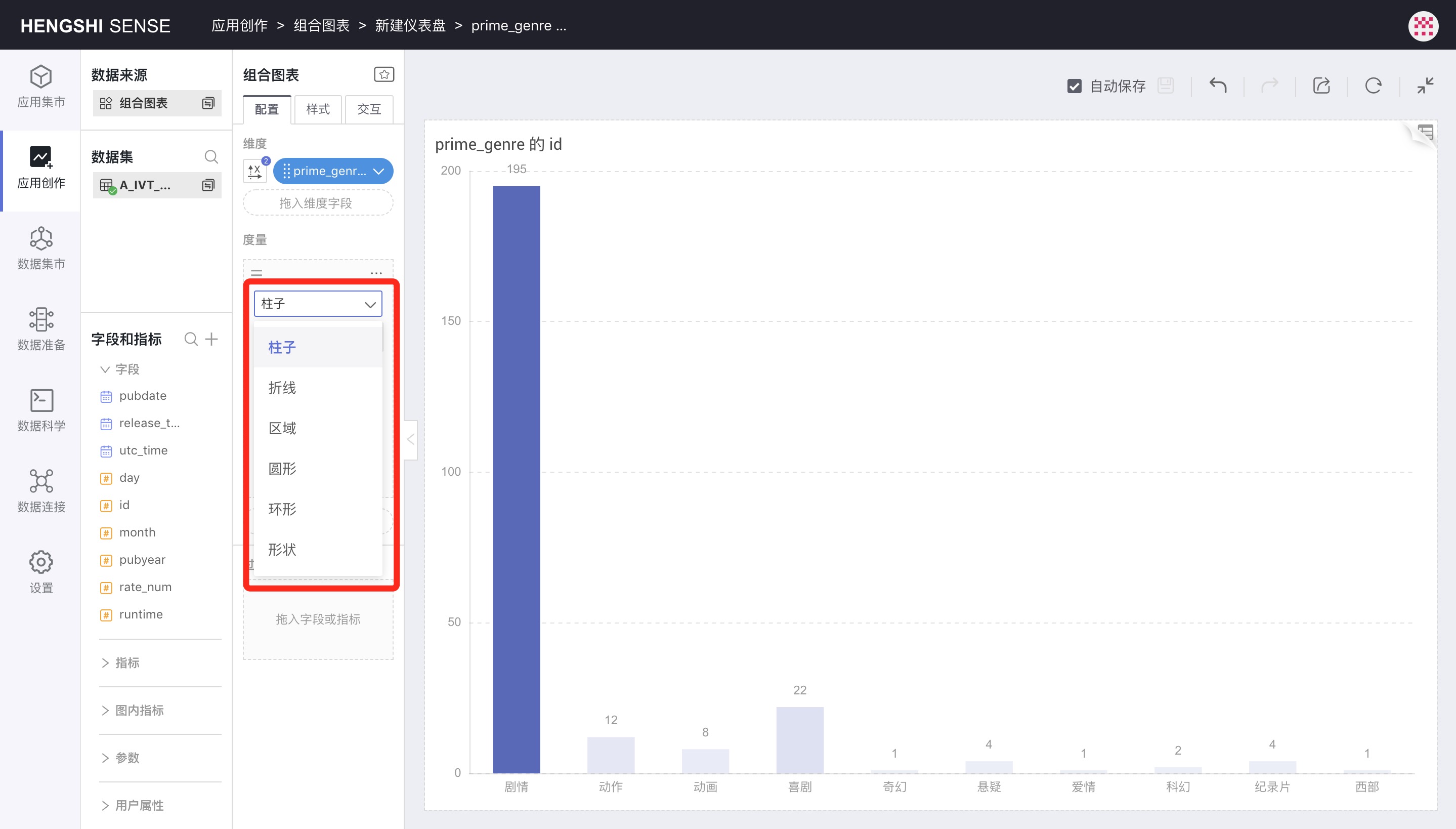
In combined charts, each metric can specify a different shape, allowing multiple shapes to appear in one chart. The shape settings are shown in the metric area because the elements are drawn based on the metric sizes.
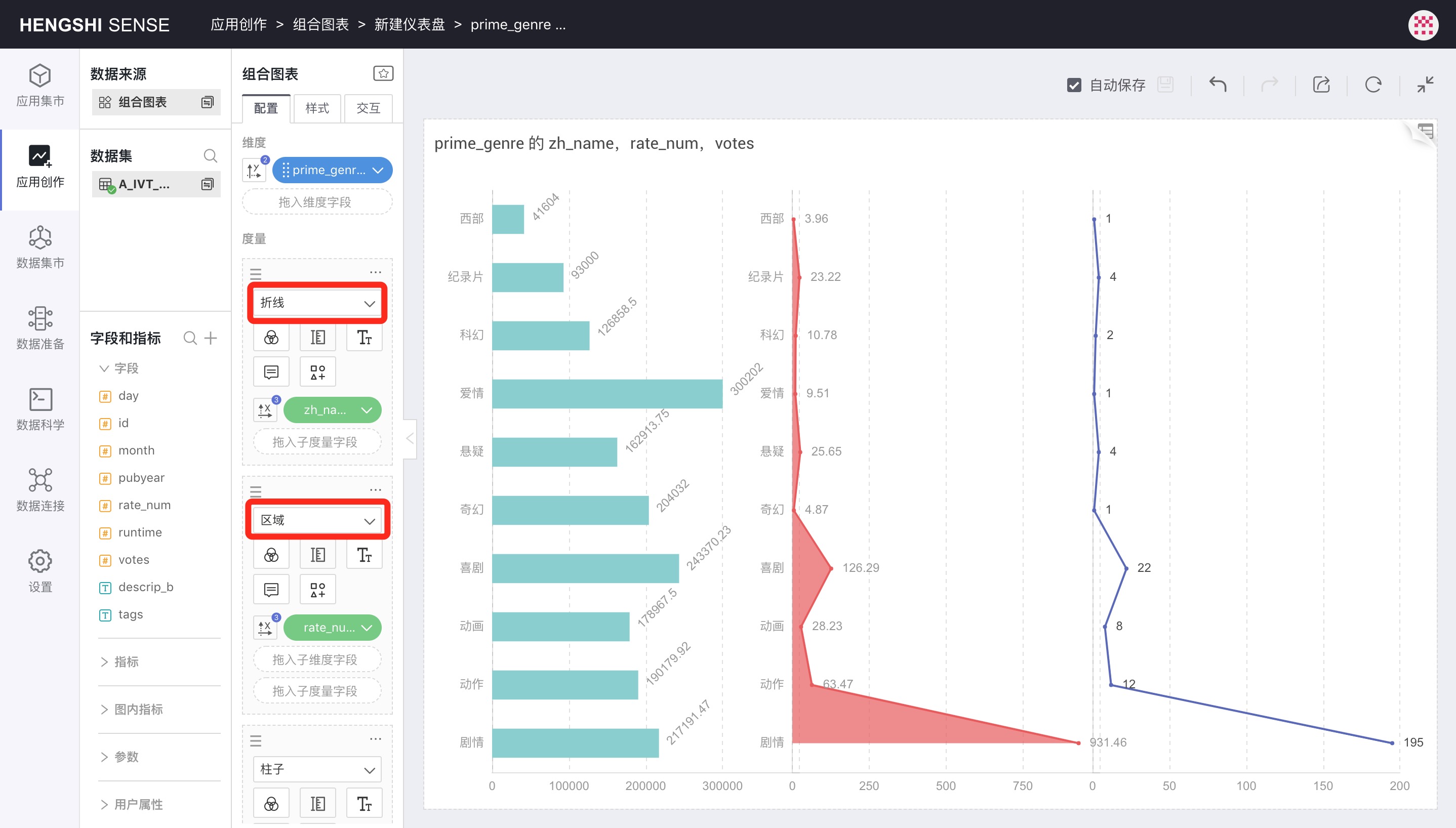
Bars
The Bar is the default shape.
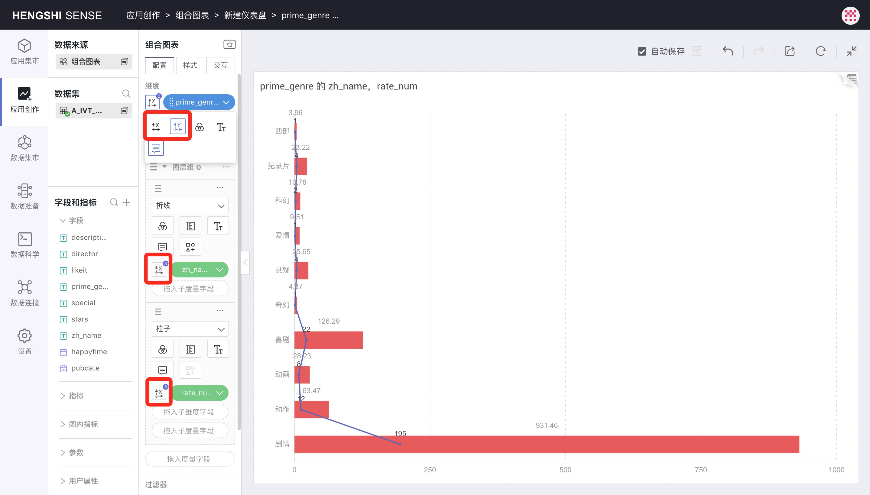
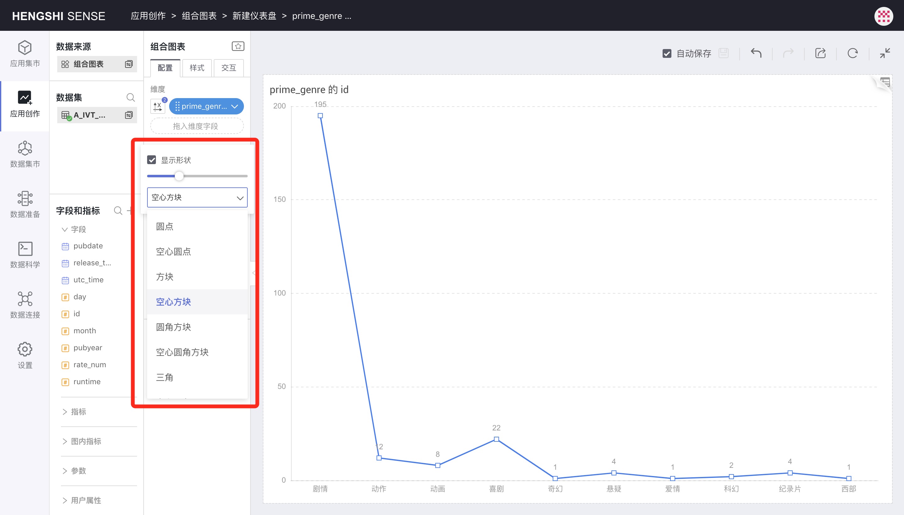
Lines
When the shape is set to Lines, the symbol control will be enabled.
Clicking the symbol icon allows you to select each data point's shape and size.
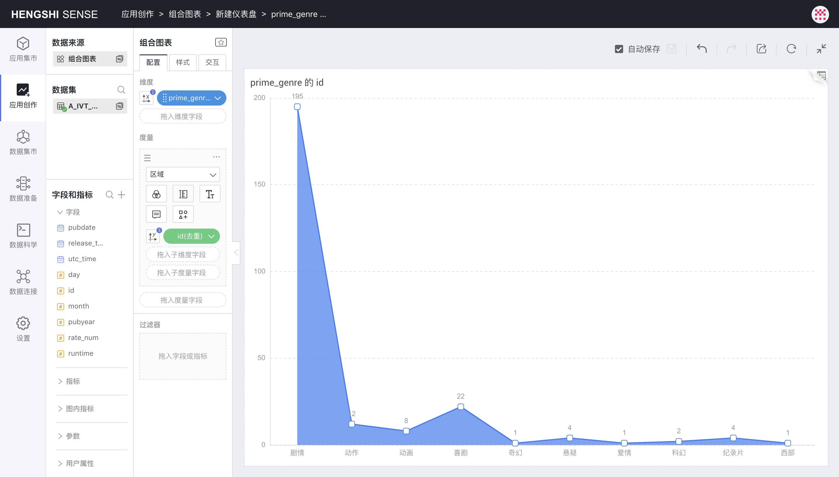
Areas
When selecting Areas as the shape:
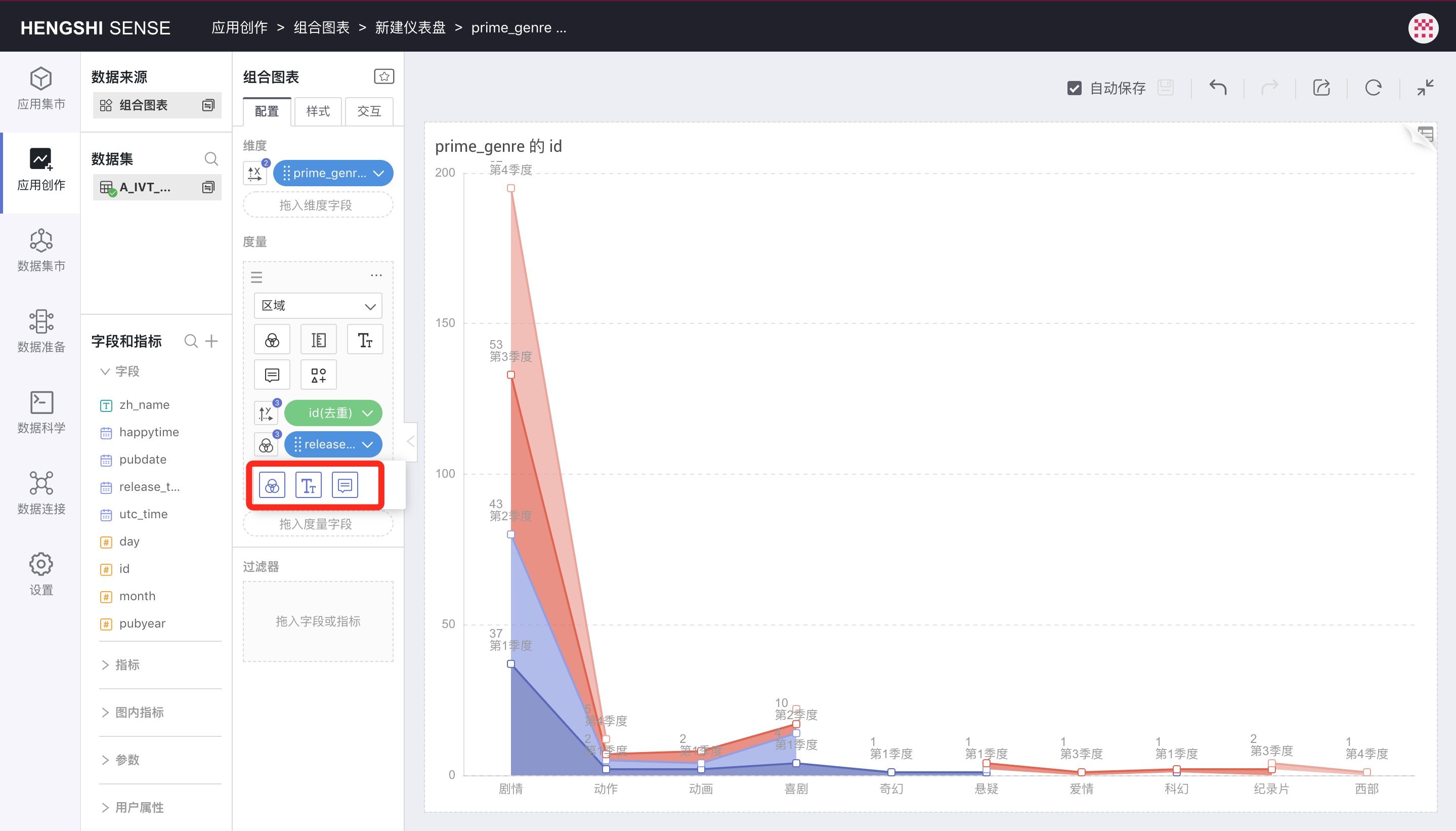
Dragging a subdimension into the metric turns the area chart into a stacked area chart, then using the subdimension to control color, label, and tooltip:
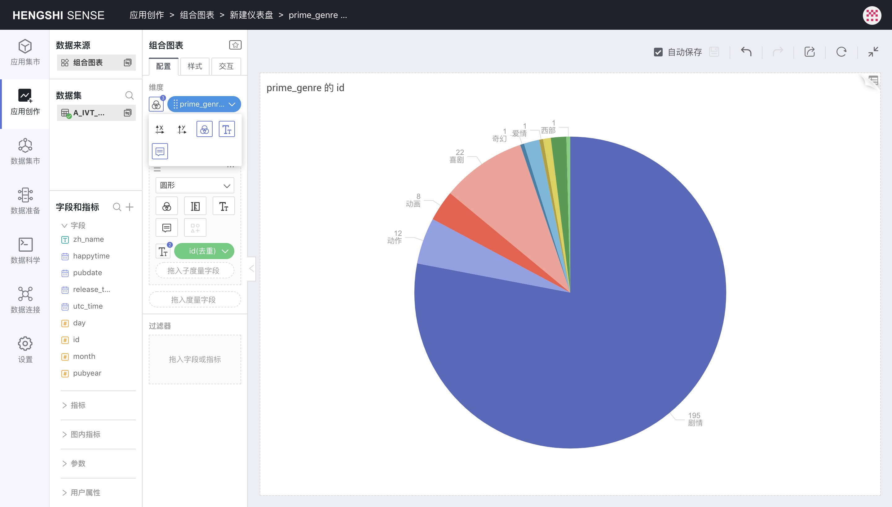
Circles
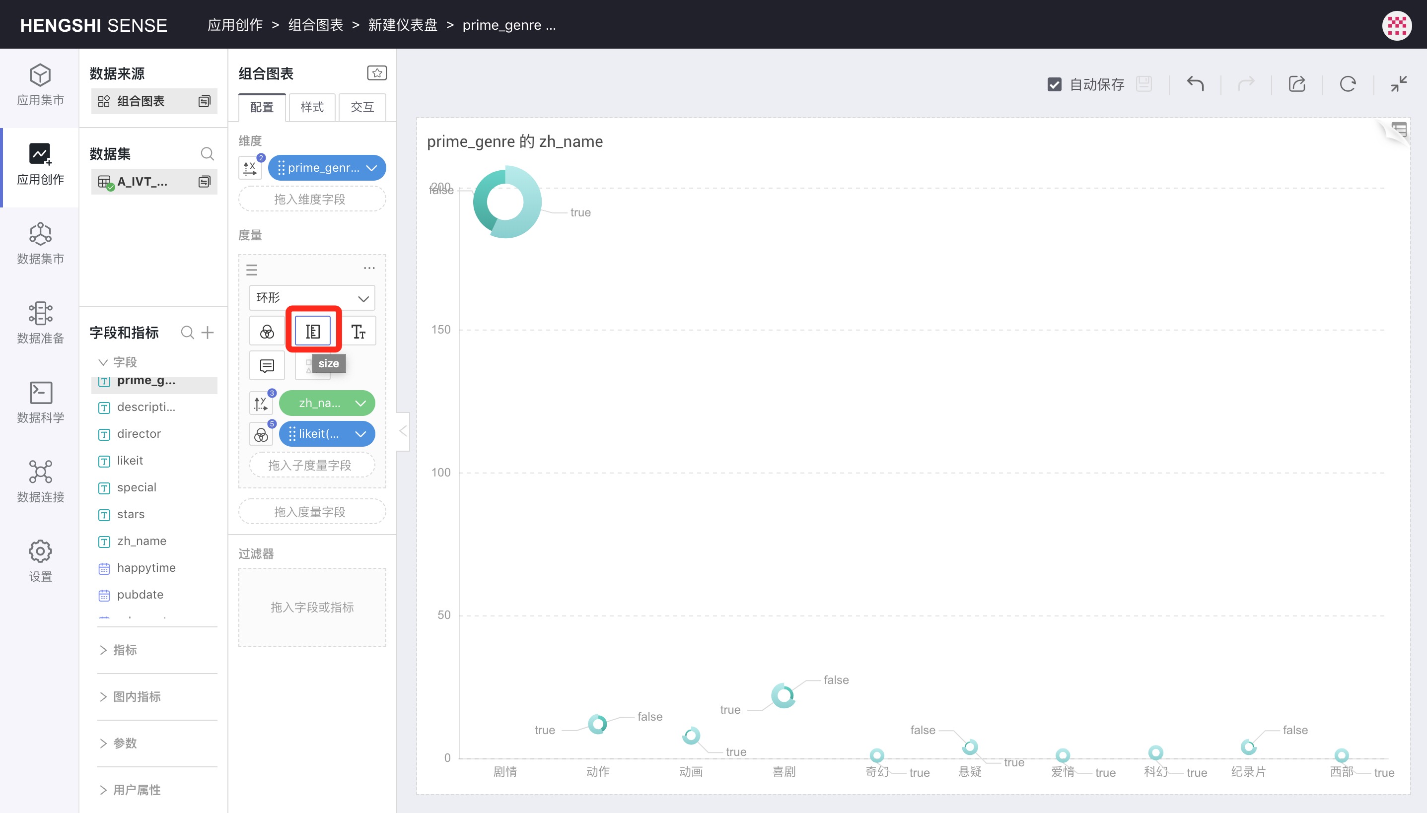
On top of the previous image, changing the shape to Circles, the chart will look like this, with the Size icon to control the circle size:
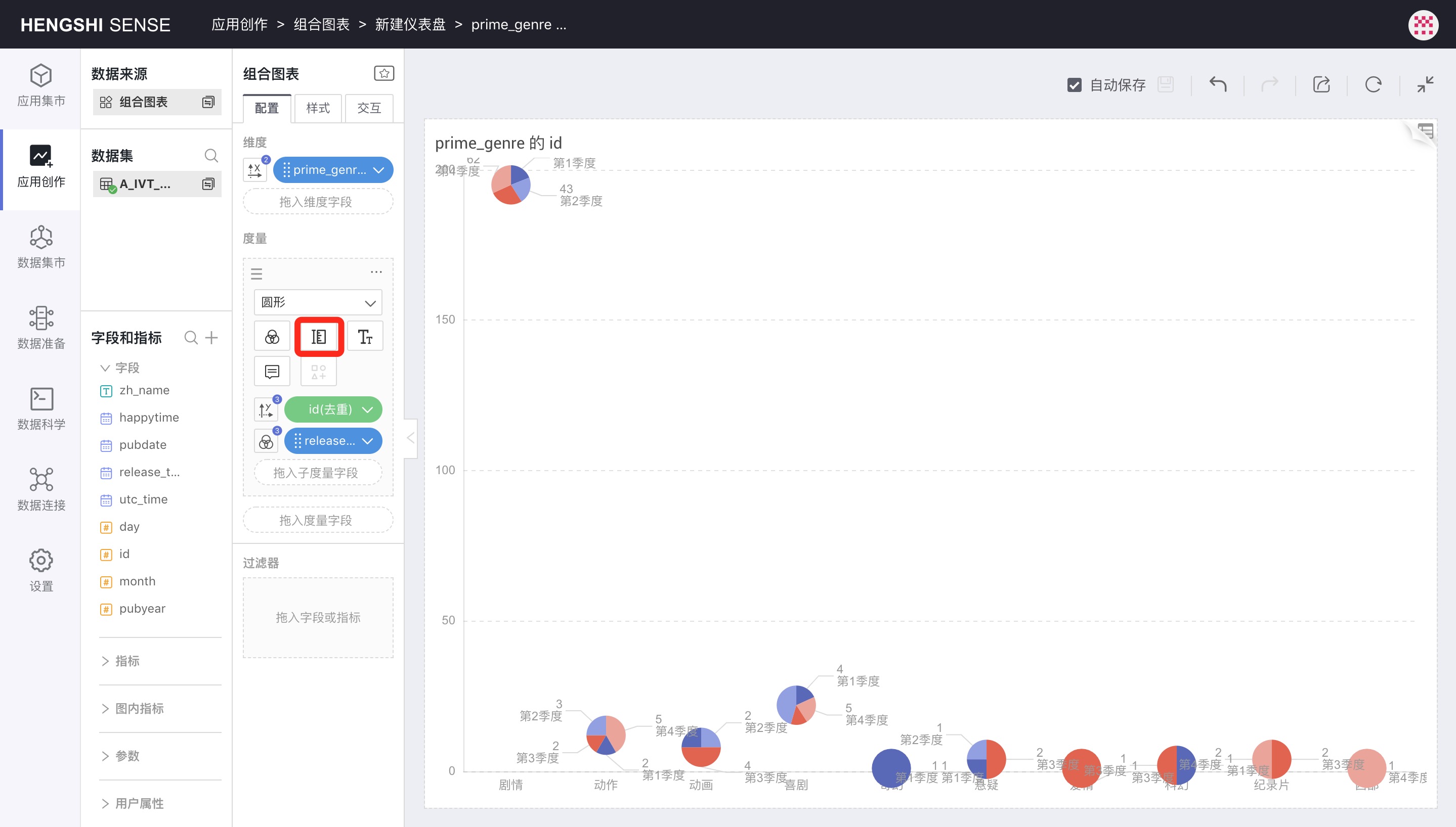
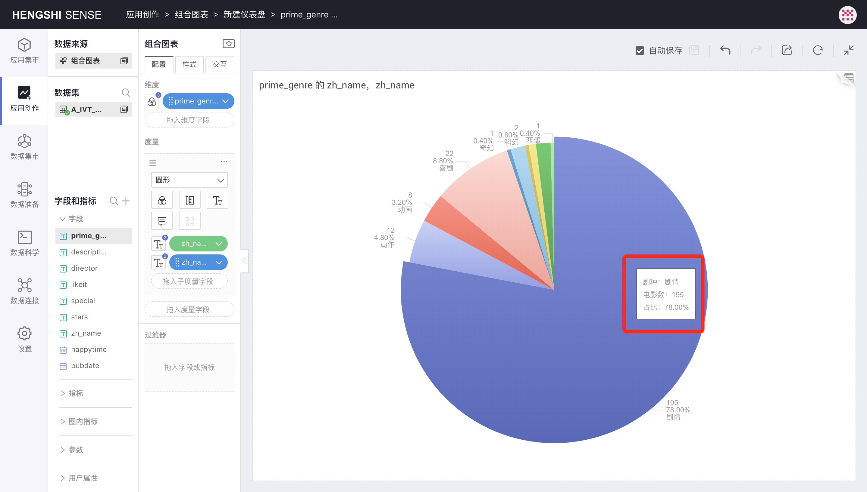
Circles can be used to draw a pie chart, provided that neither dimension nor metric controls the X and Y axes, dimension controls color, label, tooltip, and metric controls label and tooltip:
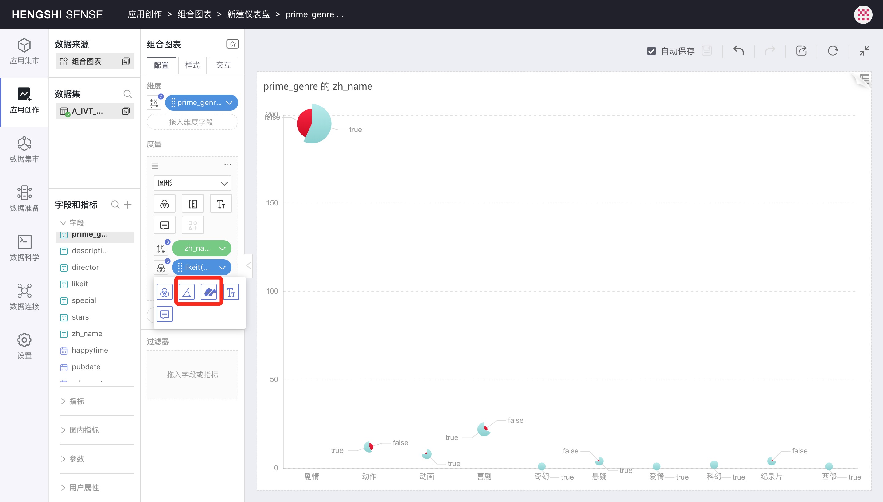
Angles and Radii
When the shape is a circle, dragging a subdimension in can control the circle's Angles and Radii.
Angles determines the sector angle for each subdimension value. If not selected, each sector will have the same angle.
Radii determine the size of the sector radius corresponding to each subdimension value. Without this, the result is a pie chart; with it selected, the result is a nightingale chart.
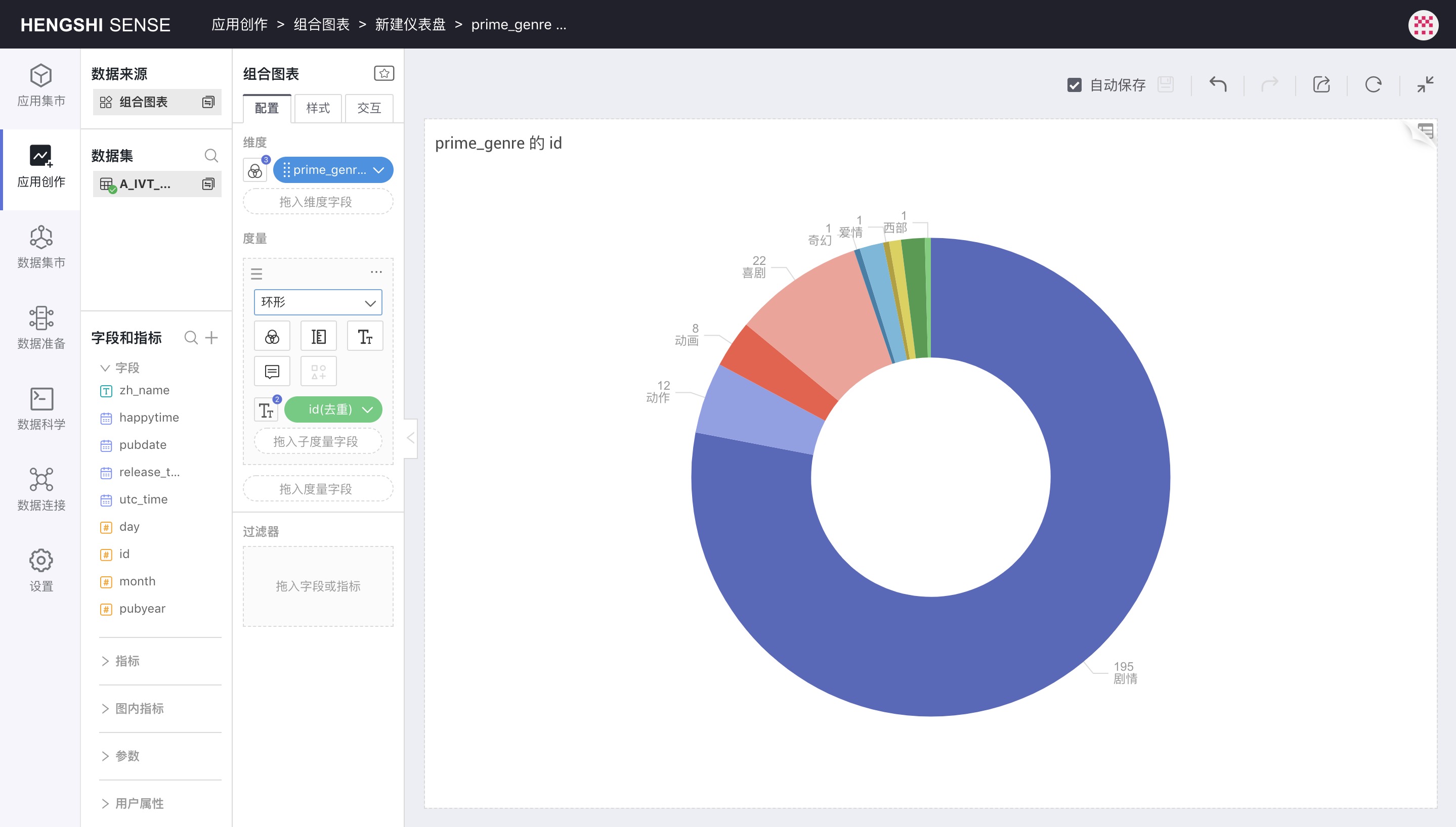
Rings
Selecting the Ring shape will produce an annular chart.
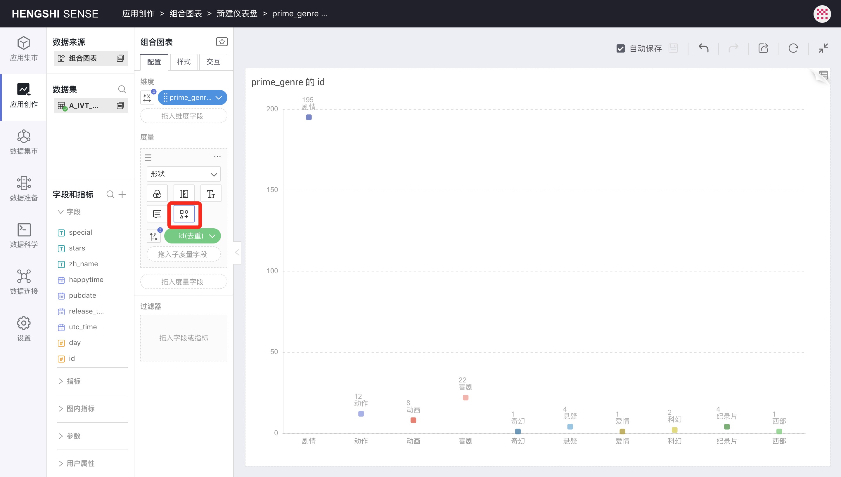
Shapes
When the shape is set to Shapes, numerical points appear as the selected symbol, which can be chosen in the symbol popup:
Color
Monochrome
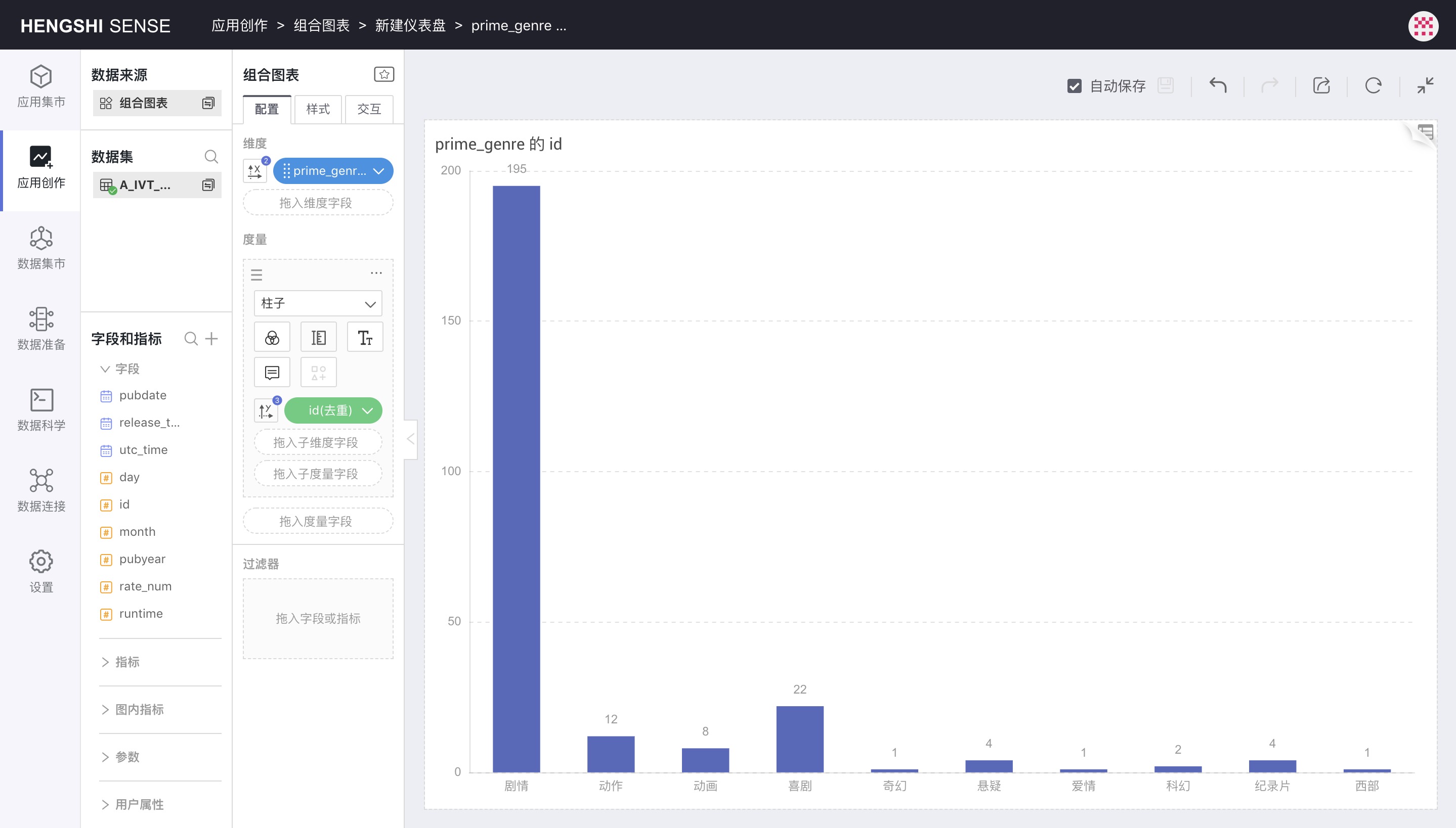
Initially, when the chart is created and no dimension/metric controls the colors, the chart is monochrome as shown below:
Discrete Colors
To control chart colors with dimensions, click the icon on the left side of the dimension to open the control menu and select the color icon. Chart colors will then be discrete, with one color per dimension value.
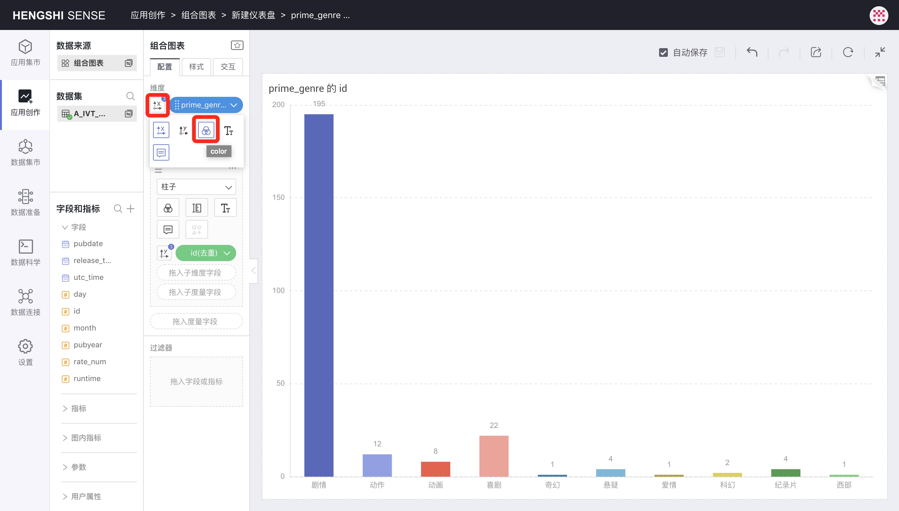
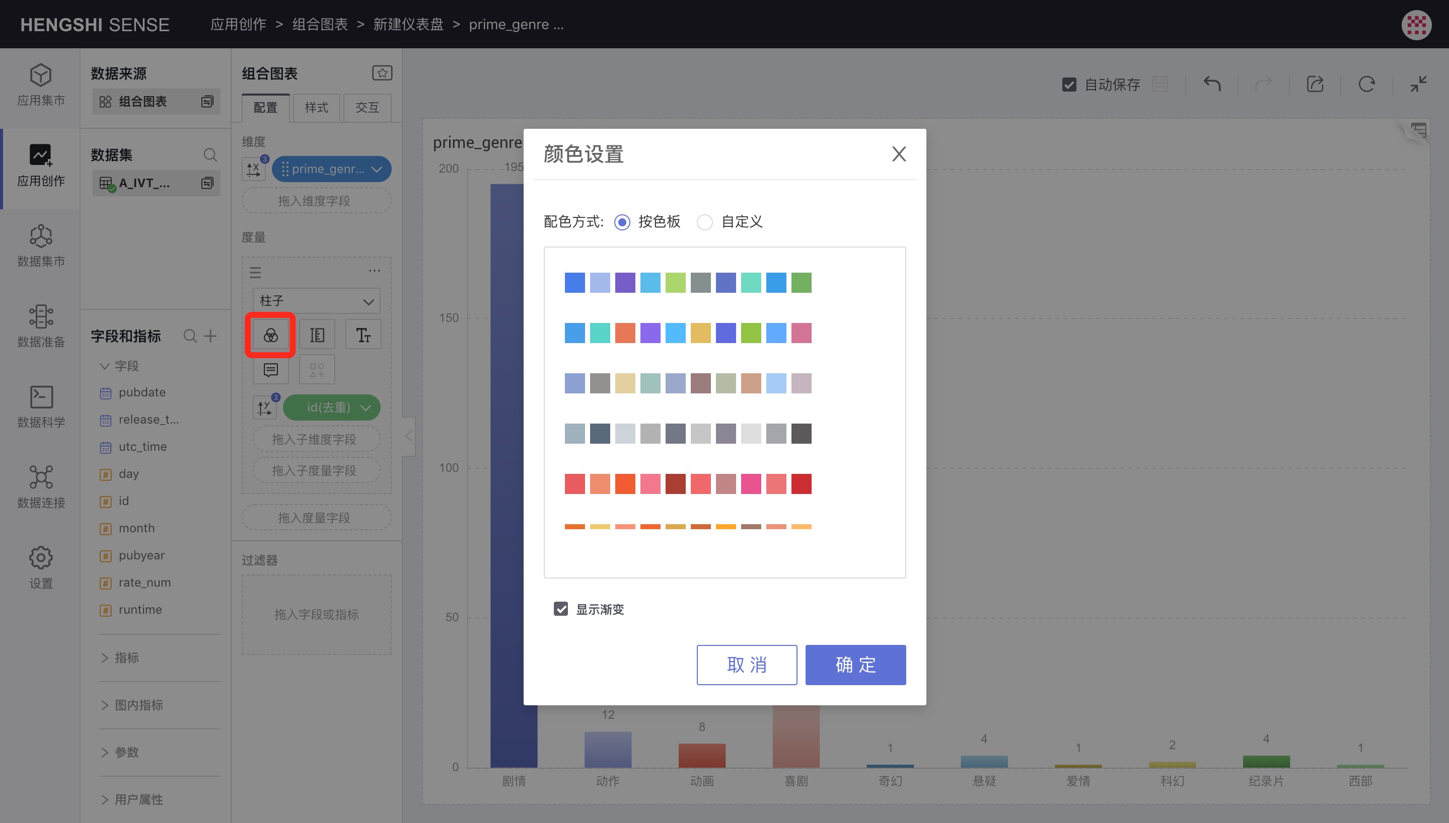
To change the color scheme, click the color icon below the shape to open the discrete color palette.
Also, if Show Gradient is selected in the palette, each bar will show a gradient effect.
Continuous Colors
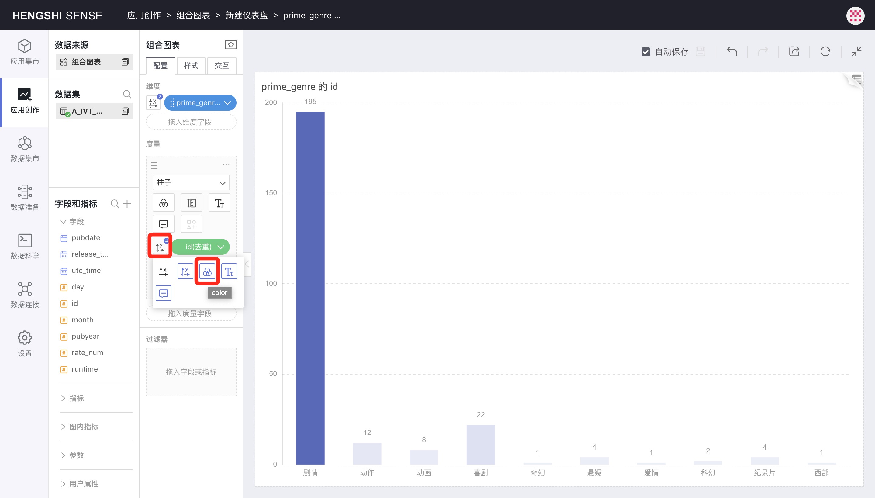
To use a metric to control chart colors, click the icon to the left of the metric to open the control menu and select the color icon. The chart colors will then display a continuous gradient based on the metric values.
Size
The Size icon controls the size of various shapes, such as the thickness of bars or the size of circles or rings.
Labels
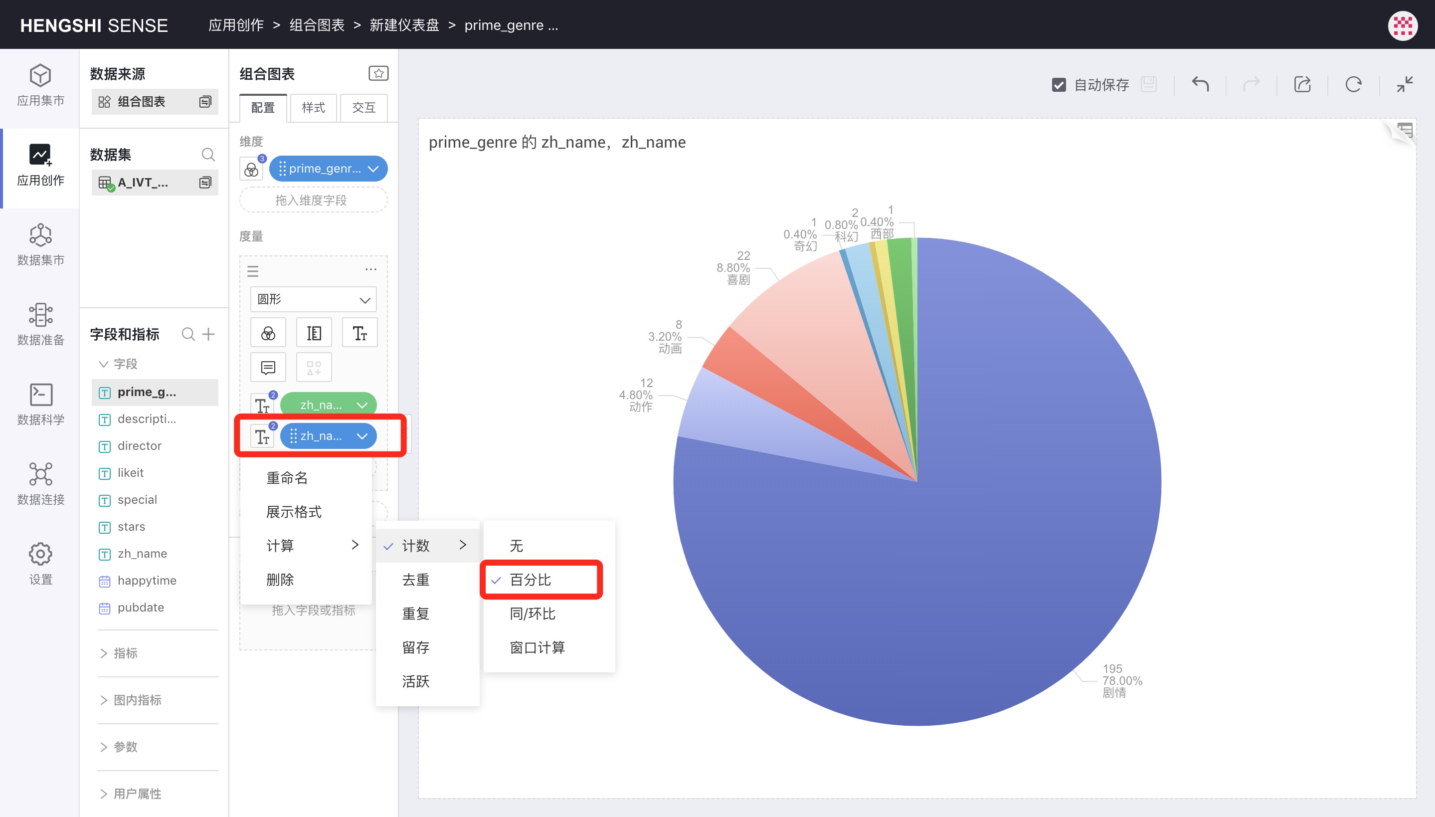
Labels are used to set label display. Additionally, various metrics can be dragged in to control label content.
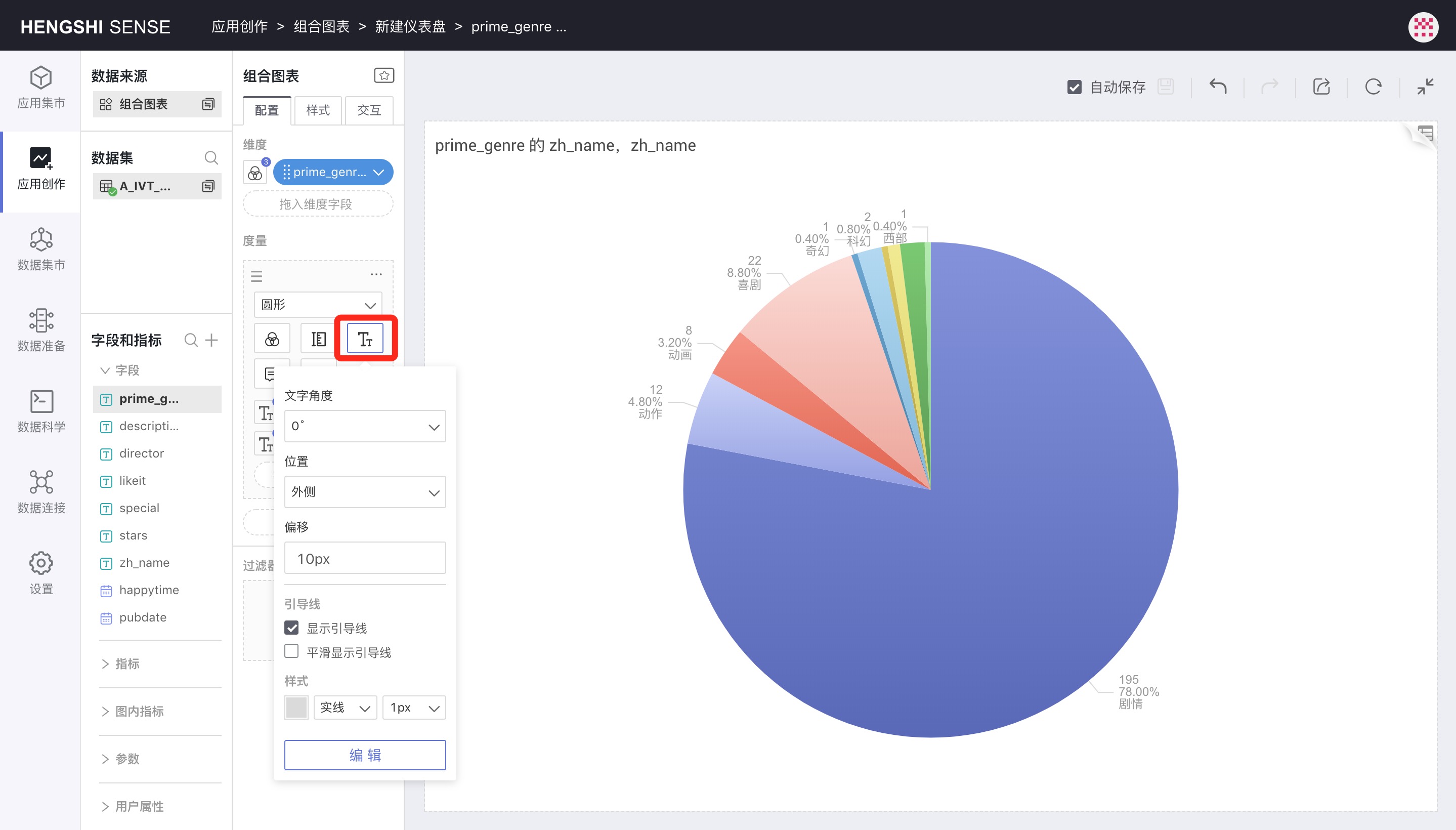
For example, in a pie chart, if a submetric is dragged in as a count->percentage, the submetric does not control the graphical display but does control the Label and Tooltips, allowing you to see both the metric and its percentage share in the chart.
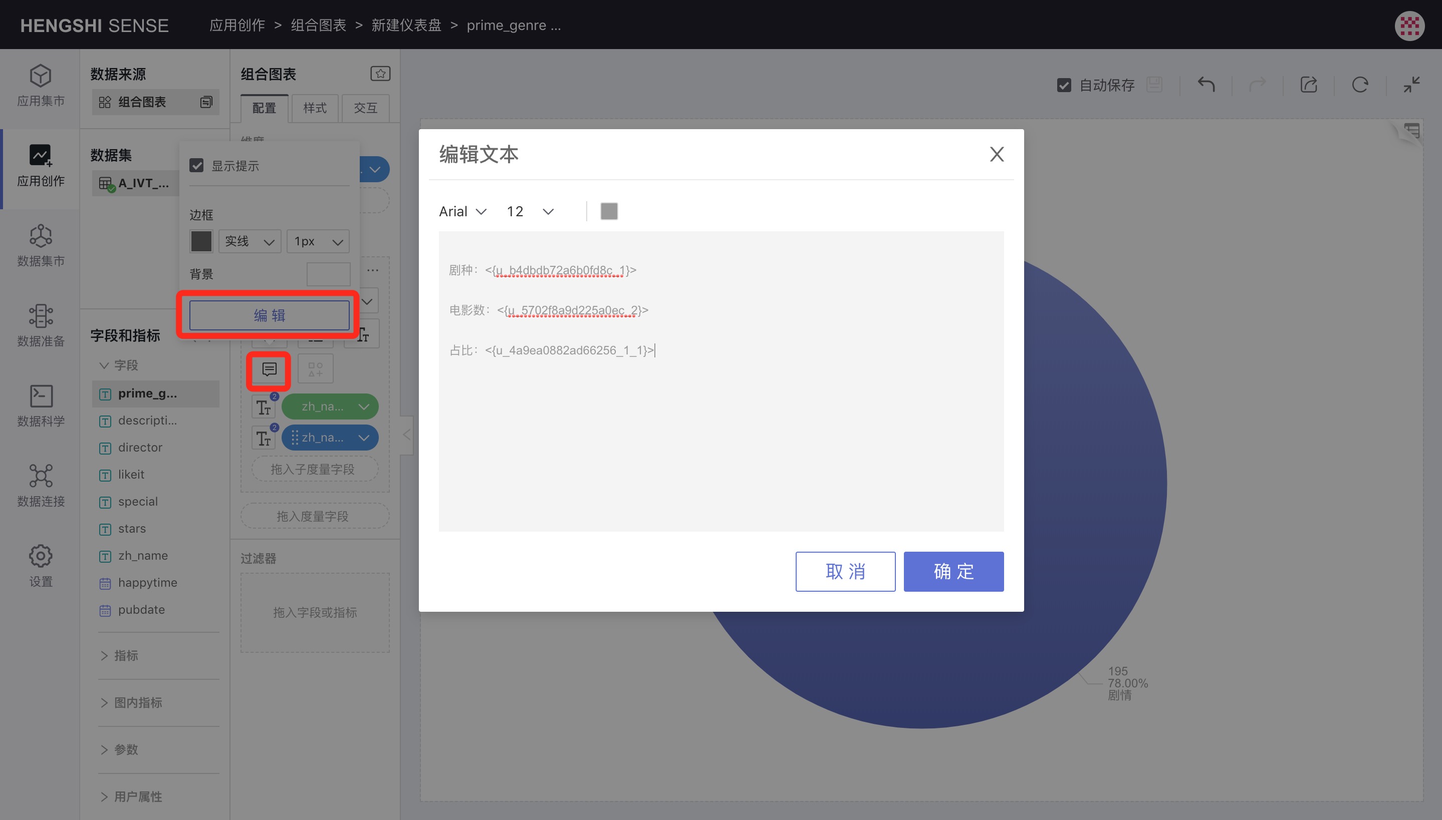
Tooltips
Tooltips control what is shown when hovering the mouse over the chart. Like labels, submetrics can be dragged into tooltips to add additional informational pop-ups.
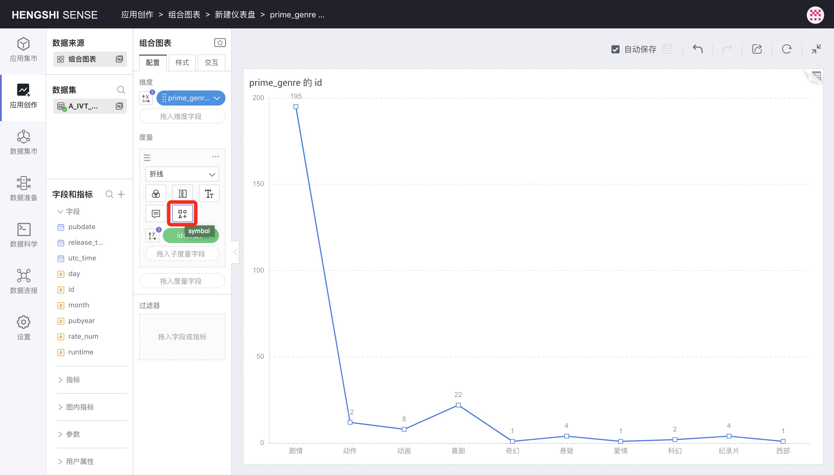
Symbols
When the shape is set to bars, areas, or shapes, the Symbol icon will be enabled.
Symbols can control the shape of each data point. Custom symbols can be set in the symbols list.
The size of the symbols is controlled by the previously mentioned Size settings.
Metric Operations
Clicking the three-dot menu in the upper right corner of the metric area will pop up the metric menu:
Creating Copies
Creating Copies will create a metric identical to the original, sharing dimension settings with the original.
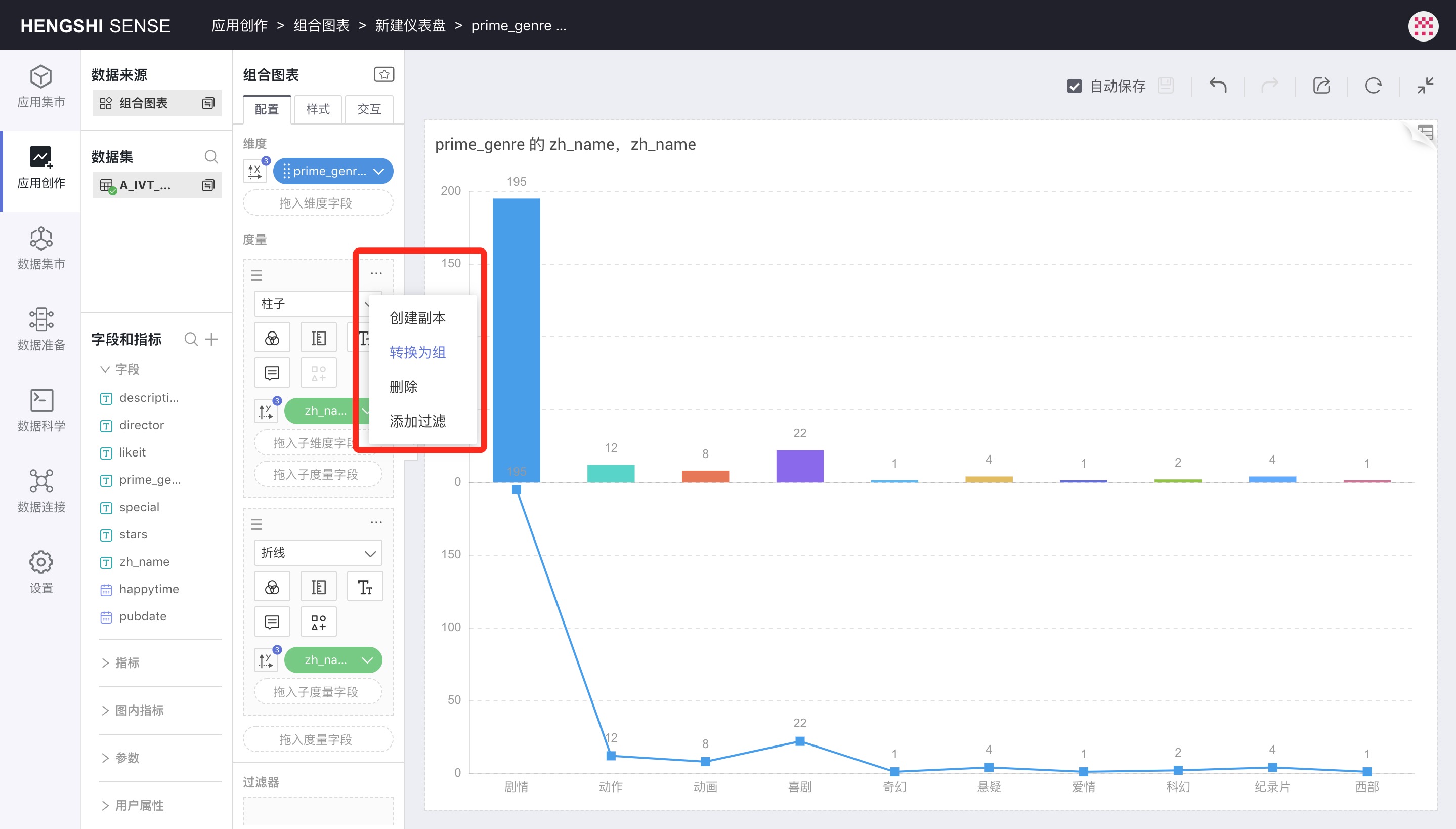
Convert to Group
Clicking Convert to Group in the metric menu allows a metric to be converted to a group, with the default group name as Layer Group 0.
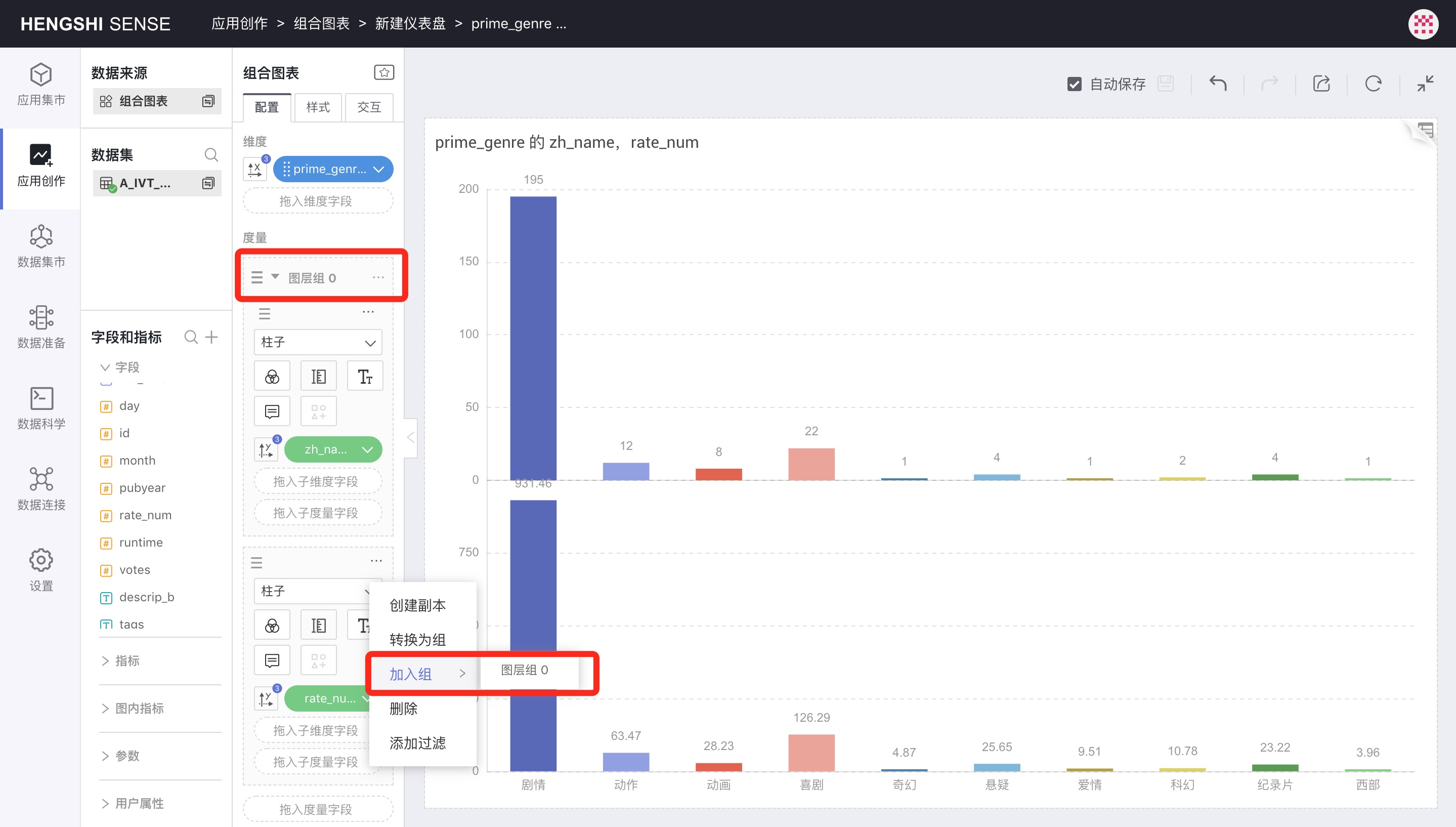
Join Group
After converting to a group, clicking the menu of another metric will show Join Group, from which you can select the previously created Layer Group 0.
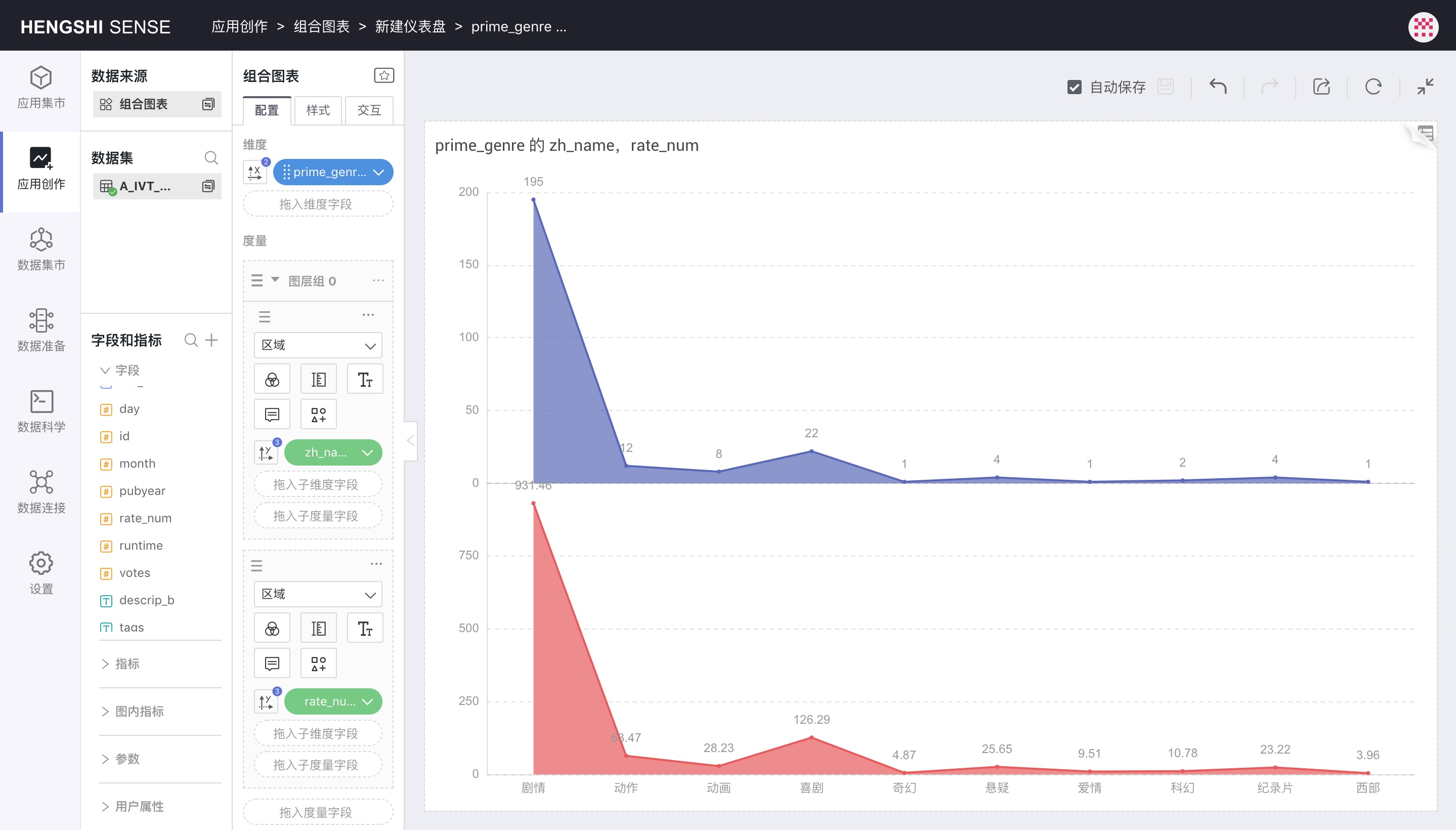
Exit Group
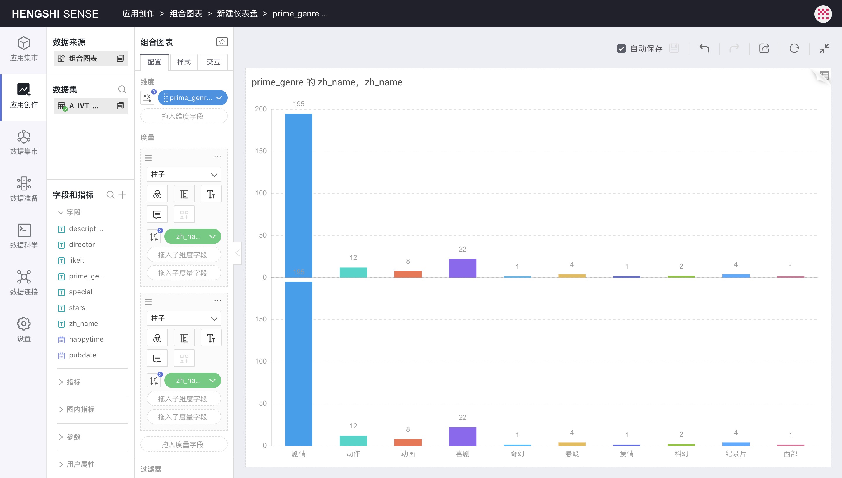
In the layer group, in the added metric, clicking the three-dot menu lets you select Exit Group.
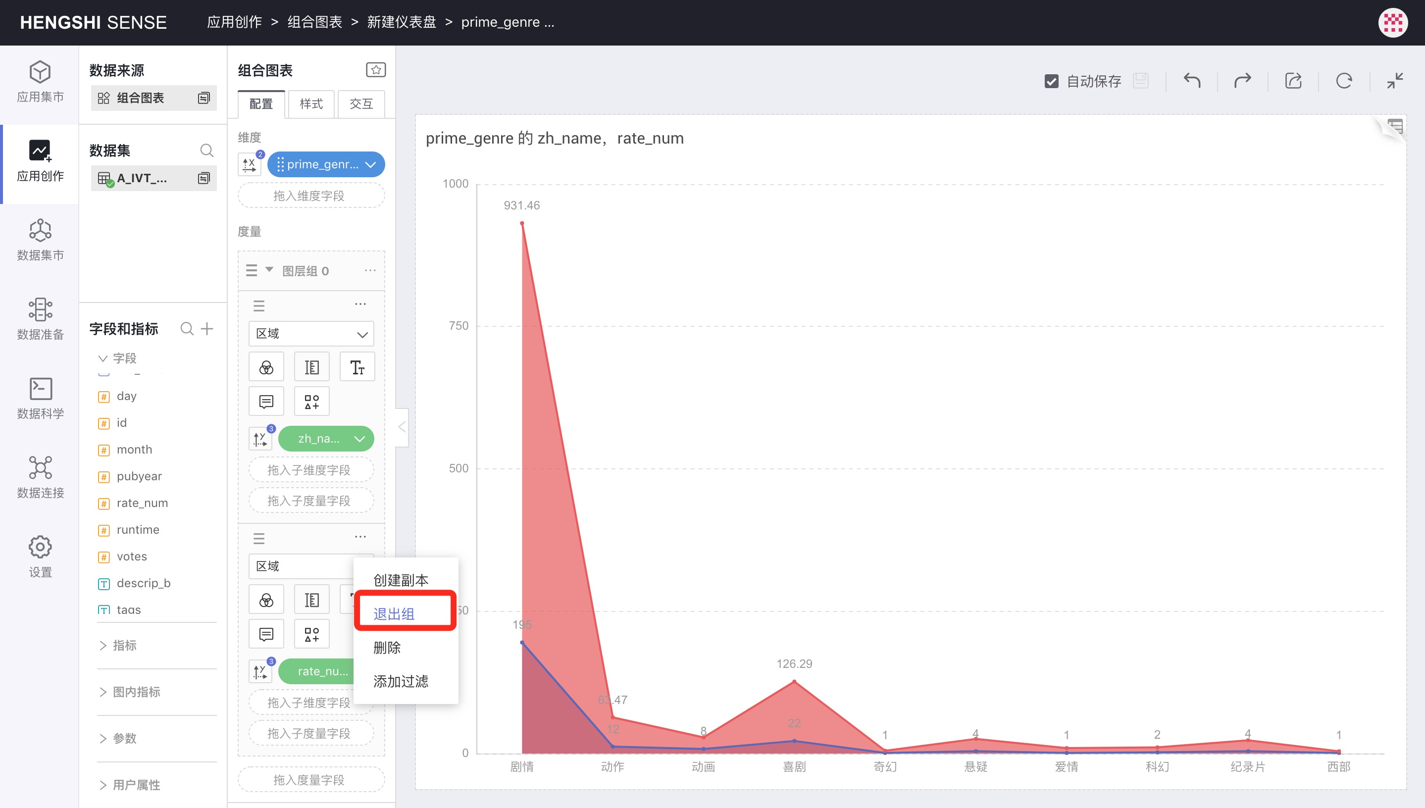
After exiting the group, the metric becomes an independent metric again and is charted separately:
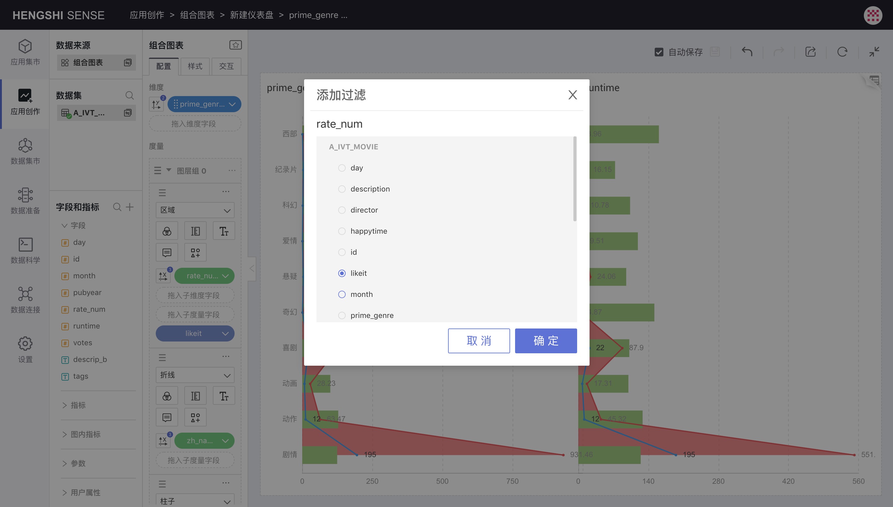
Add Filters
This feature is the same as the metric filter function in a table, allowing you to filter individual metrics, such as viewing only the metric values where likeit equals true.
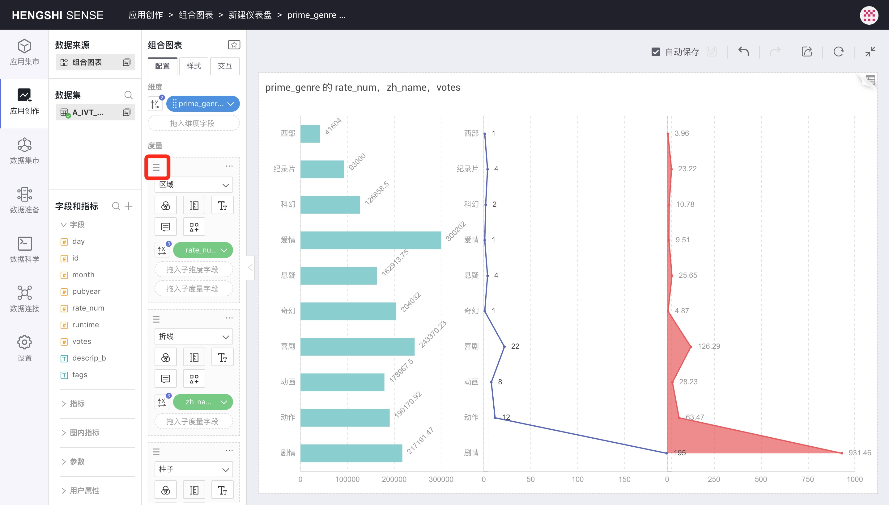
Metric Sorting
You can drag the sorting icon in the upper left corner of each metric to sort metric shapes.
Subdimensions
Drag in a subdimension into the metric to segment the metric, creating stacked bar charts, stacked area charts, etc., based on shape settings.
Sub-metrics
Dragging a sub-metric into the metric allows you to control Color, Label, Tooltips, and it can also control the X or Y axis. However, this means that no other metrics in the metric area can control the X or Y axis anymore. In other words, whether it's a metric or a sub-metric, only one metric can control the charting out.
Layer Group Menu
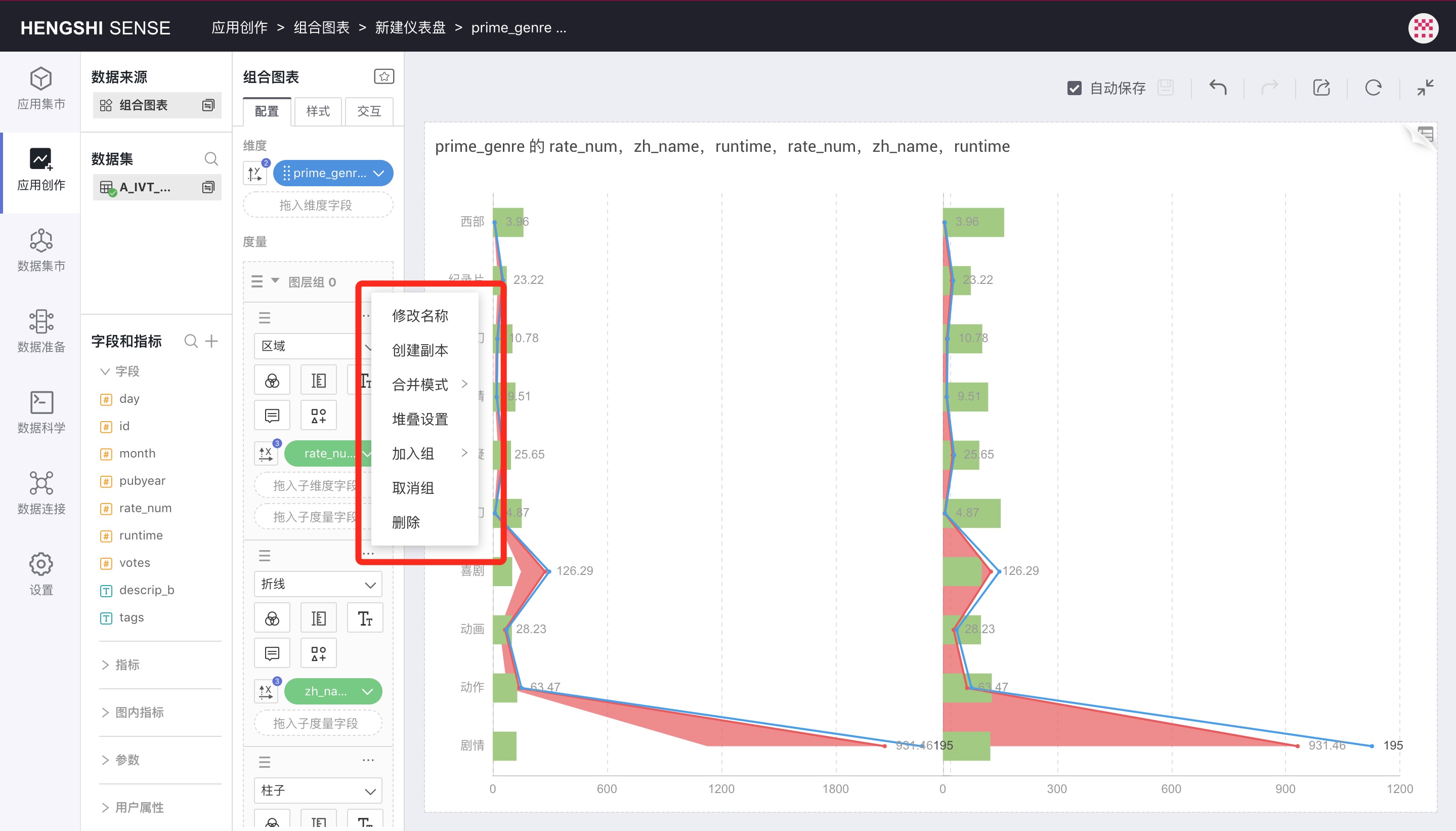
Rename
You can rename a layer group to a more user-friendly name.
Creating Copies
Create a layer group identical to the original.
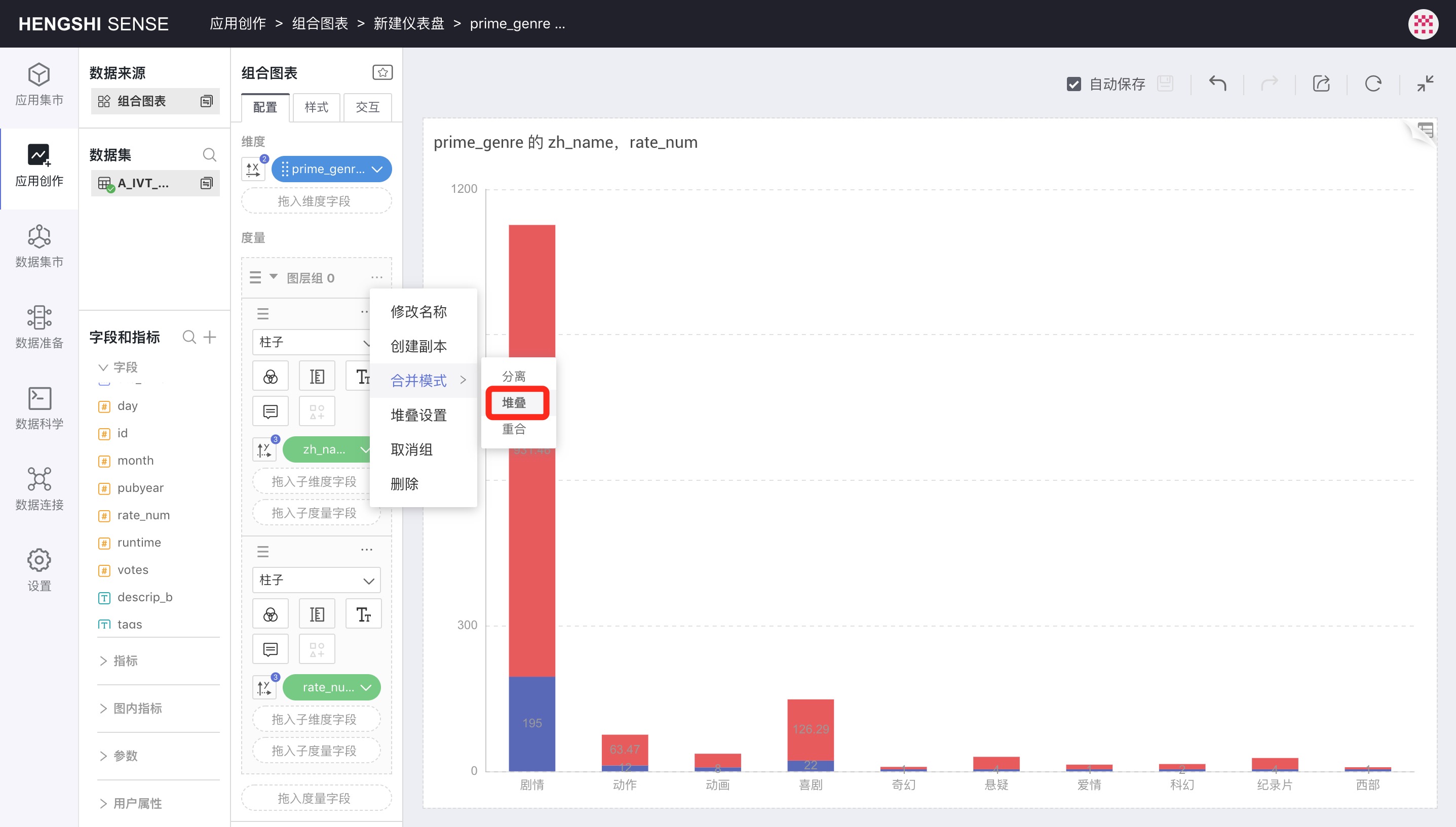
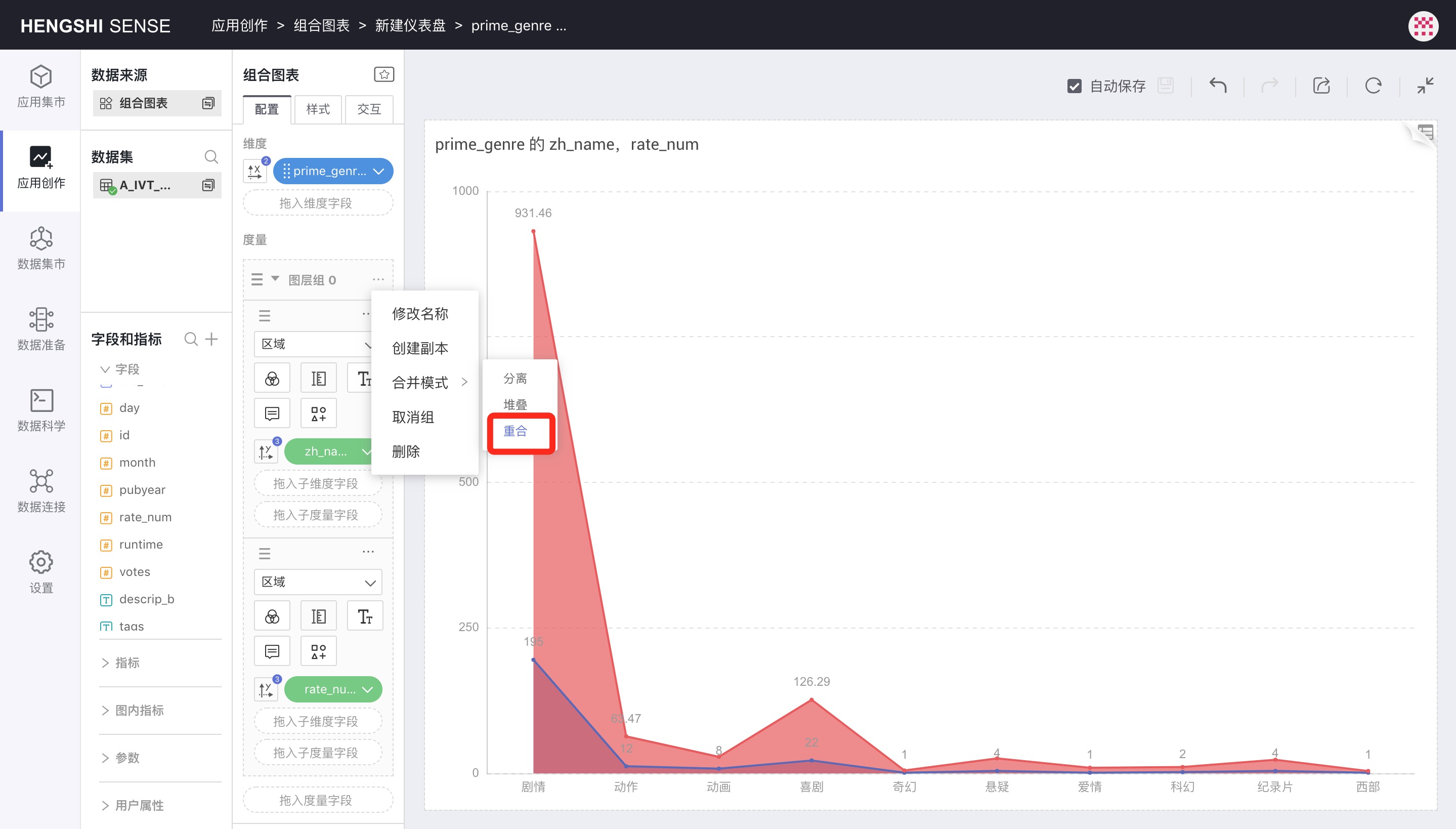
Merge Mode
Clicking the three-dot menu of the layer group will pop up a Merge Mode menu to control the merging mode of metrics within the group.
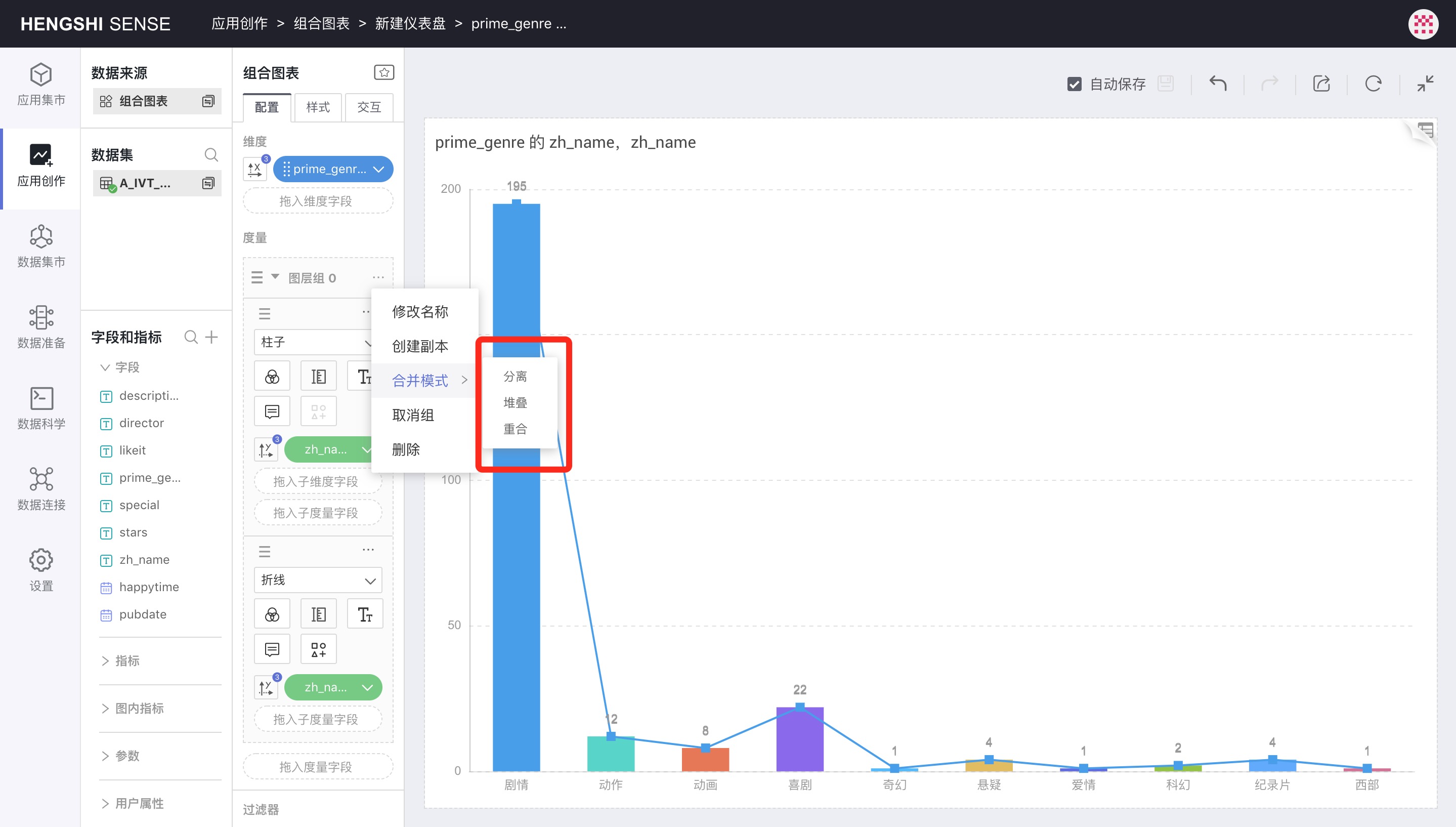
Separation
After joining the group, the default merging mode is Separation, and two merged bar charts become a clustered bar chart:
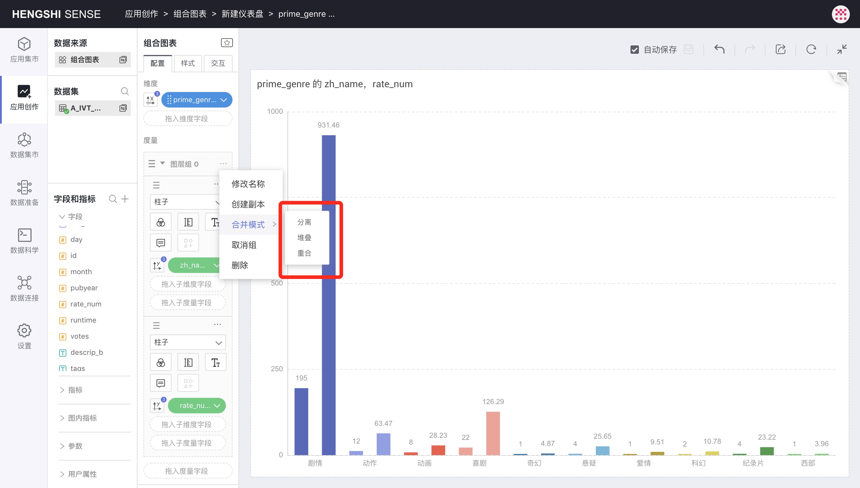
Stacking
Selecting Stacking as the merge mode will turn two bar charts into a stacked bar chart, where you'll need to unselect dimension controlling for color and instead control color separately for each metric:
Overlay
Choosing Overlay as the merge mode overlaps the metric shapes, as shown below with two overlapping area charts:
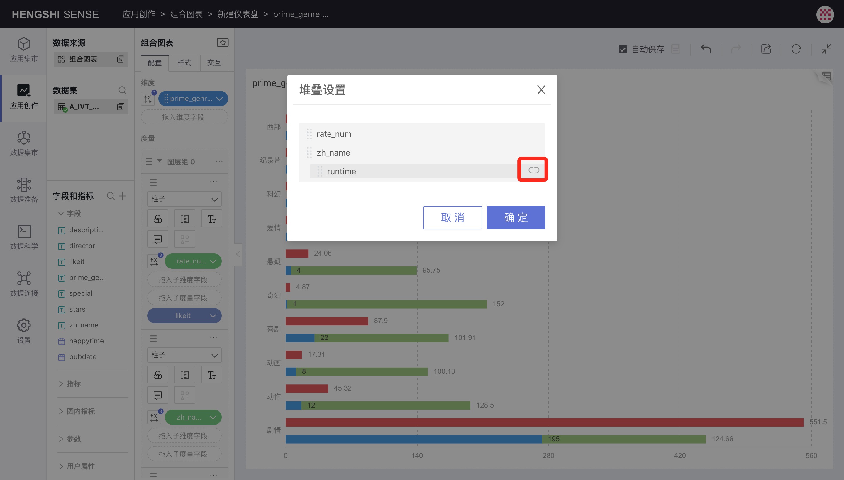
Stacking Settings
When the merging mode inside a layer group is Stacking, Stacking Settings will appear in the group menu. Stacking settings control the stacking relationship of various layers. For example, with five bars, the first can be stacked on the second, and the third and fourth can be stacked on the fifth.
Clicking Stacking Settings in the layer group menu will bring up a pop-up window, where clicking the indent icon will control whether it's stacked or not.
In the image below, the rate_num bar will chart separately, and runtime will stack on the zh_name bar.
Join Group
If multiple layer groups exist, Join Group will appear in the layer group menu, where you can select other listed groups to add all the current group's contents to the selected layer group.
Ungroup
By clicking the three-dot menu of the layer group, selecting Ungroup will dismantle the entire group, and all metrics revert to independent metrics, no longer affected by Merge Mode.
Delete
Deletes all content of the selected group. If you want to undo the deletion, click the undo button on the chart.
Layer Group Sorting
You can drag the sorting icon in the upper left corner of the layer group to sort between the groups.