Hengshi Documentation
Table of Contents generated with DocToc
- KPI
- Pie Chart
- Doughnut Chart
- Gauge
- Word Cloud
- Table
KPI
Displays the current value of a metric in a prominent way and supports showing multiple other metrics and their trends.
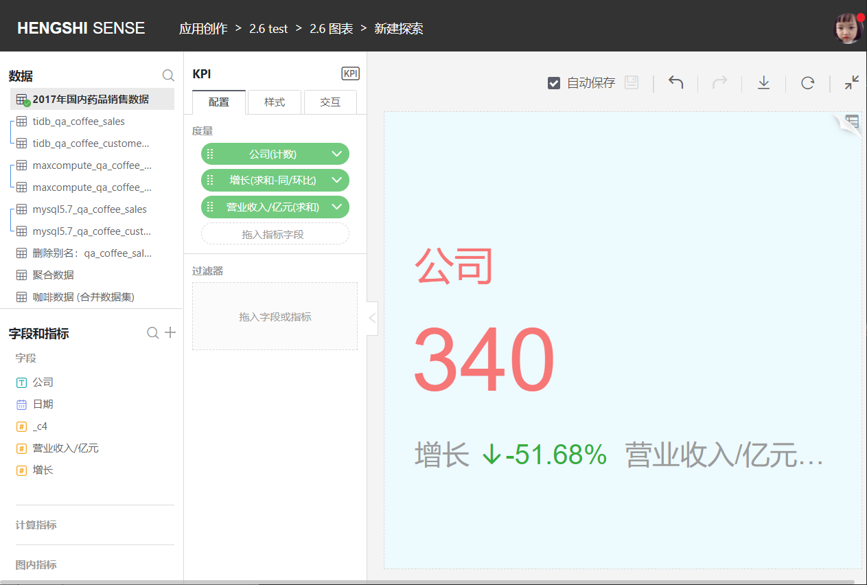
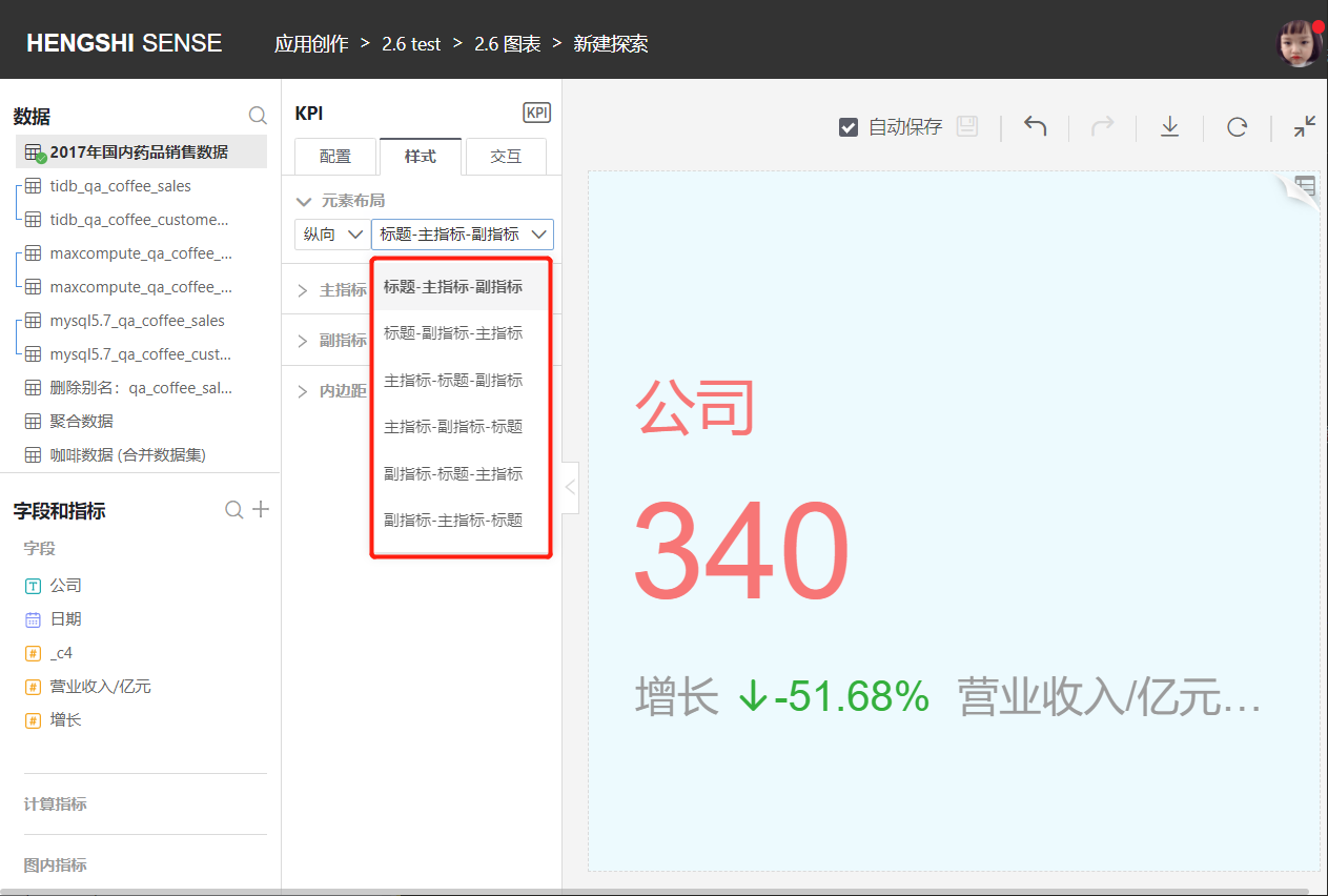
KPI supports horizontal and vertical arrangement of metrics, and you can set the order of display for the title, main metric, and sub-metrics.
Pie Chart
A pie chart shows the comparison of a measure value across a dimension, which may have a large value domain with high discreteness. In this case, it is often necessary to configure filters, as the large value domain can affect visualization.
- You can adjust the category field (How many parts is the pie divided into? Based on which field?)
- You can adjust which field determines the size of each slice.
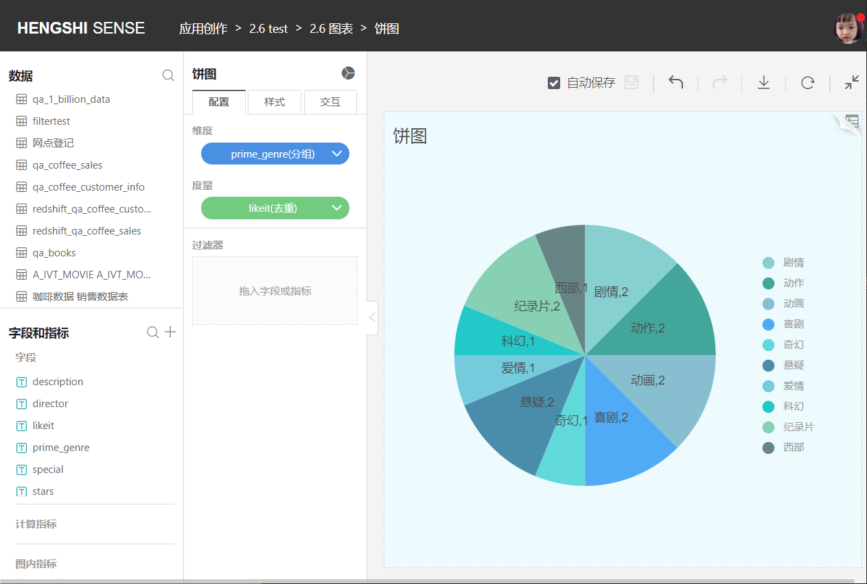
Pie charts default to Display Labels and Display Guide Lines checked. Users can customize whether to display the guide lines and whether to display all labels.
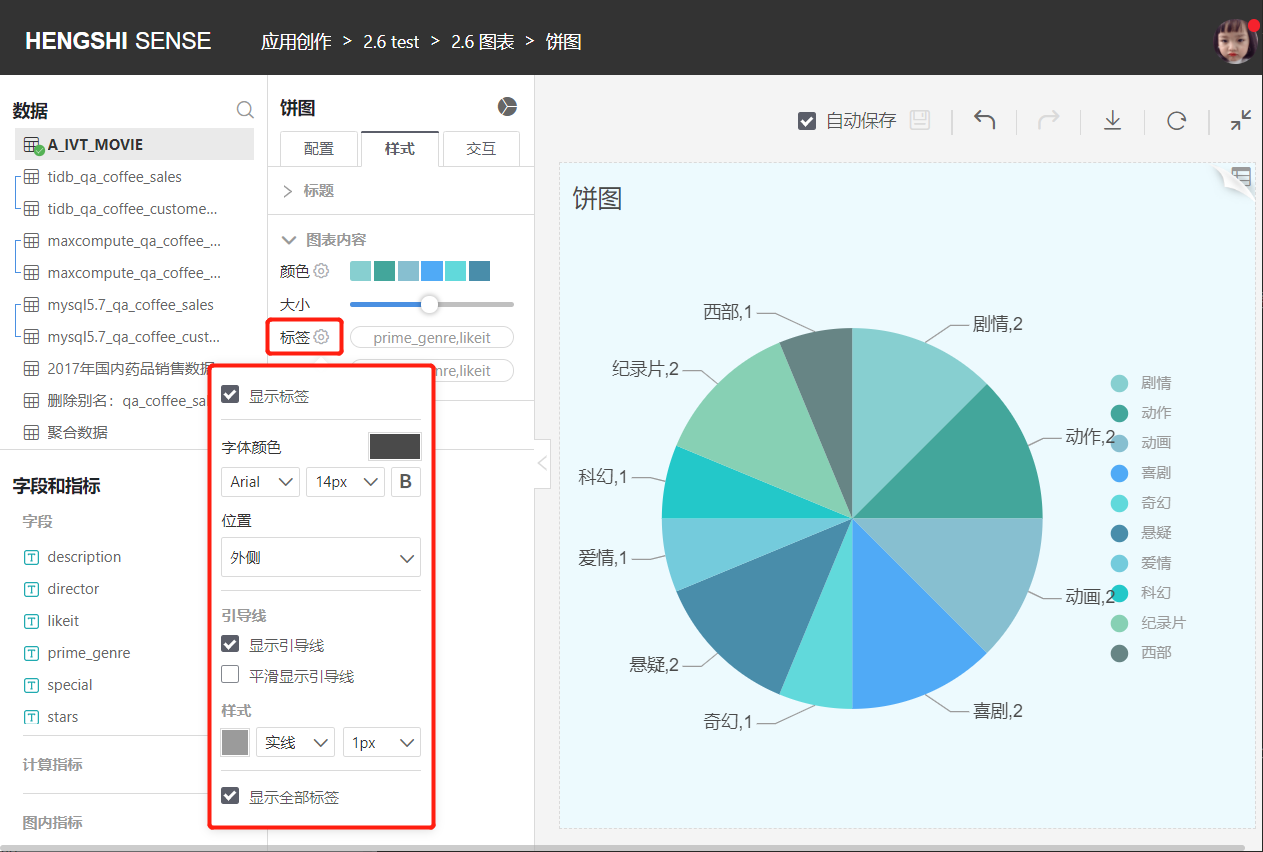
Charts that can set guide lines include pie charts, doughnut charts, funnel charts, and nightingale rose charts.
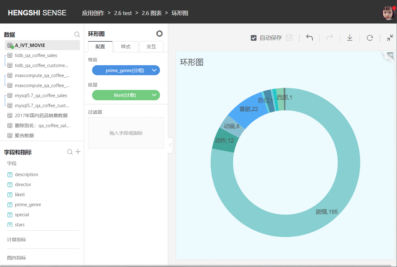
Doughnut Chart
Similar to a pie chart, it is used to represent the proportion of different categories, comparing categories by arc size. It can greatly assist users in quickly understanding data proportion allocations.
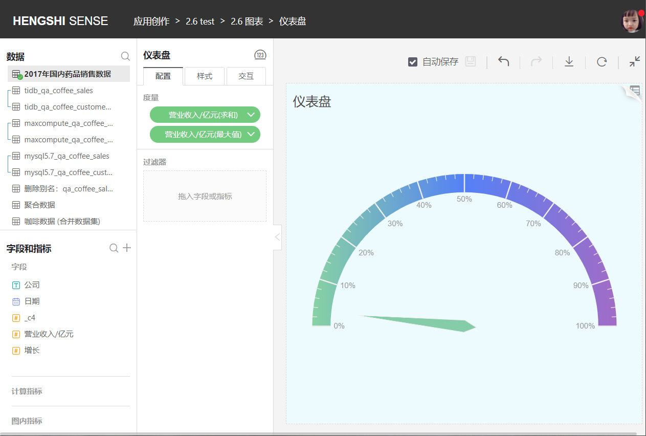
Gauge
The gauge (Gauge) is a kind of skeuomorphic chart, just like a car's speedometer. Currently, many management reports or presentations use such charts to visually show the progress or actual situation of a certain metric.
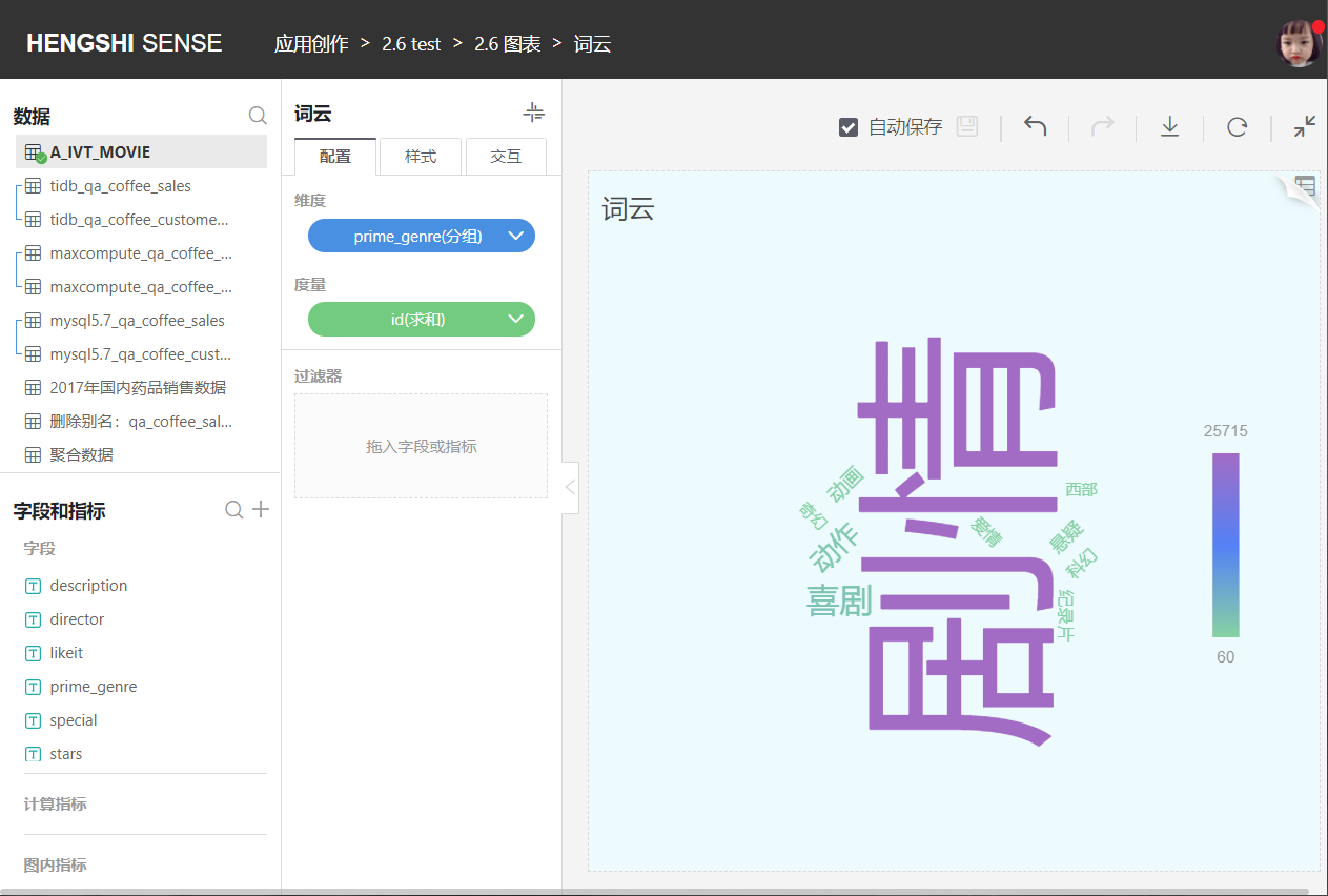
Word Cloud
Different from a bar chart, a word cloud extracts content from the database's corresponding field and compares and displays it through the depth and size of fonts.
Table
A standard table view for data browsing in reports. Users can switch from a data table's visualization exploration page to the data view page to see the data presentation under the current exploration context directly and make adjustments and changes at the data level. Note that this does not refer to the entire original data table but the data under the currently confirmed display graphics and the dimensions and metrics of interest. Therefore, any adjustments made here will be directly reflected in the table.
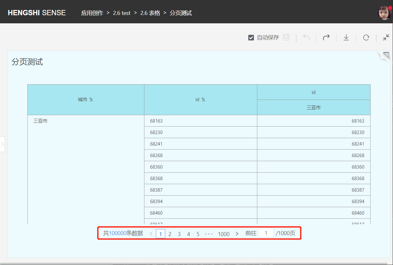
Table Pagination
By default, the table displays 1000 data rows per page. You can change the number of data rows displayed per page in
Interaction->Limit Number, with a minimum of 1 and a maximum of 10000.If the total number of data rows in the current table exceeds the limit, the table will display the data in pages.
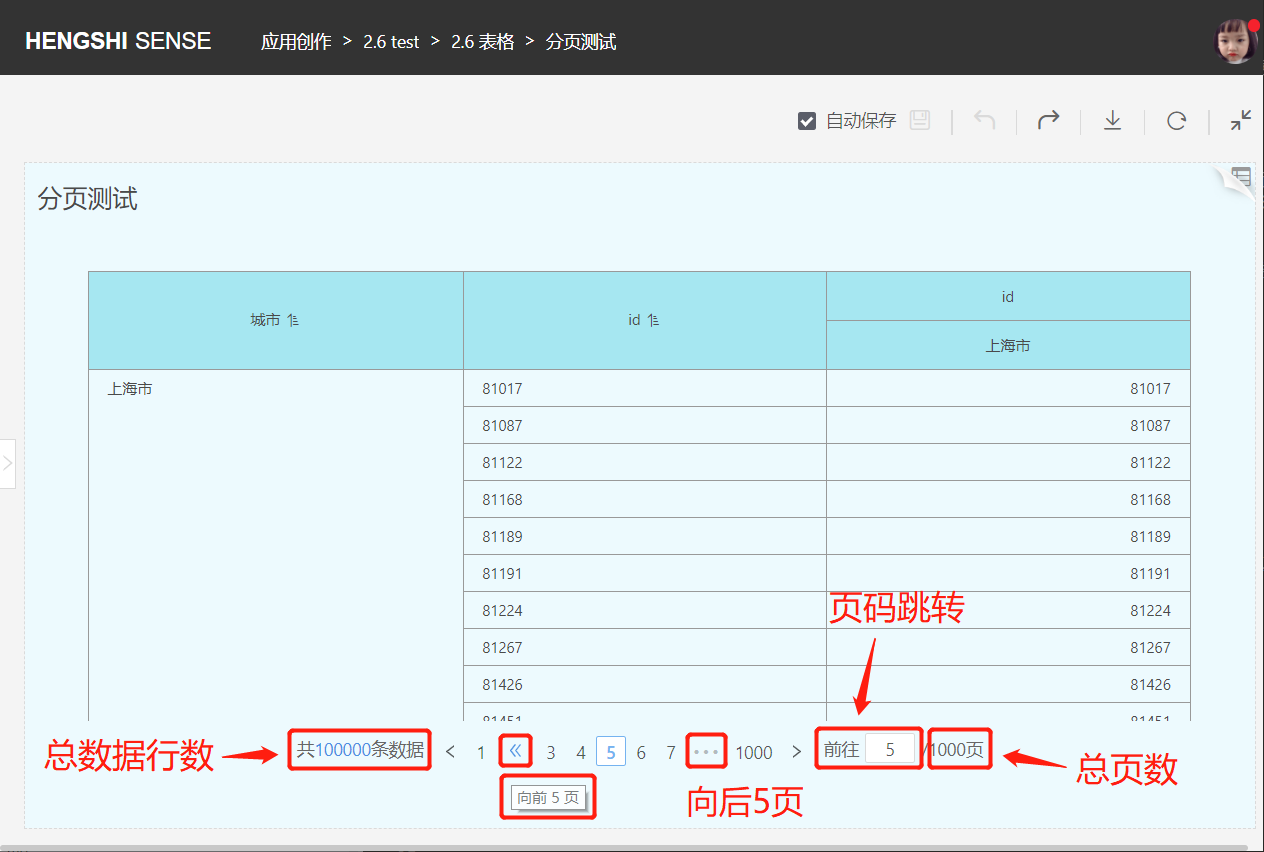
In the page number area at the bottom of the table: It displays the total number of data rows, the total number of pages, and the table supports page jumping, switching of the previous and next pages, as well as jumping forward or backward by five pages.
Configuration
Click Configuration in the middle toolbar to make the following settings:
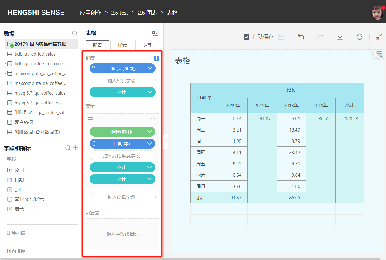
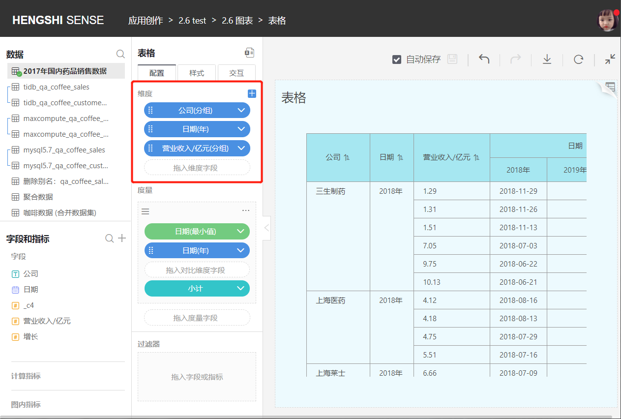
Dimensions
Add Dimensions
- You can add multiple dimensions in order, with the first dimension being the primary one and subsequent dimensions being secondary. Dimension order can be adjusted.
- All dimensions are arranged from left to right at the very left of the header, following the principle that dimensions come before measures.
- Users can customize dimension names.
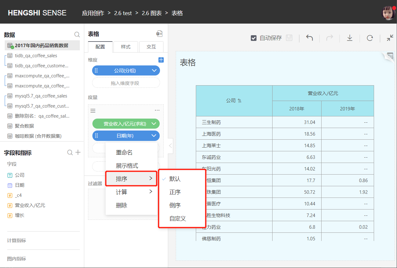
Dimension Sorting
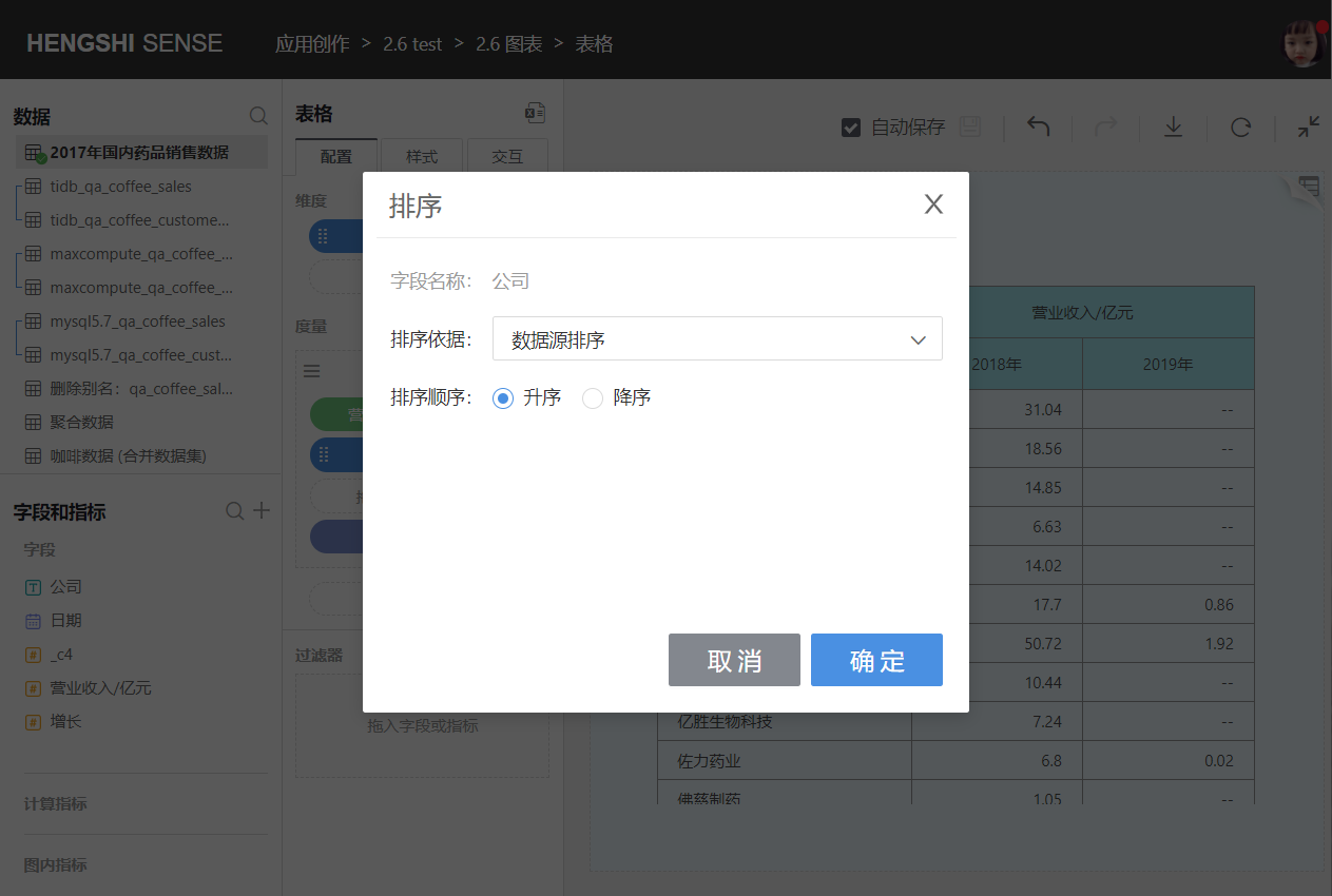
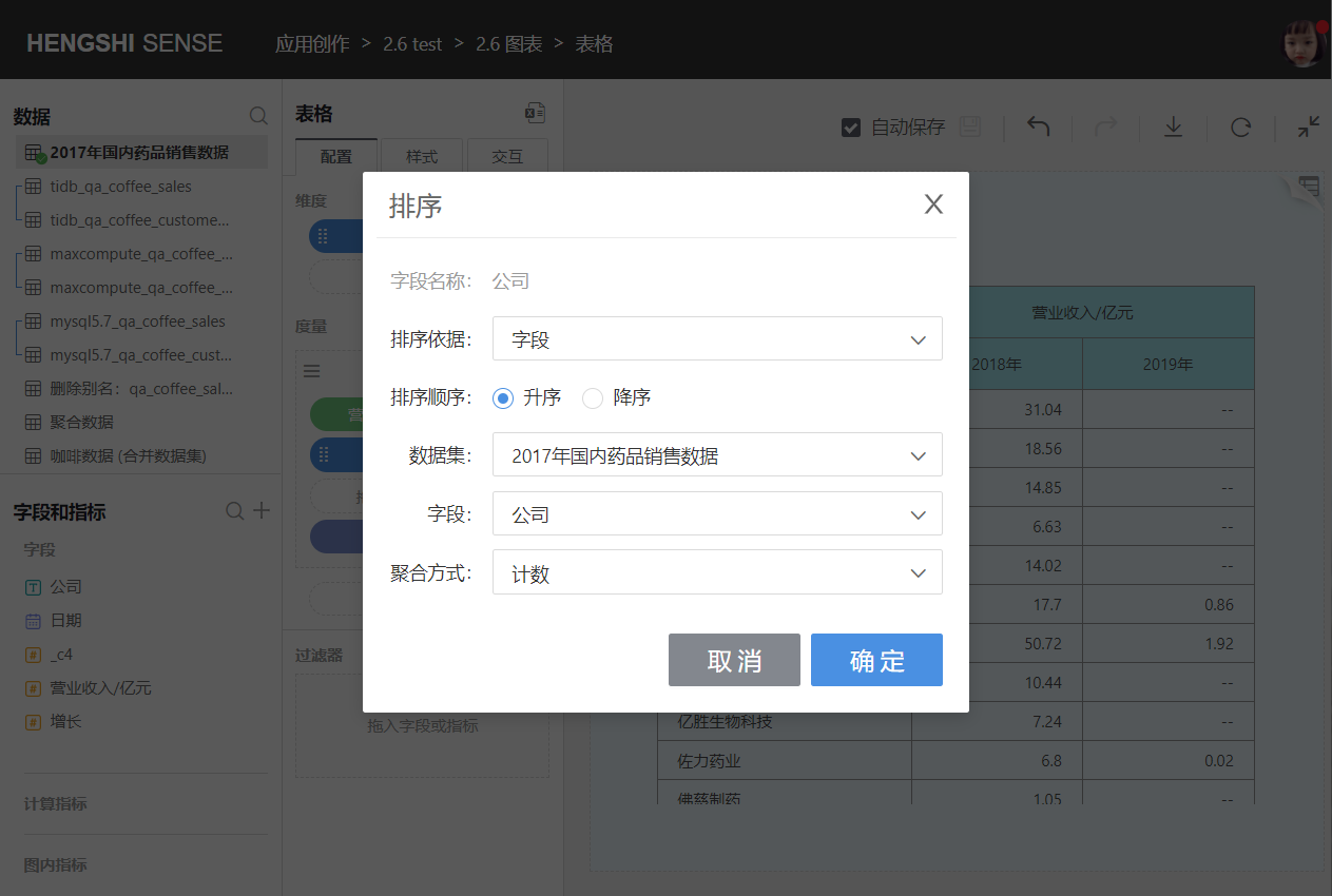
Dimension sorting includes data source sorting, alphabet sorting, field sorting, and manual sorting. When there are multiple dimensions, the primary dimension is sorted first, and secondary dimensions are sorted based on the primary dimension's sorting results. Click the drop-down menu on the right side of the dimension field to sort.
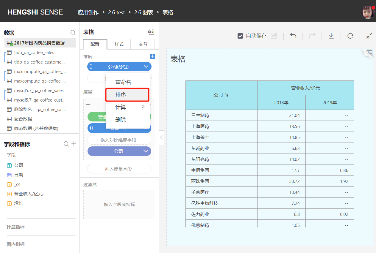
- Data Source Sorting
Sorts dimensions according to their storage position in the database.
- Alphabet
Sorts dimensions according to the alphabetical order A-Z; currently, alphabet sorting is supported by Oracle, MySQL, Sqlserver, PostgreSQL, GreenPlum, and Engine, six types in total.
There is no alphabet sorting for date and numerical types of dimension fields.

- Field
You can choose a field from the same dataset or related datasets, specify the aggregation method, and sort dimensions based on aggregated results.
- Manual Sorting
You can manually adjust the order of the dimension groups.

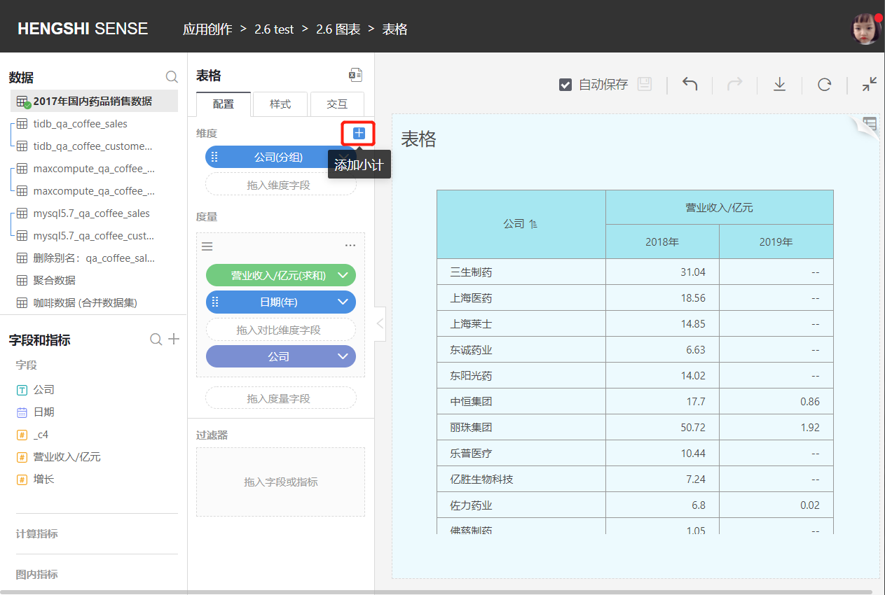
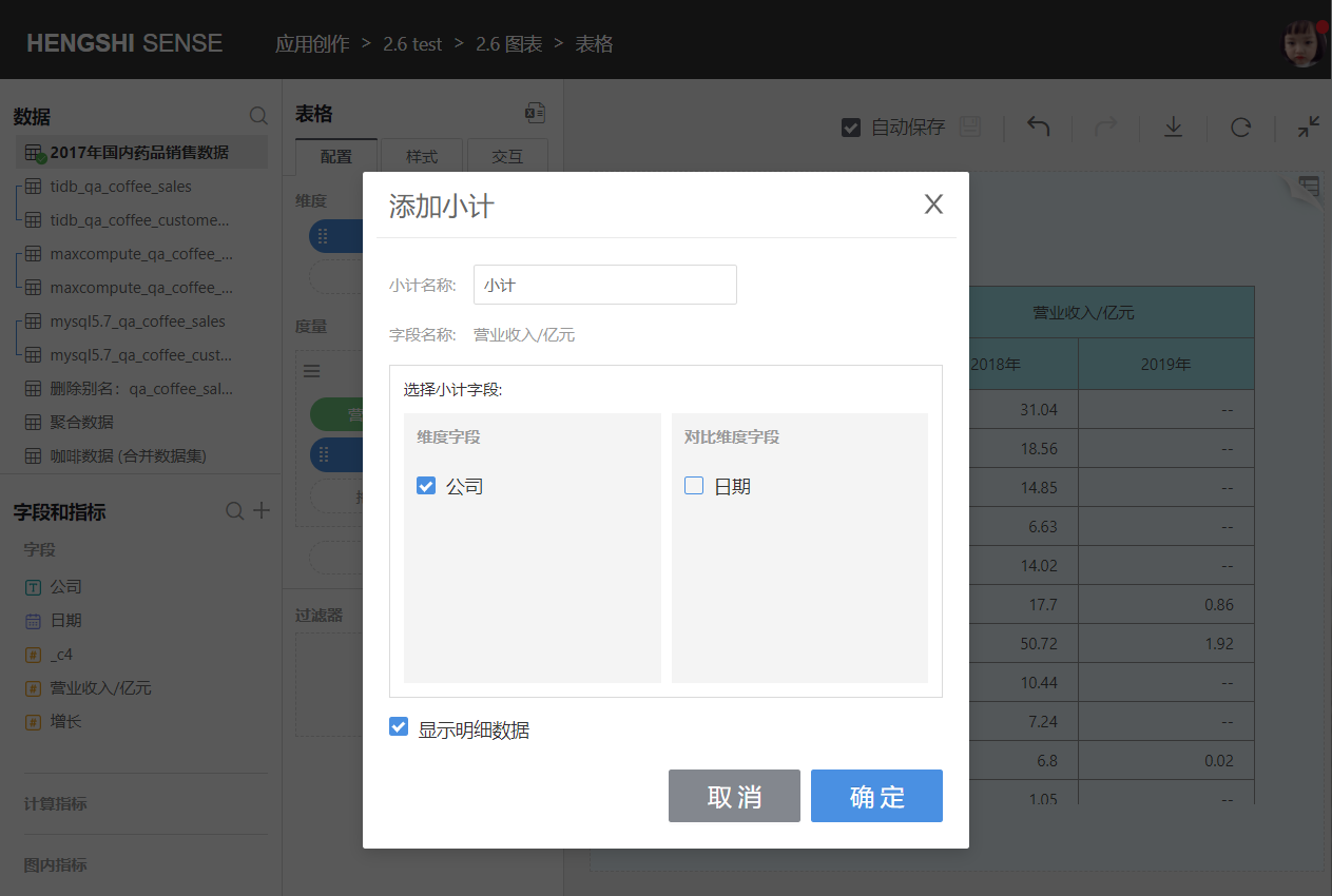
Add Subtotal
Click the "+" on the right of the dimension to add a subtotal.
You can choose one dimension field to add a subtotal, calculating the subtotal of the current dimension group. The primary dimension's subtotal is displayed at the bottom of the table under the dimension value, and the secondary dimension's subtotal is calculated based on the cell of its upper-level dimension group.
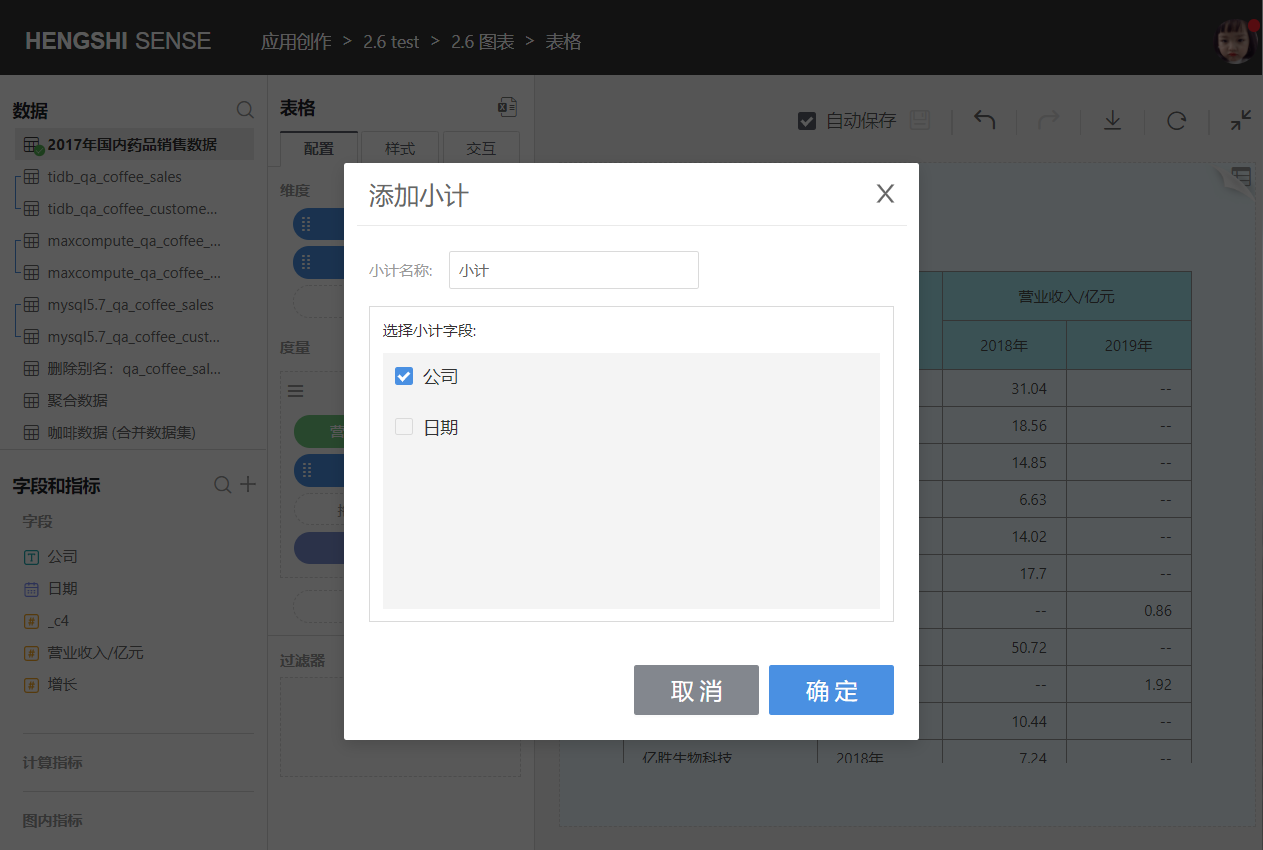
You can also choose multiple dimension fields to add a combined subtotal, calculating the total of the current columns. The combined subtotal added is displayed at the very bottom of the table.

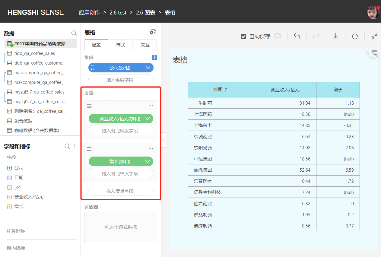
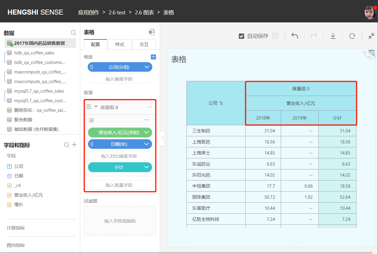
Measures
Add Measures
- You can add multiple measures to the measure area.
- Measures added to the table are arranged after the dimensions, following the principle that dimensions come before measures.
- Users can customize measure names.
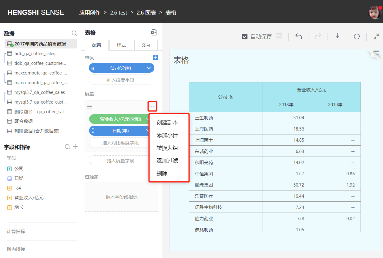
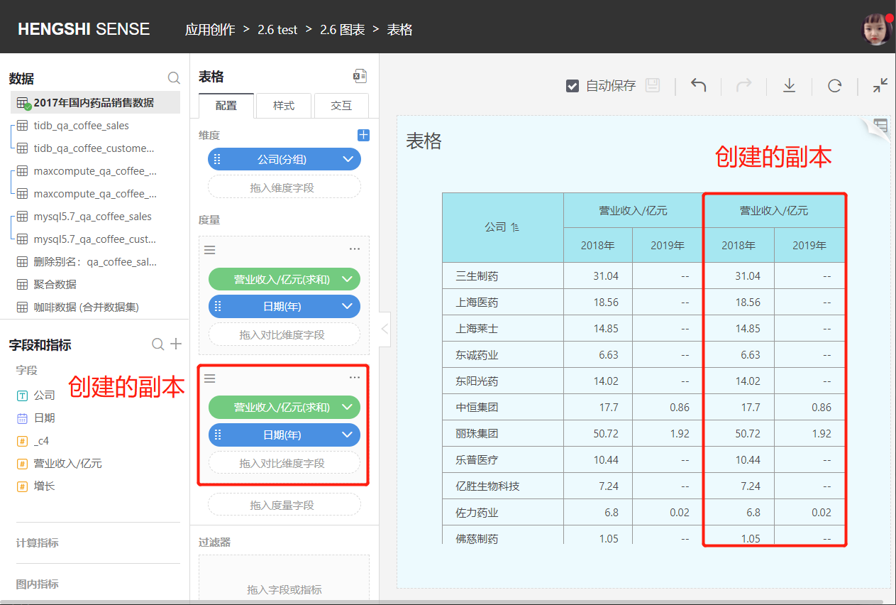
Create Copy
Creates another measure with the same content as this measure.
Add Subtotal
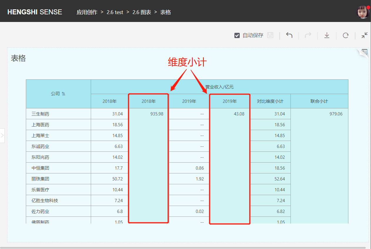
You can choose comparative dimension fields to add a subtotal, calculating the subtotal of the current row. The comparative dimension subtotal is displayed at the end of the comparative dimension.

You can also choose dimension fields to add a subtotal, calculating the subtotal of the current comparative dimension group's column. The dimension subtotal added is displayed after every comparative dimension group, with the header named after the comparative dimension.
You can also choose comparative dimension fields and dimension fields to add a combined subtotal, calculating the total of all rows. The combined subtotal is displayed at the far right of the table.

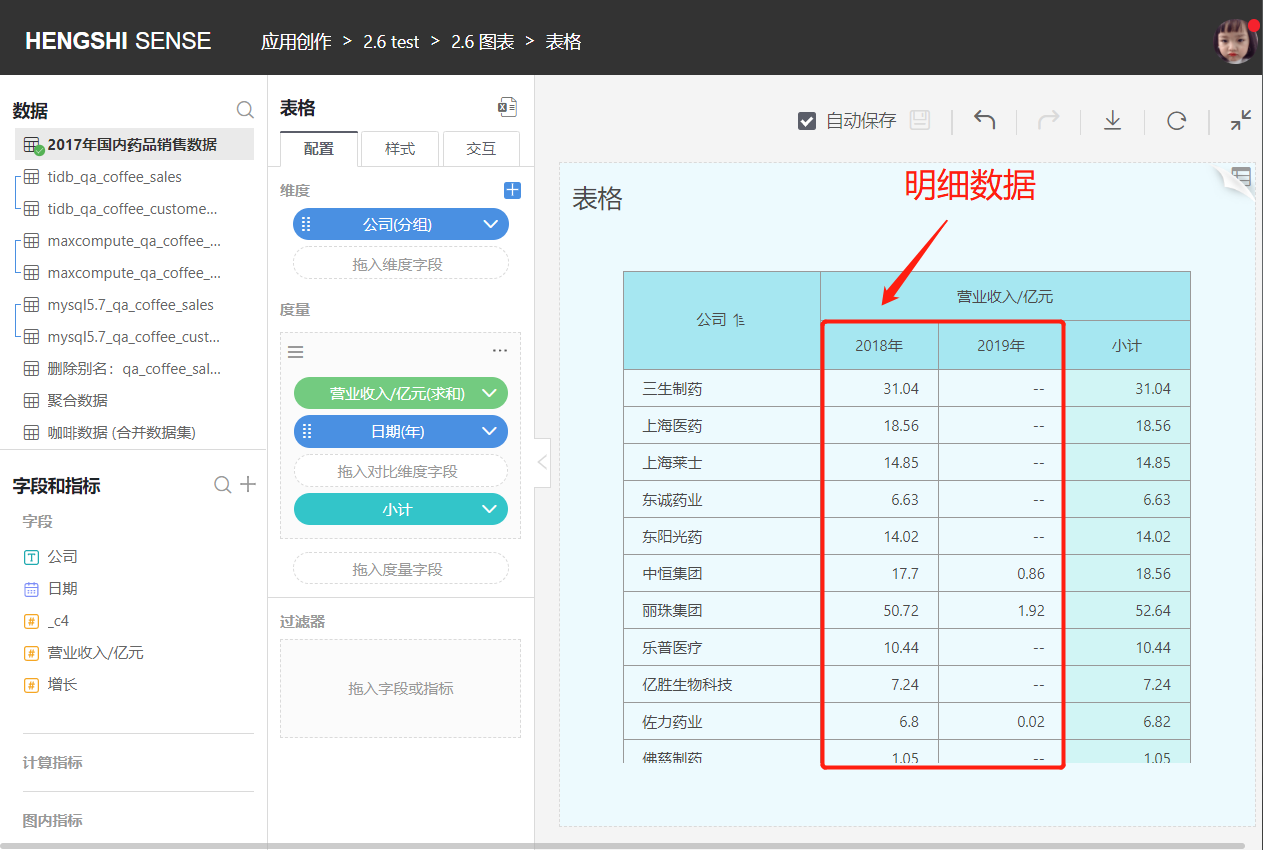
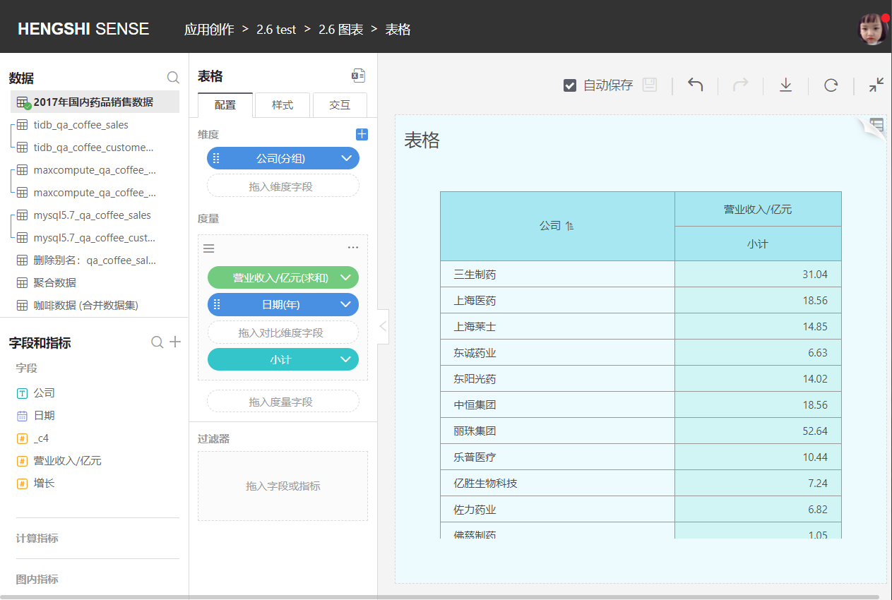
When "Show Detailed Data" is checked, the table shows detailed data. If unchecked, detailed data will not be displayed in the table.
Detailed data is shown, displaying dimensions, measures, and subtotals.
Without showing detailed data, only displaying dimensions and subtotals.
Convert to Group
Converts this measure into a measure group, which is displayed above the current measure in the table header. Users can customize the name of the measure group.
The measure group can use the same measure with different filtering conditions, mainly to show a comparison of the same set of calculation metrics under different environments (filtering conditions).
Add Filter
Adds a filter condition for this measure, determining which data needs to be displayed in the details based on the filter condition.
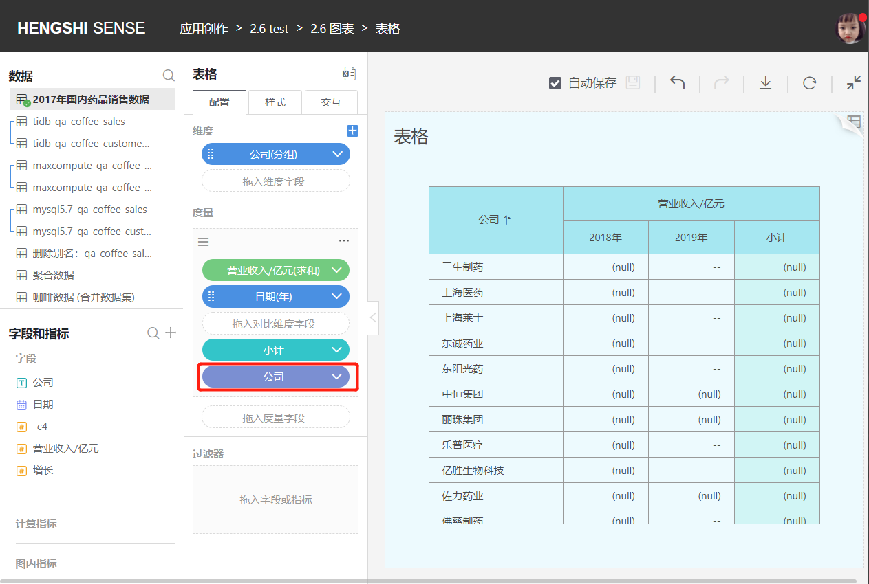
Delete
Deletes the measure, and this will also remove all comparative dimensions and filter conditions associated with this measure.
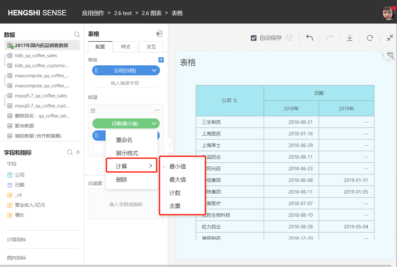
Date as a Measure
The table also supports selecting a date as a measure. The aggregation methods for dates are "Maximum," "Minimum," "Count," and "Distinct."
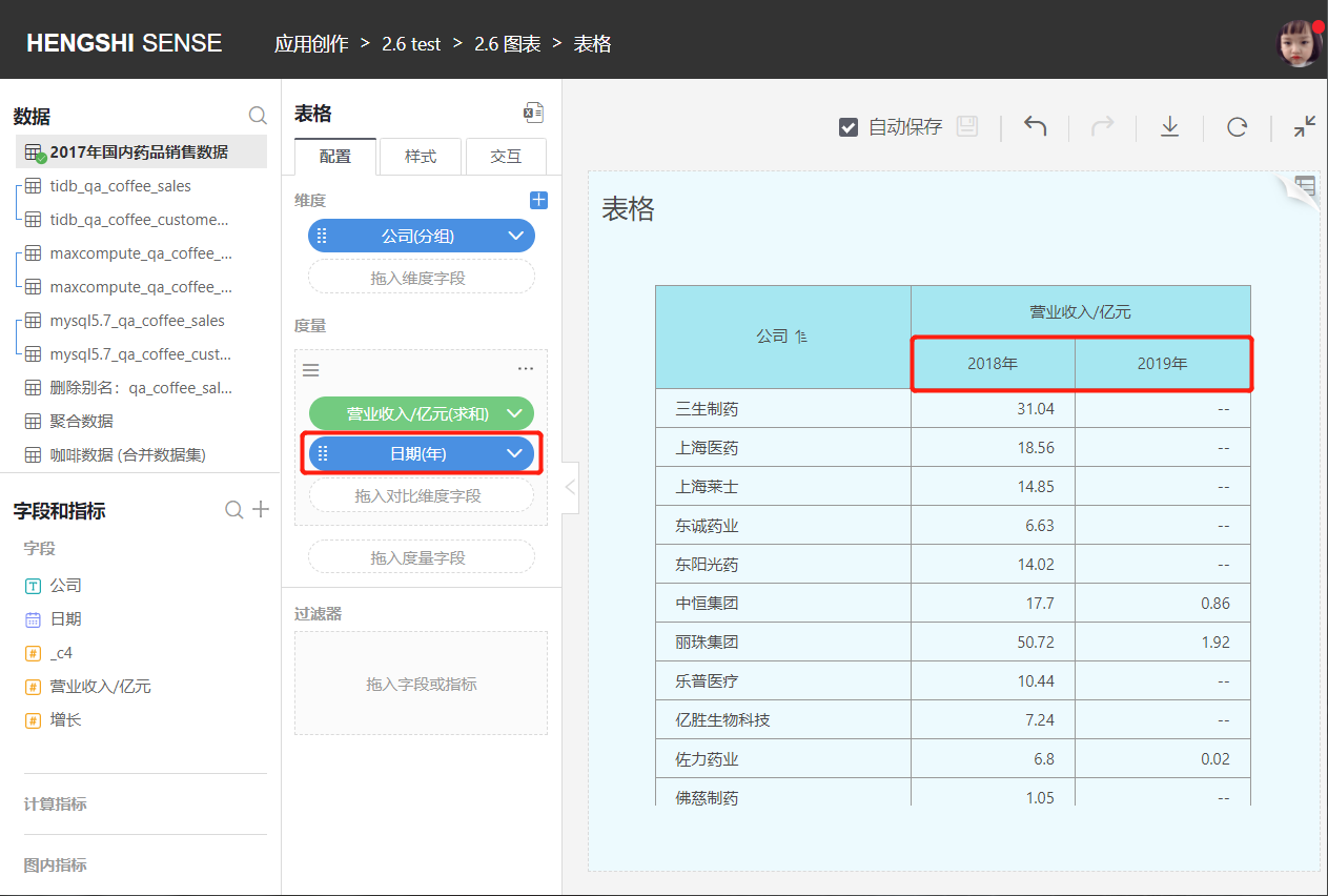
Comparative Dimensions
- Add Comparative Dimensions
Drag fields into the comparative dimension area in the measure section to show comparative dimension group headers below the measure header in the table.
The number of columns displayed in the measure depends on how many groups exist in the bottom-level comparative dimension.
The number of columns in comparative dimensions must not exceed 512.
Comparative dimension sorting includes default, ascending, descending, and custom.
Click the drop-down arrow to the right of the comparative dimension to sort.
- Default
Sorts based on the data's storage position in the database.
- Ascending/Descending
When choosing ascending/descending, text-type fields are sorted alphabetically A-Z, numerical-type fields are sorted by value size, and date-type fields are sorted chronologically.
- Custom Sorting
You can manually adjust the order of the comparative dimension groups.
Filters
Please refer to the chart documentation for Filters.
Currently, filters on original fields will affect subtotals, while filters on calculated indicators and chart internal indicators do not affect subtotals.
Style
Click Style in the middle toolbar to make the following settings:
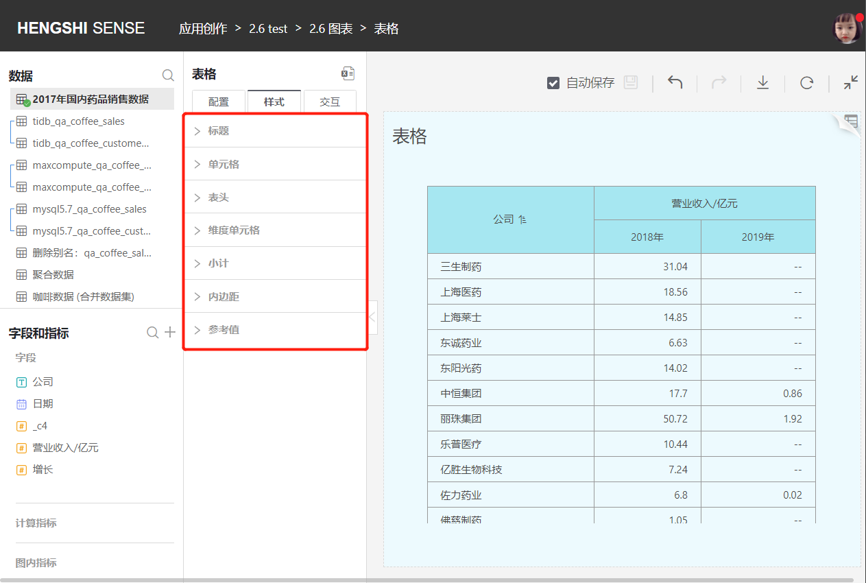
Cell
- Cell font color, size, and whether bold
- Cell alignment (left/center/right)
- Cell background color
- Cell border style
- Whether to merge cells
Header
- Header font color, size, and whether bold
- Header alignment (left/center/right)
- Header background color
- Header border style
Dimension Cell
- Dimension cell font color, size, and whether bold
- Dimension cell alignment (left/center/right)
- Dimension cell background color
- Dimension cell border style
Subtotal
- Subtotal font color, size, and whether bold
- Subtotal alignment (left/center/right)
- Subtotal background color
- Subtotal border style
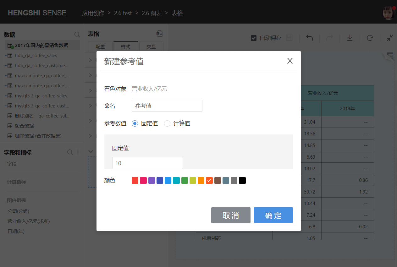
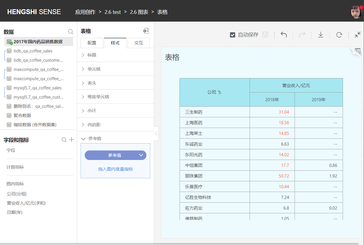
Reference Value
Through Style -> Reference Value, the table supports color-coding of exceptional values. As shown in the image, metric values greater than the set reference value will be displayed in the selected color.
Interaction
Click Interaction in the middle toolbar to make the following settings:
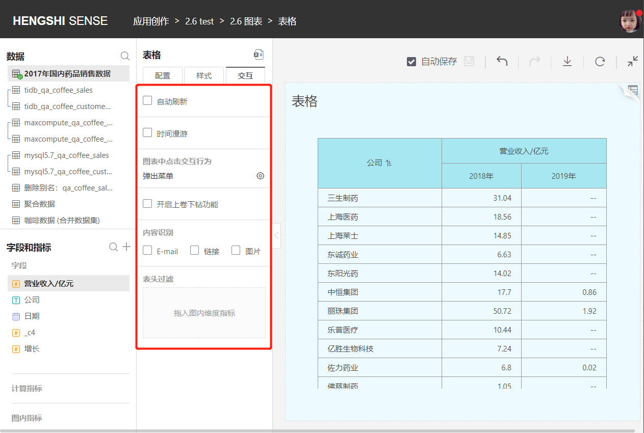
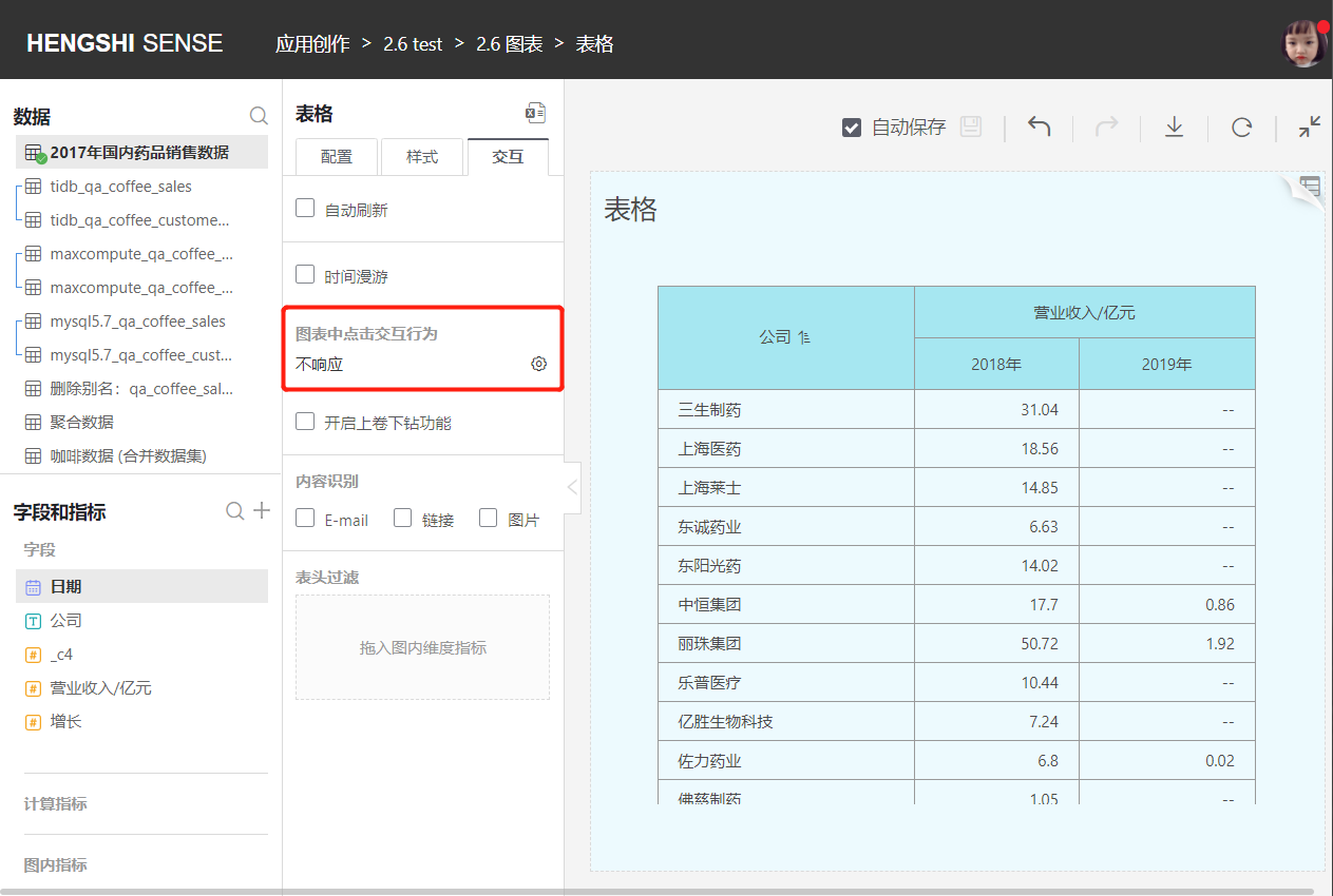
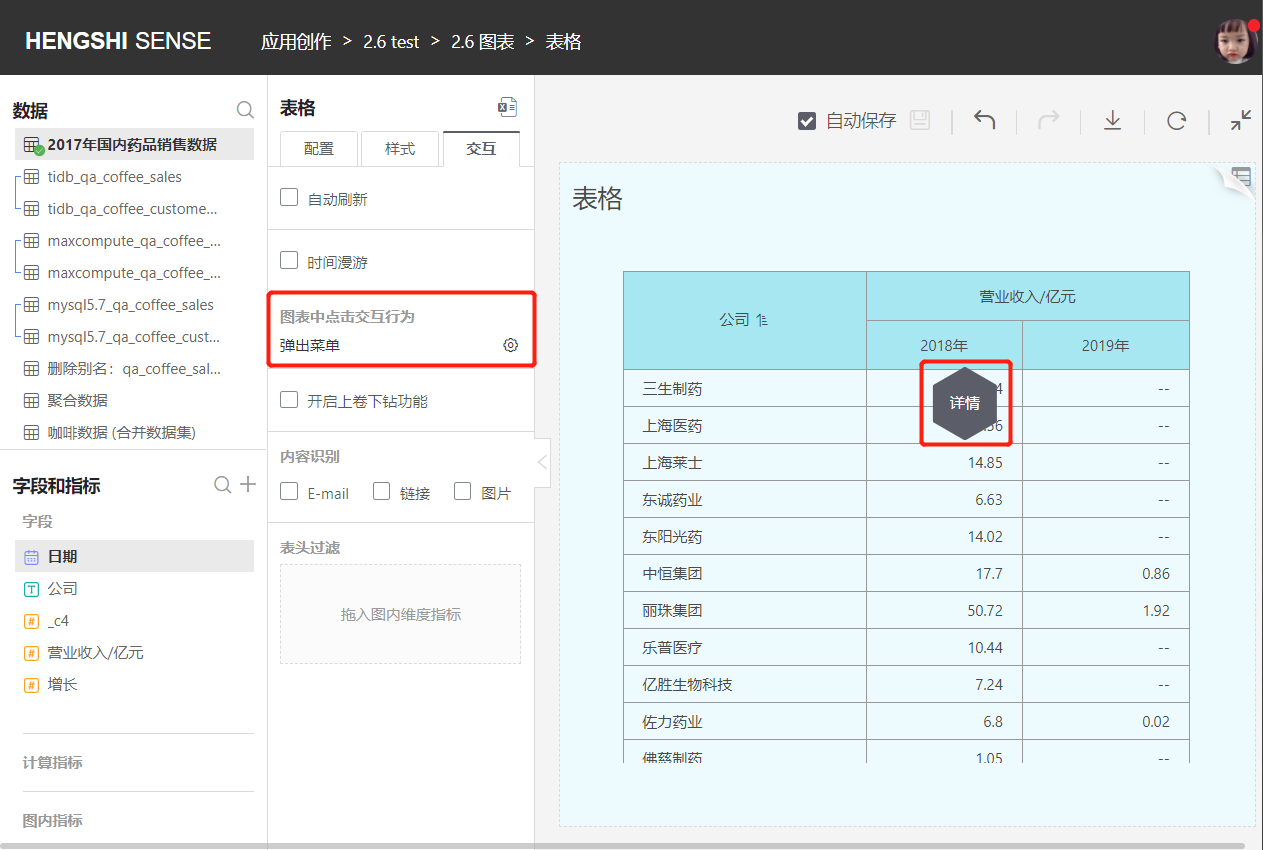
Click Interaction Behavior in Chart
Two display modes can be set when clicking on a dimension group:
No Response
When opening the table, clicking anywhere in the detail area has no response.
Popup Menu
When opening the table, clicking anywhere in the detail area will show a Tooltip menu with operations such as Details.
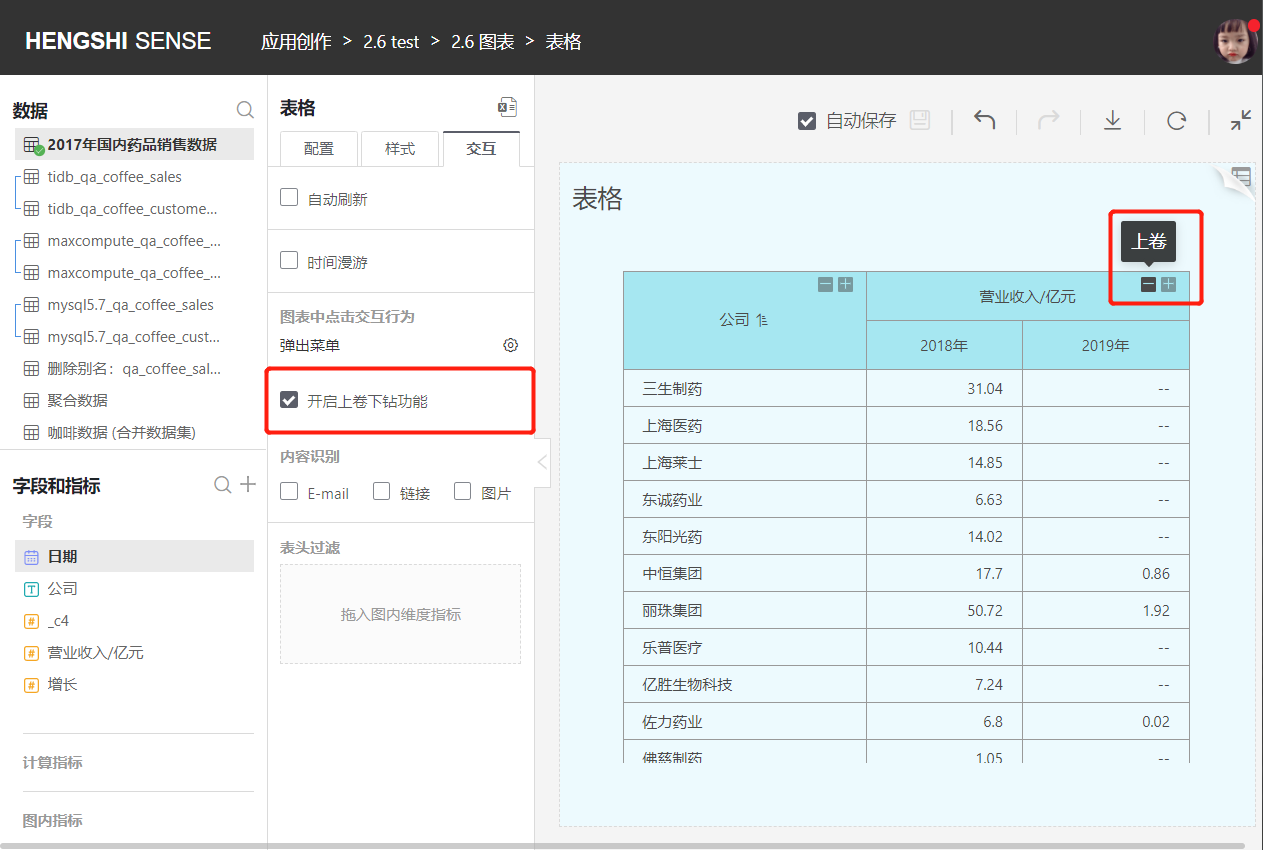
Enable Roll-up and Drill-down
When Enable Roll-up and Drill-down is checked, roll-up ("+") and drill-down ("-") icons are displayed on the headers of dimensions and subtotals in the table, allowing for hierarchical roll-up or hierarchical drill-down.
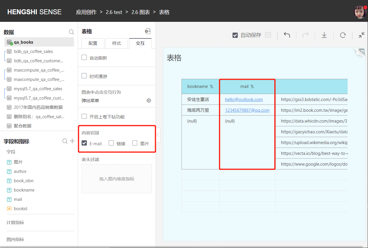
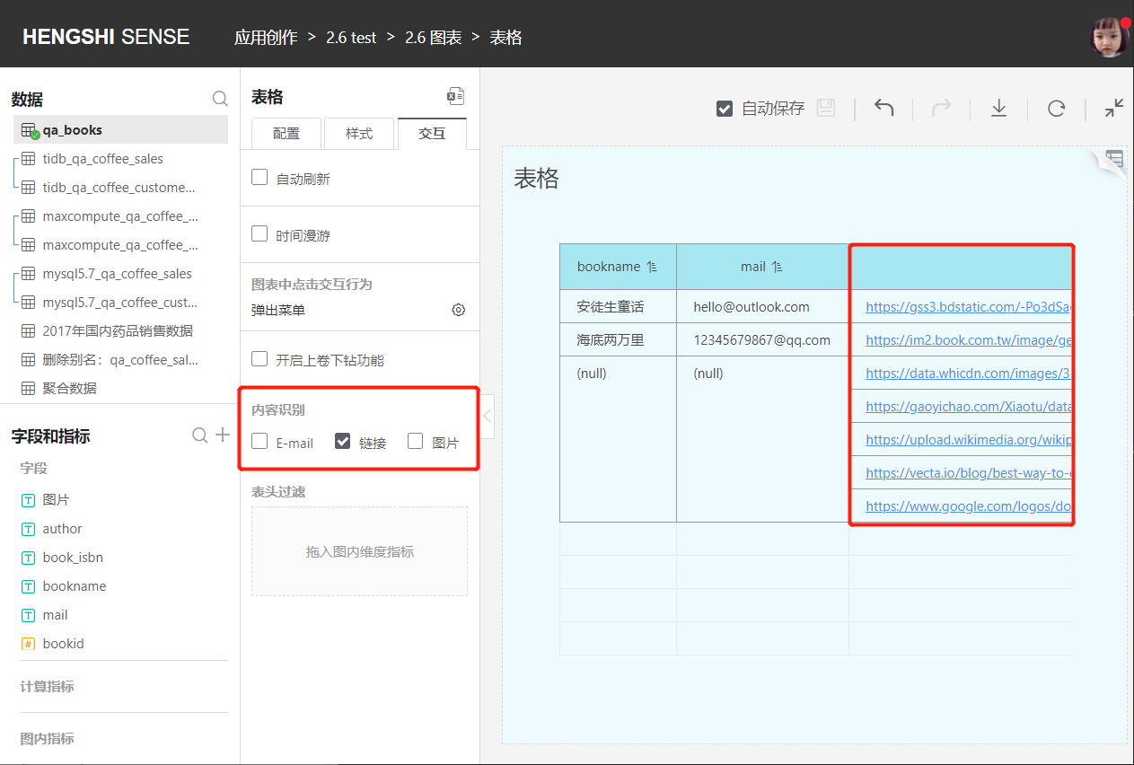
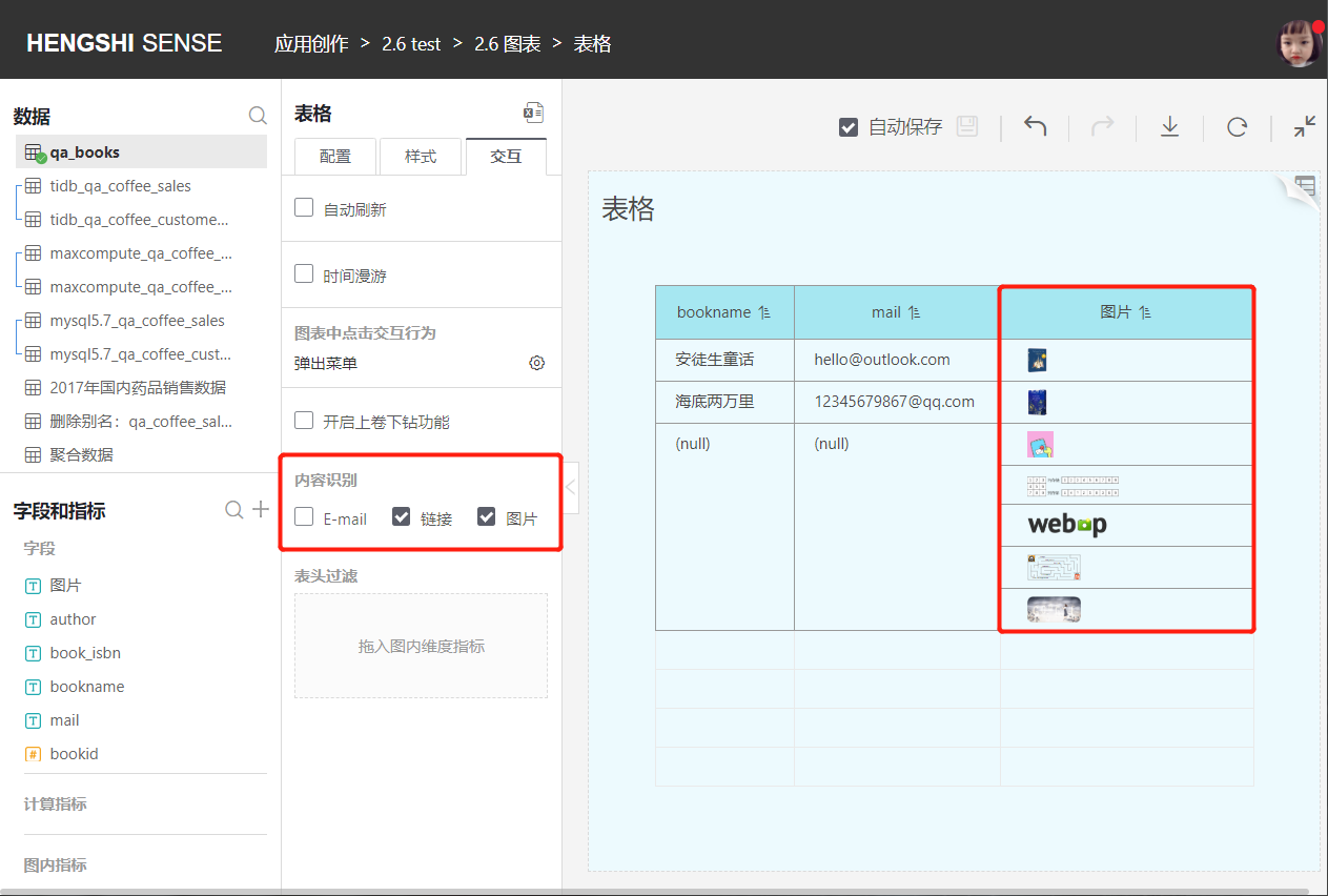
Content Recognition
Content recognition includes E-mail, link, and image. By default, it is unchecked when creating a new table.
When E-mail is checked, the table will automatically recognize E-mail, and clicking on an E-mail link will automatically open an email client.
- Link
When Link is checked and Image is not, the table will automatically recognize links, clicking on a URL will navigate to the link page.
- Image
When Image is checked or both Link and Image are checked, the table will automatically convert image links to images in cells, clicking on an image navigates to the link page.
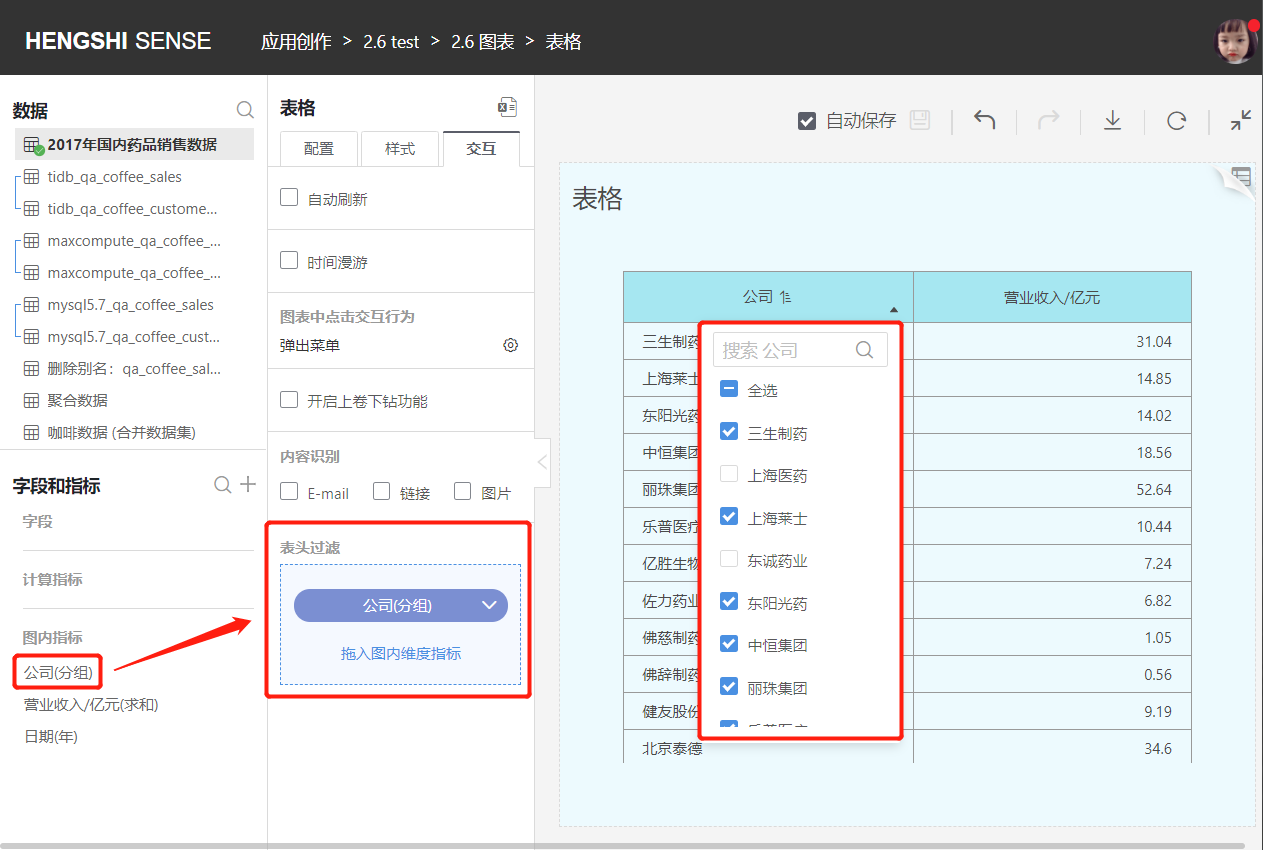
Header Filter
Header filtering can quickly filter which groups users should pay attention to (functions similar to the Filters in the Configuration section).
Drag the chart's dimension group indicators into the Header Filter, and the headers for dimension groups in the table will show a triangle button below, allowing the setting of filter conditions for the header.