Hengshi Documentation
Table of Contents generated with DocToc
- Dashboard Filters
Dashboard Filters
Filters, like charts, are elements of the dashboard. Once added, they are saved. The selection state within the filters is persistent, and each update of the filter overwrites the previous content and gets saved.
Workflow
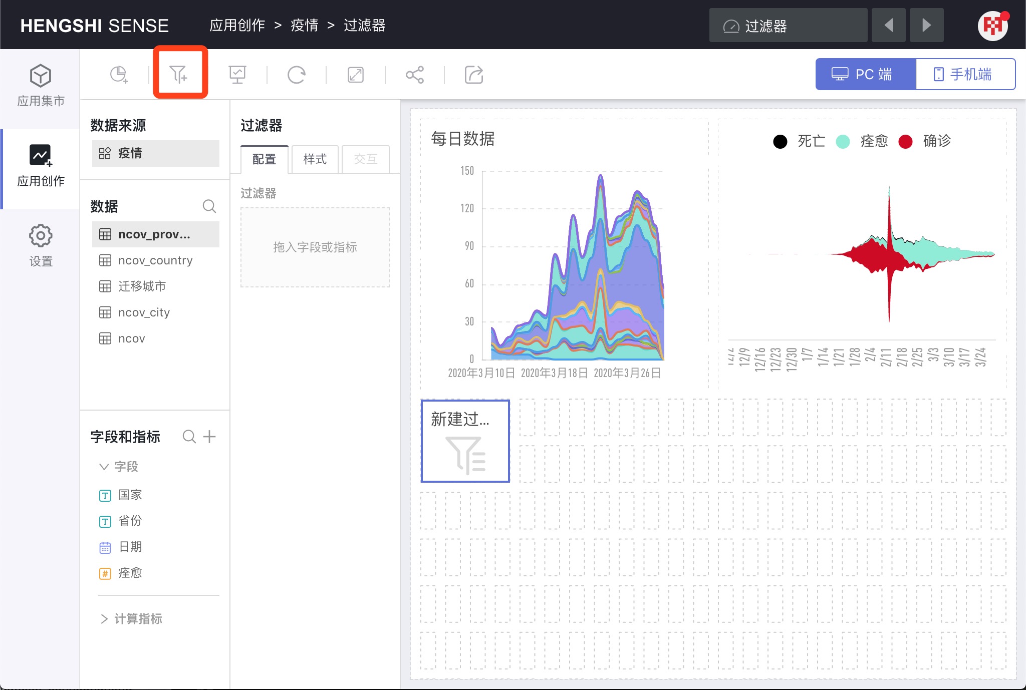
Click the
Add Filterbutton, the system will create a new empty filter in the dashboard layout.In
Data Source, select the application, which can be the current application or an application from the dataset market.Choose a dataset at the
Datasection.Drag a field from the
Fieldslist into theFilterarea of theConfiguration.Like charts, drag the filter to adjust its position and size.
To move the filter to the sidebar, click
Move to Sidebarin the filter's three-dot menu.Adjust the order and filtering levels of the filters in
Global Settings.
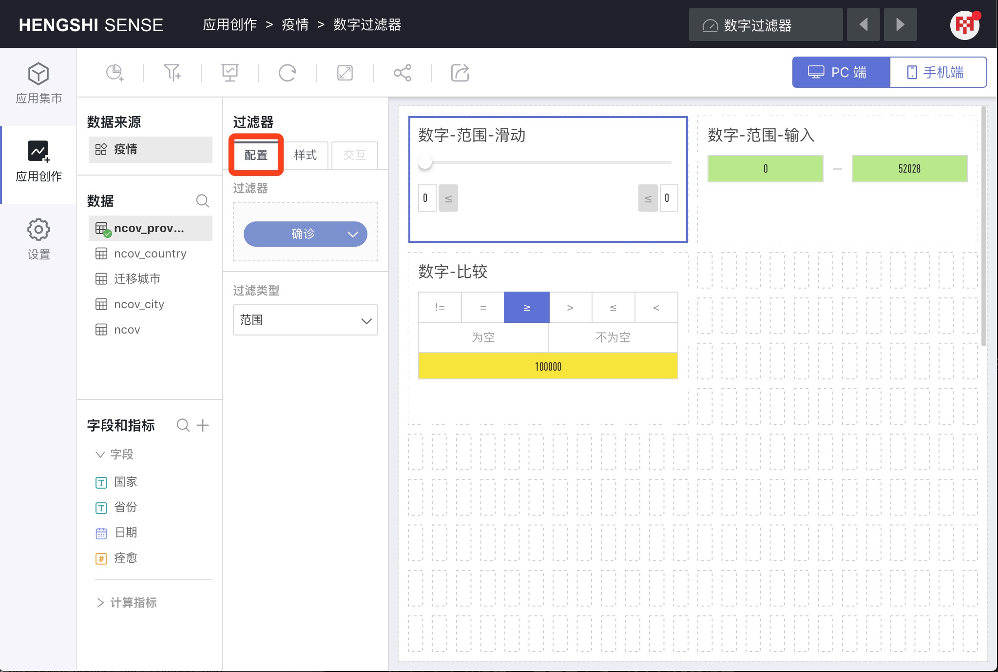
Configuration
Click a filter, and the filter configuration pane will open on the left panel. In Configuration, you can drag in filter fields and select Filter Types.
Filter Fields
Any field from the dataset can be dragged into the Filter.
Filter Types
Different types of fields have different Filter Types.
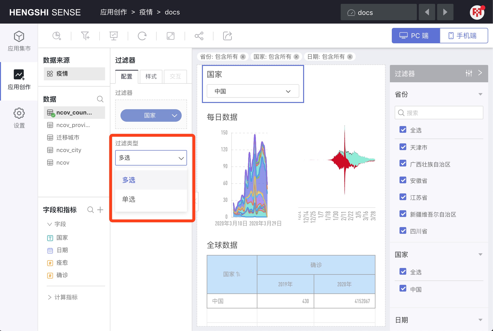
String
String filter types include: Multiple Selection and Single Selection.
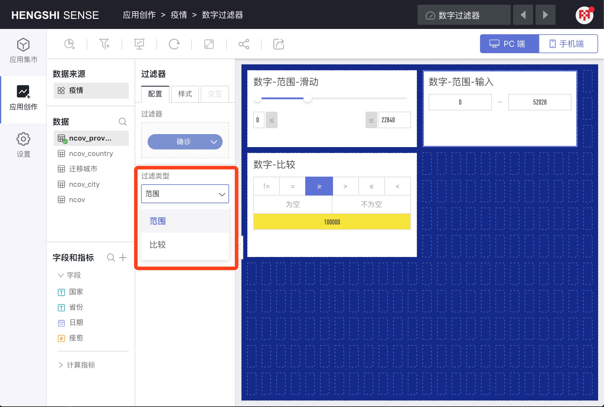
Number
Filter types for numeric fields include: Range and Comparison.
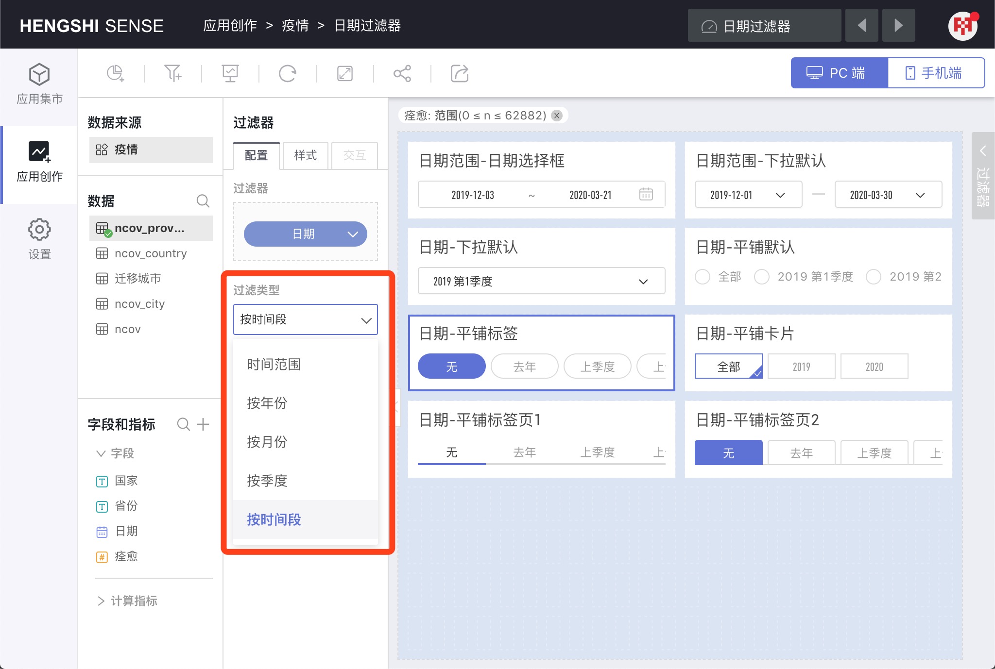
Date
The Filter Types for date filters include: Time Range, By Year, By Quarter, By Month, By Time Period.
Title
Display Title
Select Display Title to show the title within the filter. If unselected, the title will not be displayed.
Customize Title
By default, Customize Title is unselected, and the filter's title will be auto-generated based on the name of the dragged in field.
Select Customize Title to manually enter a title for the filter.
In-Canvas Filters
String Filters
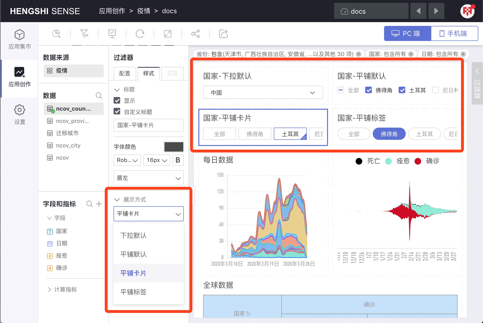
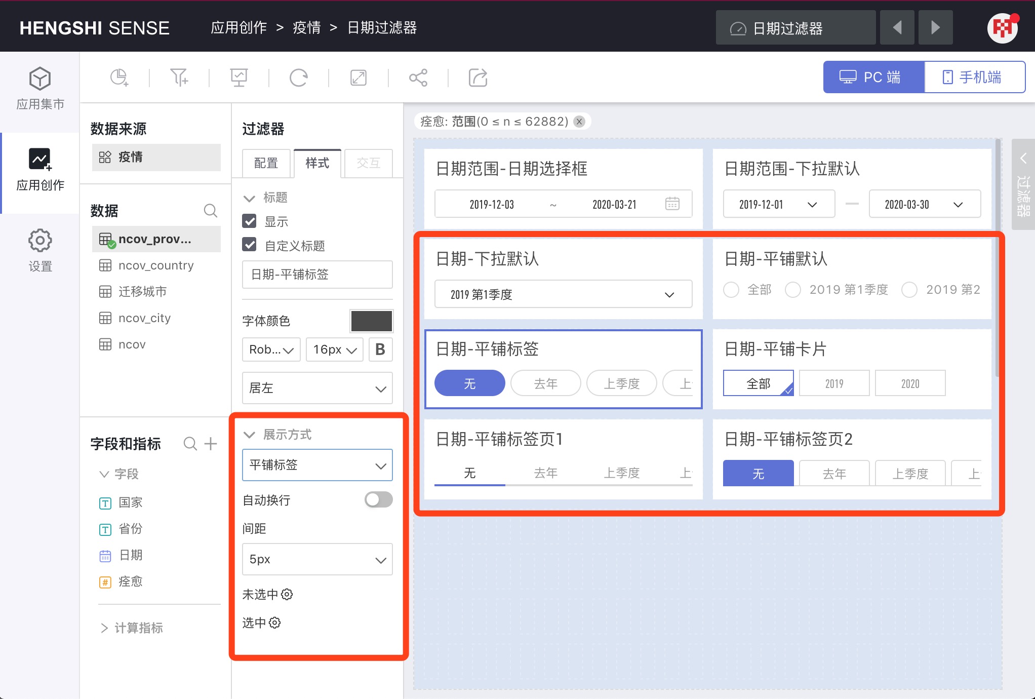
Display Mode
Switch to the Style tab to configure the Display Mode; details below.
Styles that can be configured under various display modes include: Auto Wrap, Arrangement, Spacing, Unselected, and Selected.
Multiple Selection
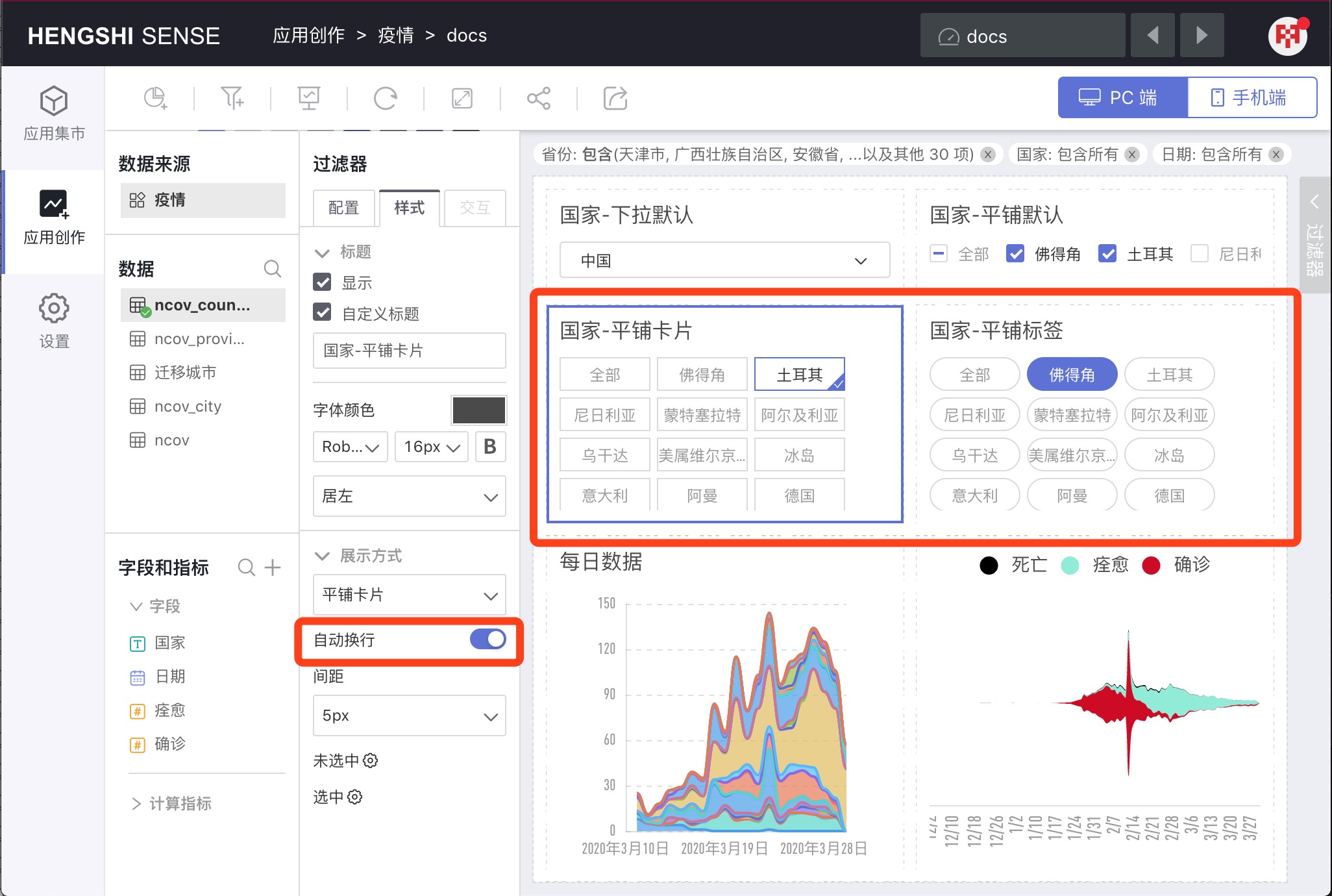
For the filter type Multiple Selection, there are four display modes: Dropdown Default, Tiled Default, Tiled Card, Tiled Label.
Single Selection
For the filter type Single Selection, there are six display modes: Dropdown Default, Tiled Default, Tiled Card, Tiled Label, Tiled Tabs 1, Tiled Tabs 2.
The additional display modes Tiled Tabs 1 and Tiled Tabs 2 can function as tab switches.
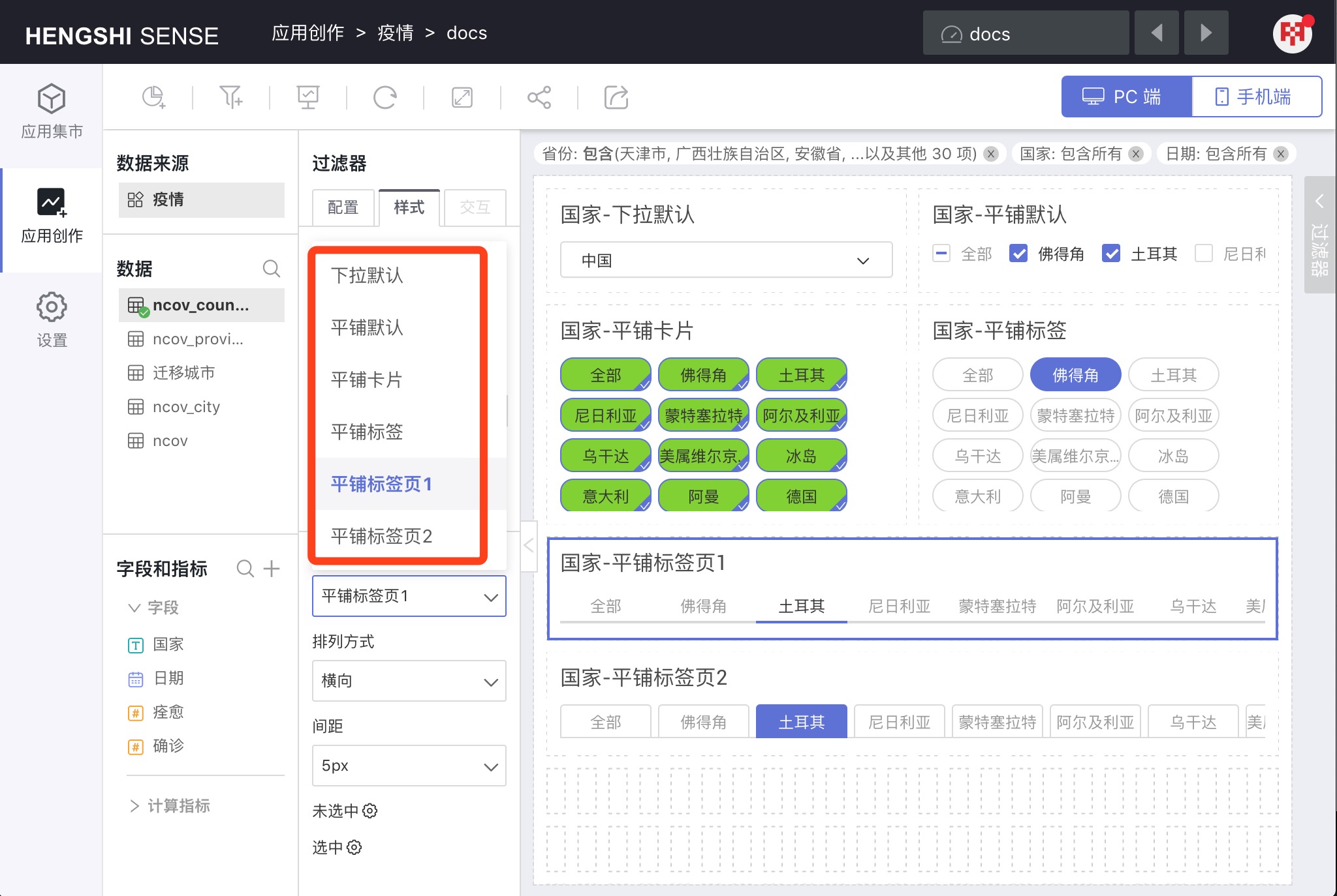
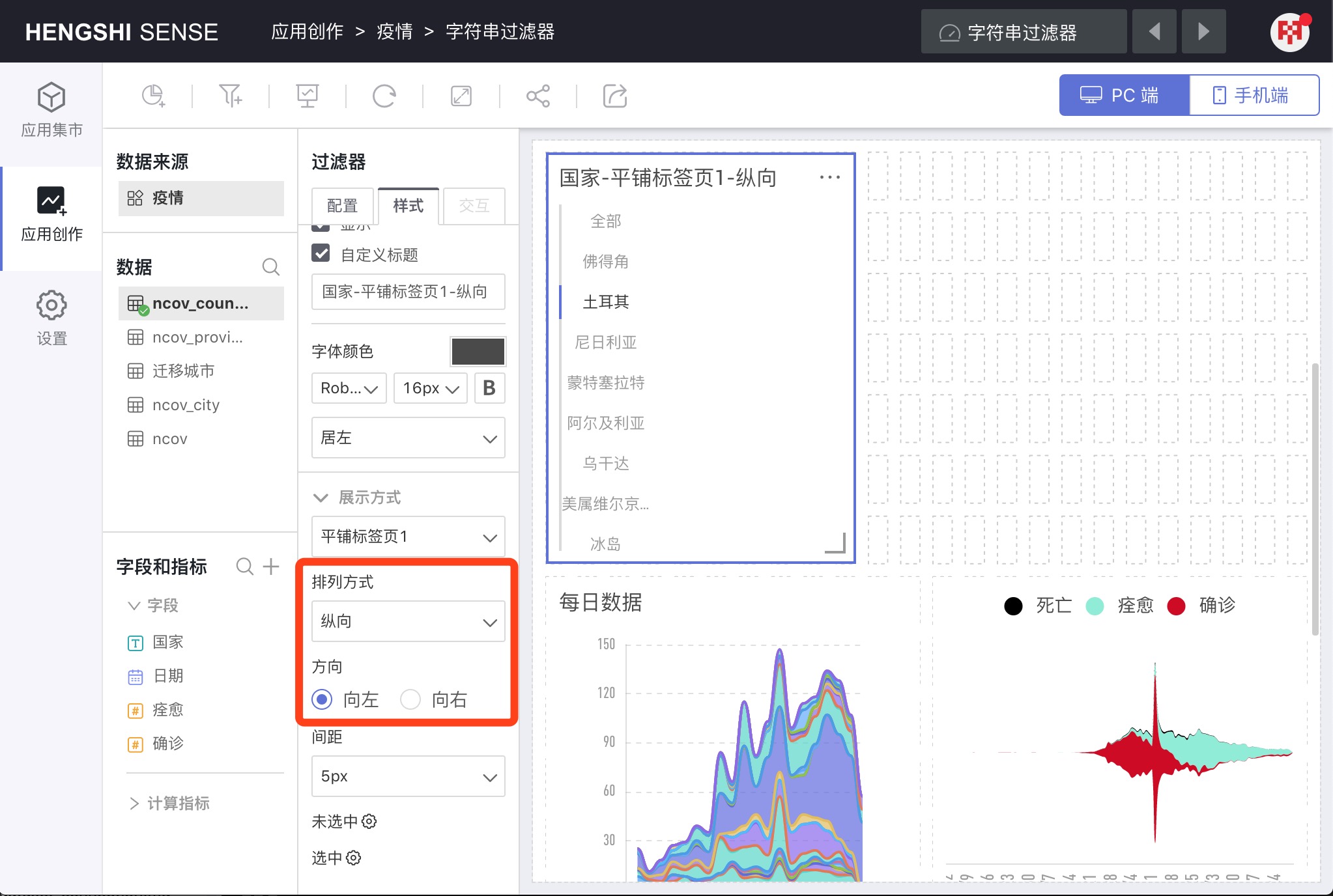
Arrangement
In the display modes Tiled Tabs 1 and Tiled Tabs 2, you can configure the Arrangement.
The arrangement can be Horizontal or Vertical. In Vertical mode, you can configure the direction to be Left or Right.
Auto Wrap
Activate Auto Wrap, and the effect is as shown; the scroll list transitions from horizontal to vertical.
Spacing
Configure the spacing between each option.
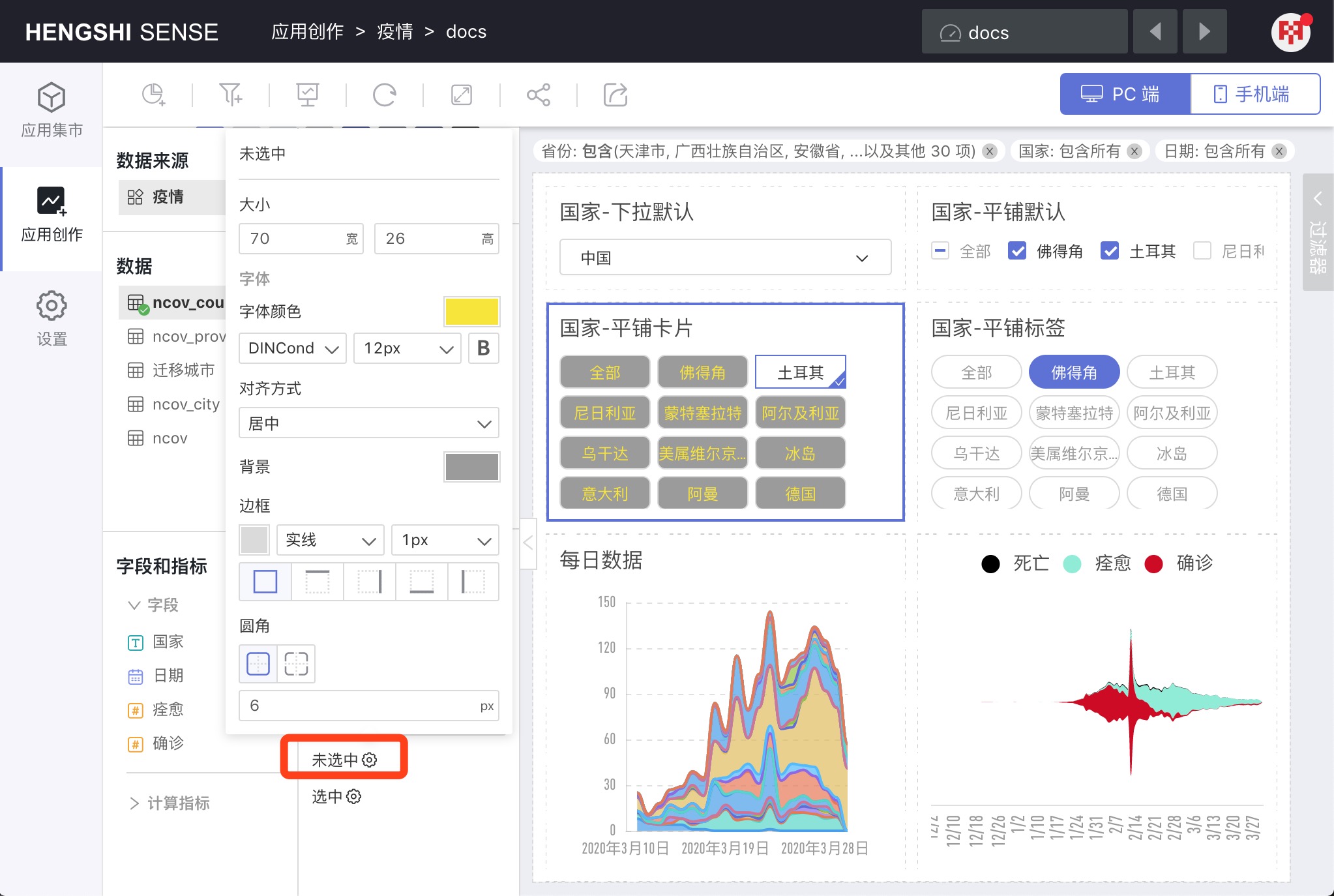
Unselected
You can set the style for unselected cards/labels, which includes:
- Size: Width and height of the card/label
- Font: Font, font color, size
- Alignment: Left, Center, Right
- Background color
- Border: Which border (top, bottom, left, right), border line (solid, long dash, short dash), line thickness
- Border Radius: Radius size specified in px; the greater the px, the larger the curve.
Selected
The settings for Selected are exactly the same as Unselected.
Number Filters
Display Mode
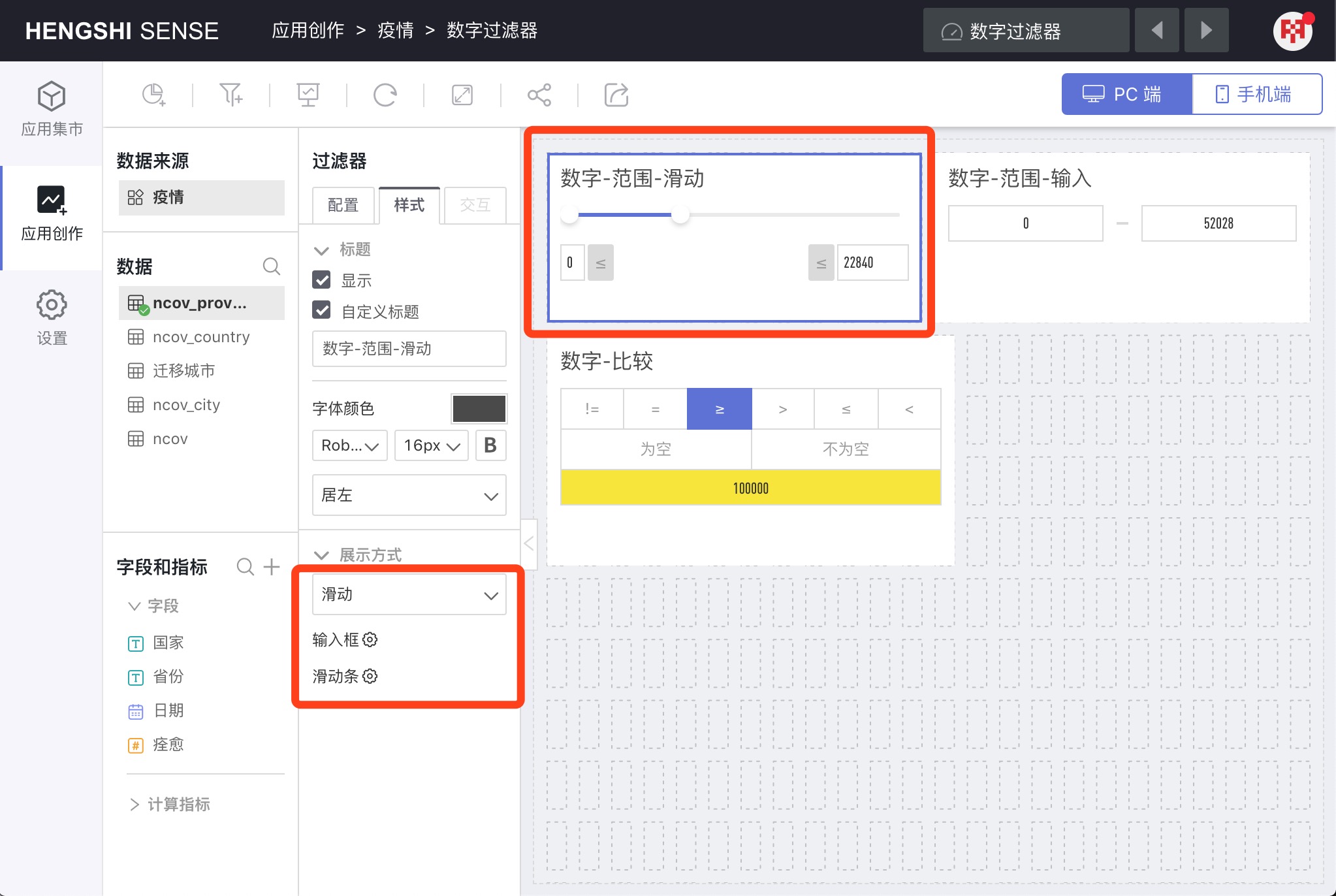
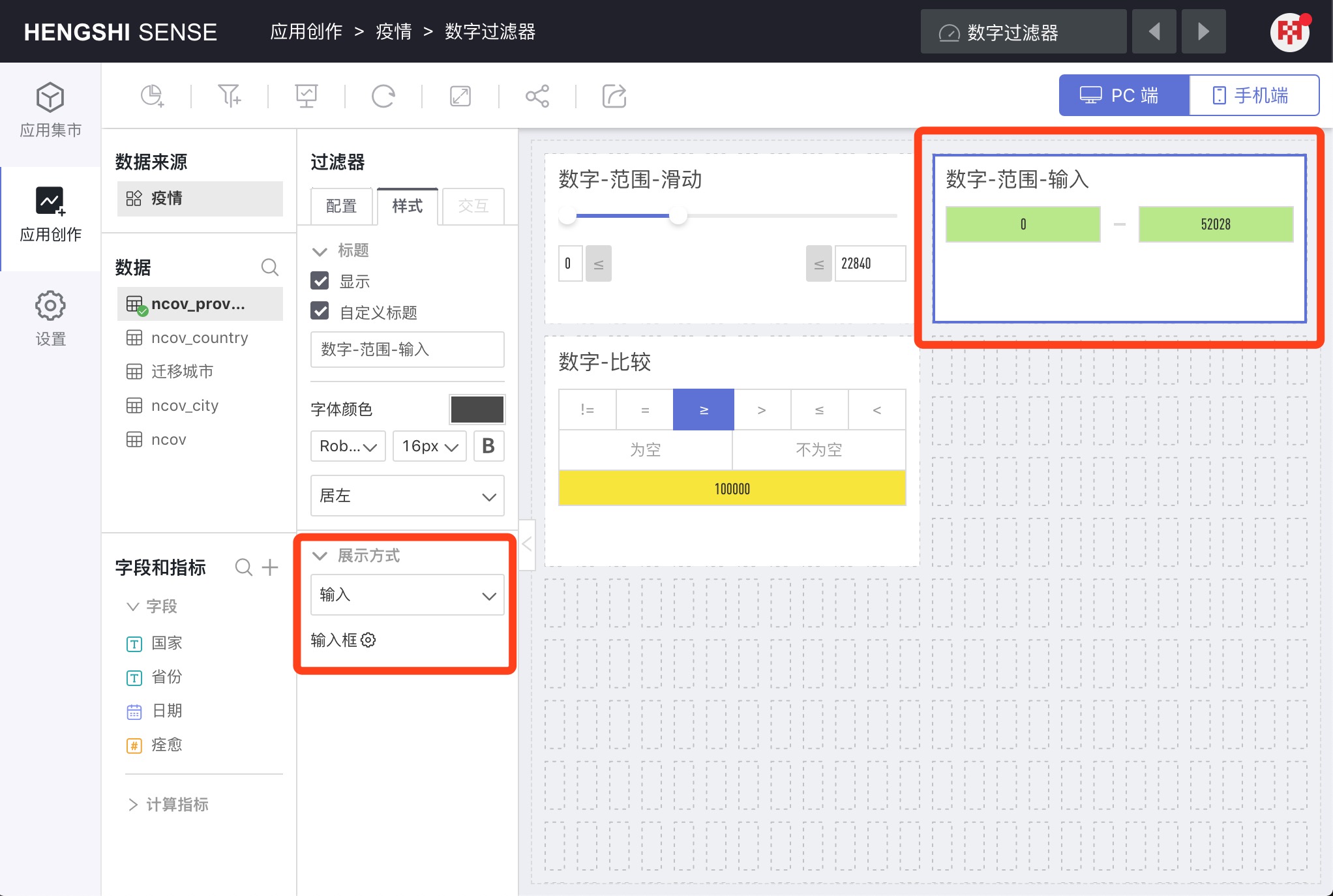
When selecting the Range filter type, there are two display modes: Slider and Input.
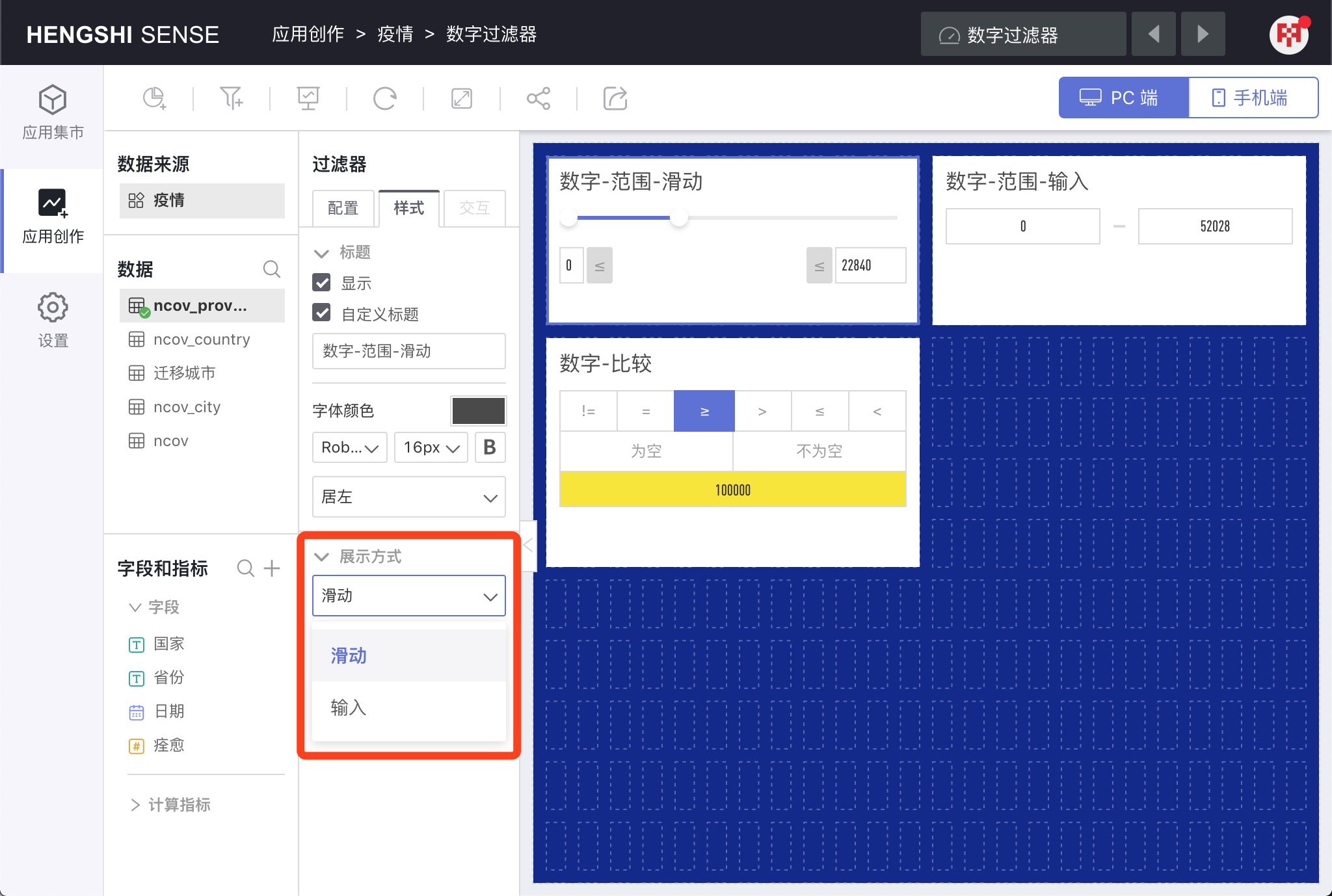
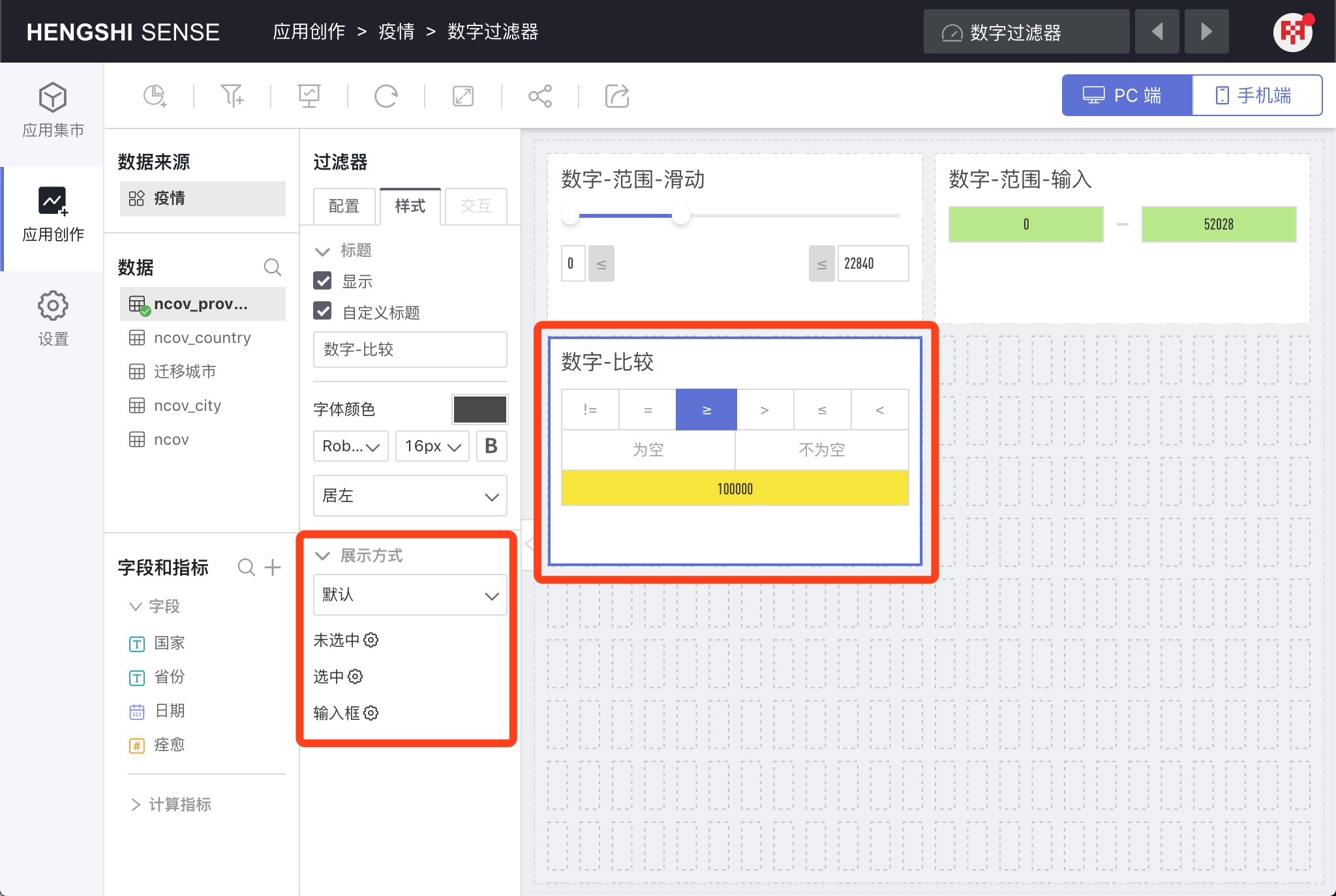
When choosing the Comparison filter type, there's only one presentation method: Default, as shown by the "Number - Comparison" filter in the picture.
Range - Slider
Styles that can be configured include: Input box and Slider bar.
Range - Input
Configurable styles include: Input box.
Comparison
Configurable styles include: Unselected, Selected, and Input box.
Date Filters
Display Mode
Time Range
When the filter type is a time range, there are two display modes: Date Picker and Dropdown Default.
Configurable styles include: Picker Box.
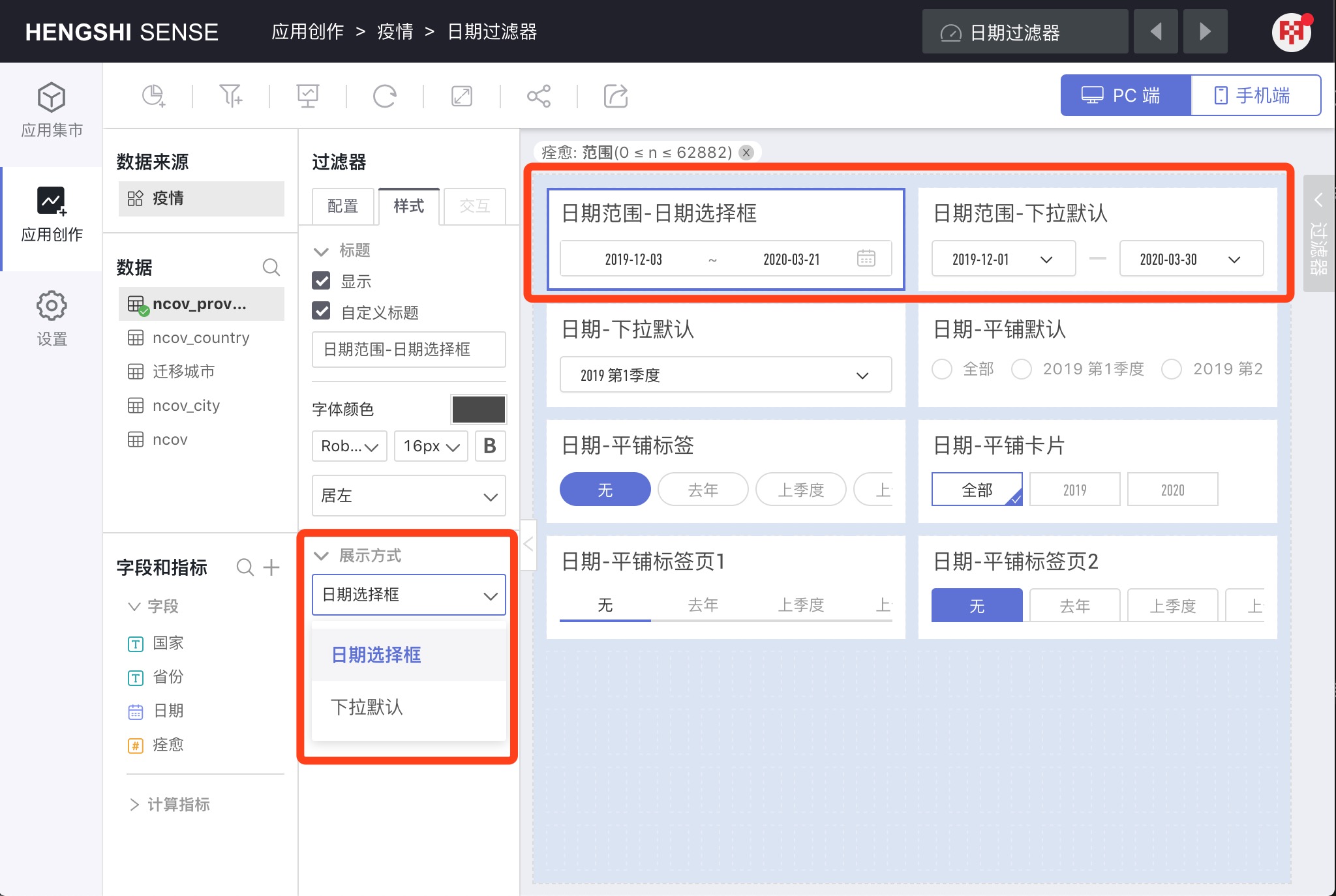
By Year/By Quarter/By Month/By Time Period
When selecting these filter types, the display mode is actually the same as the single selection of text fields, featuring: Dropdown Default, Tiled Default, Tiled Card, Tiled Label, Tiled Tabs 1, Tiled Tabs 2.
The configurable styles are also the same as text filters.
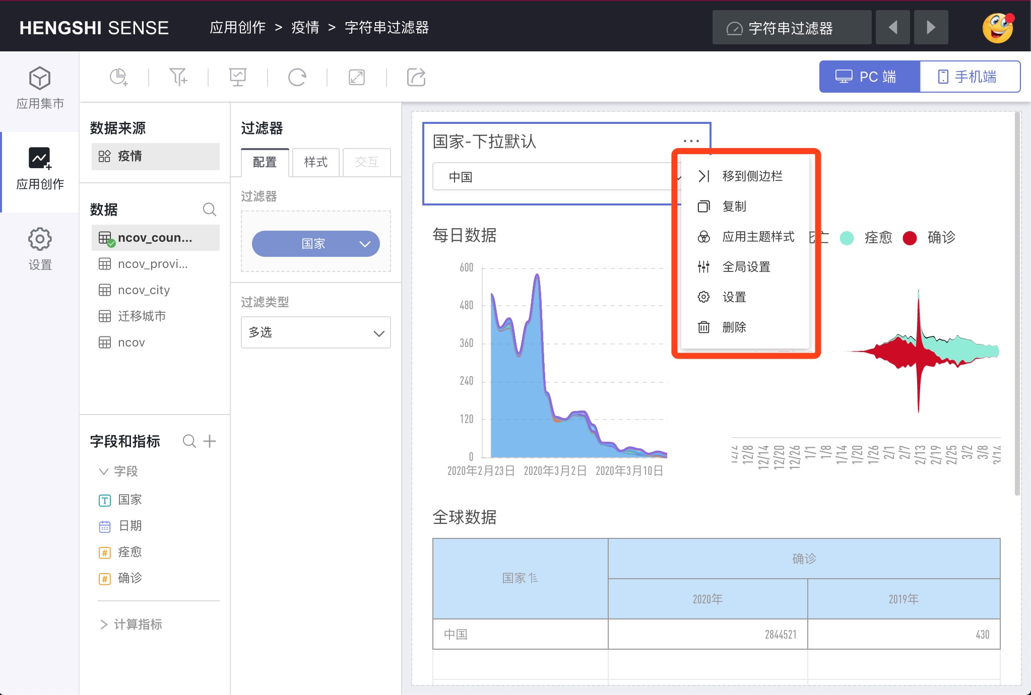
Move to Sidebar
Move an in-canvas filter to the sidebar. After moving to the sidebar, the filter's style will be completely cleared.
Copy
Copy a completely identical filter within the canvas.
Apply Theme Style
Apply the dashboard theme style to the filter.
Global Settings
Click the Global Settings menu to pop up the Global Settings dialog box, where you can sort filter fields and set filter levels for linked filtering.
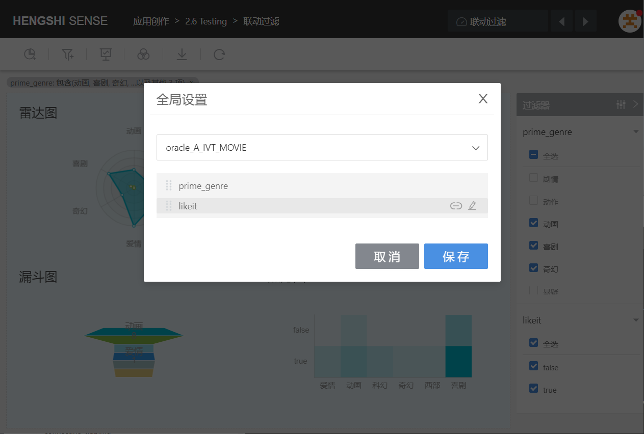
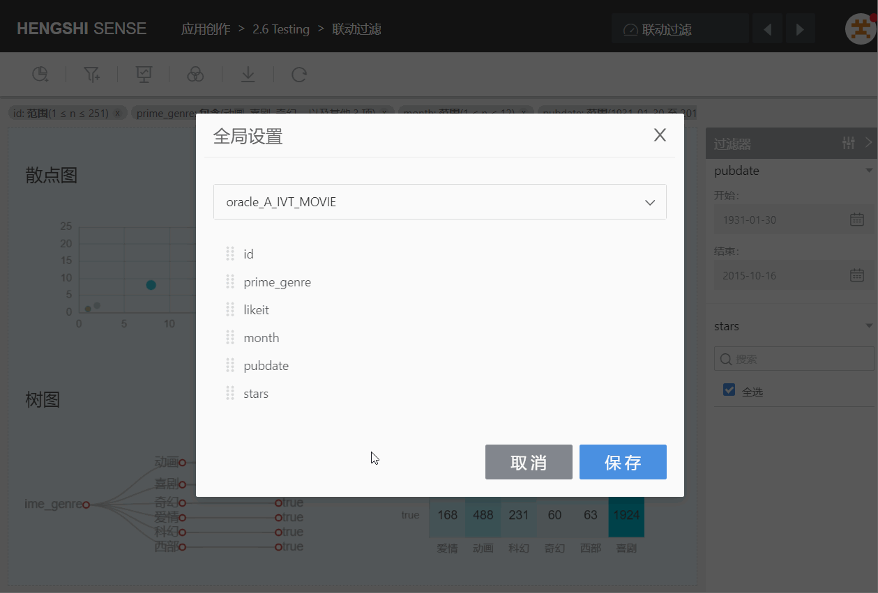
Ordering
Sort by dragging, and when dragging, it will also move all the child nodes beneath that filter.
For example, in the following figure, when moving the filter "month" below the filter "id", it also moves the child nodes "pubdate" and the child nodes of "pubdate", "stars".
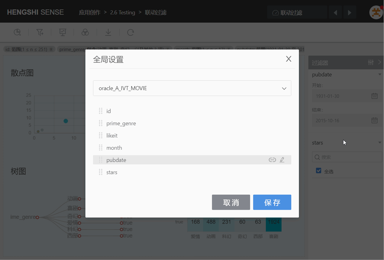
Cascading Filter
Click on the chain icon, the filter will indent backwards, becoming a child node of the previous one, and the child filter's value range will dynamically link with the parent node's selected value.
Click on the chain again to cancel the indentation.
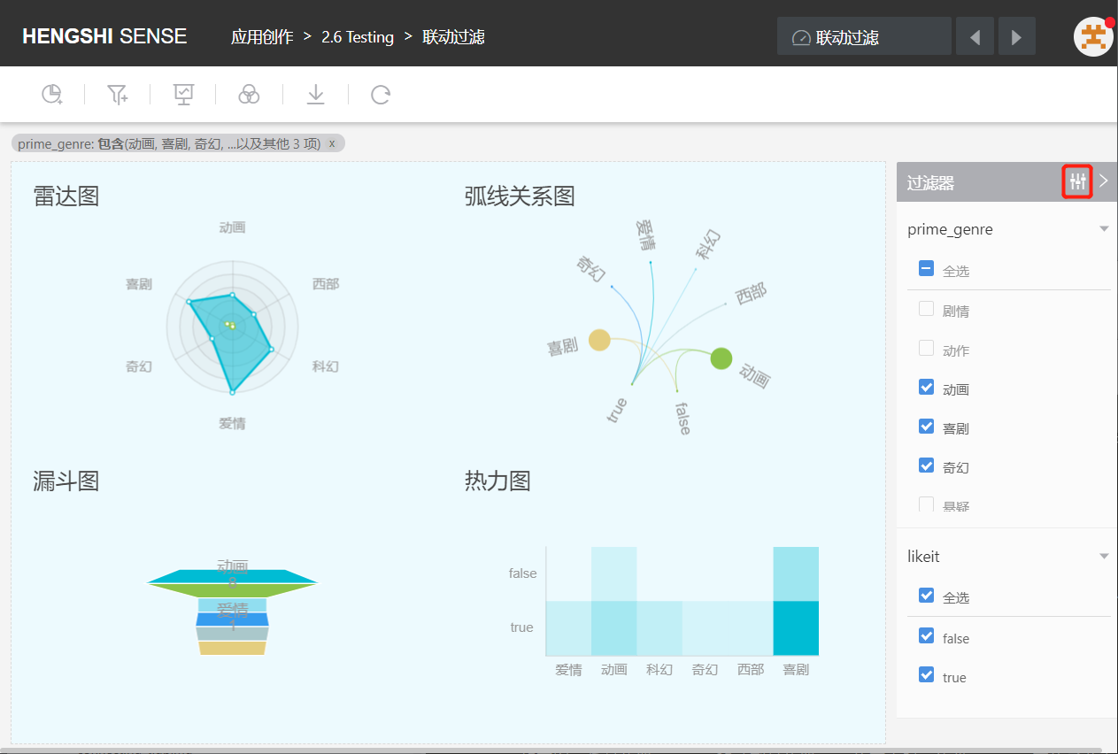
When multiple filters are added to a dashboard, changing the filter conditions in one filter will also update the value range of the filters involved in the linkage in real-time.
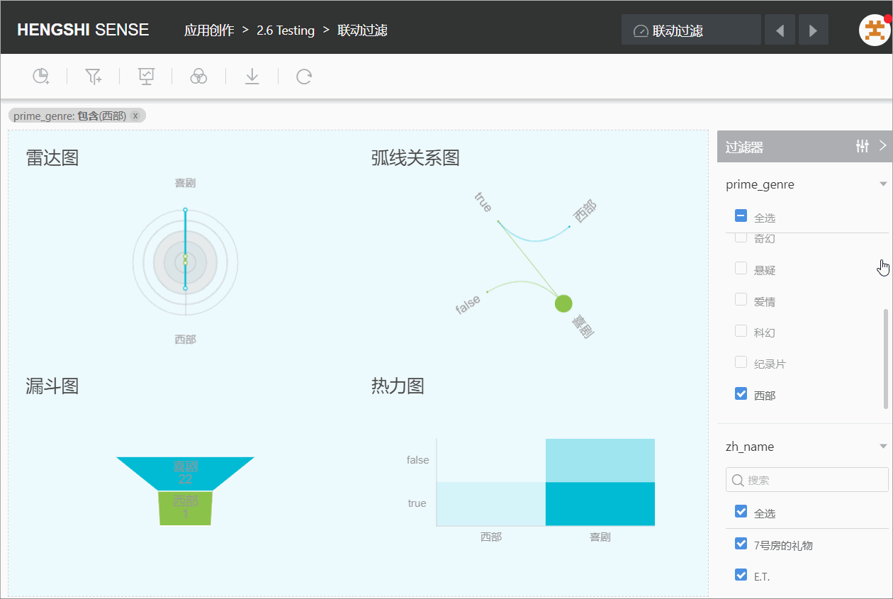
As shown below: The filter prime_genre currently selects the value "Western". Set global settings, making zh_name a child node of prime_genre. After clicking OK, the selectable values for zh_name filter are only those where "prime_genre" is "Western".
Please note:
- The value range of the child field will be filtered step by step with the ancestor field.
- Parallel fields do not interfere with each other.
- Changes in the selected value or range of the child field will not affect the ancestor field.
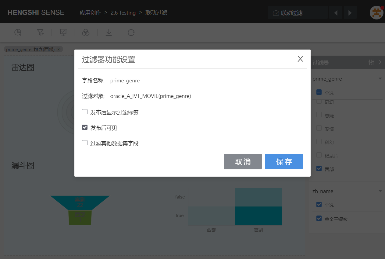
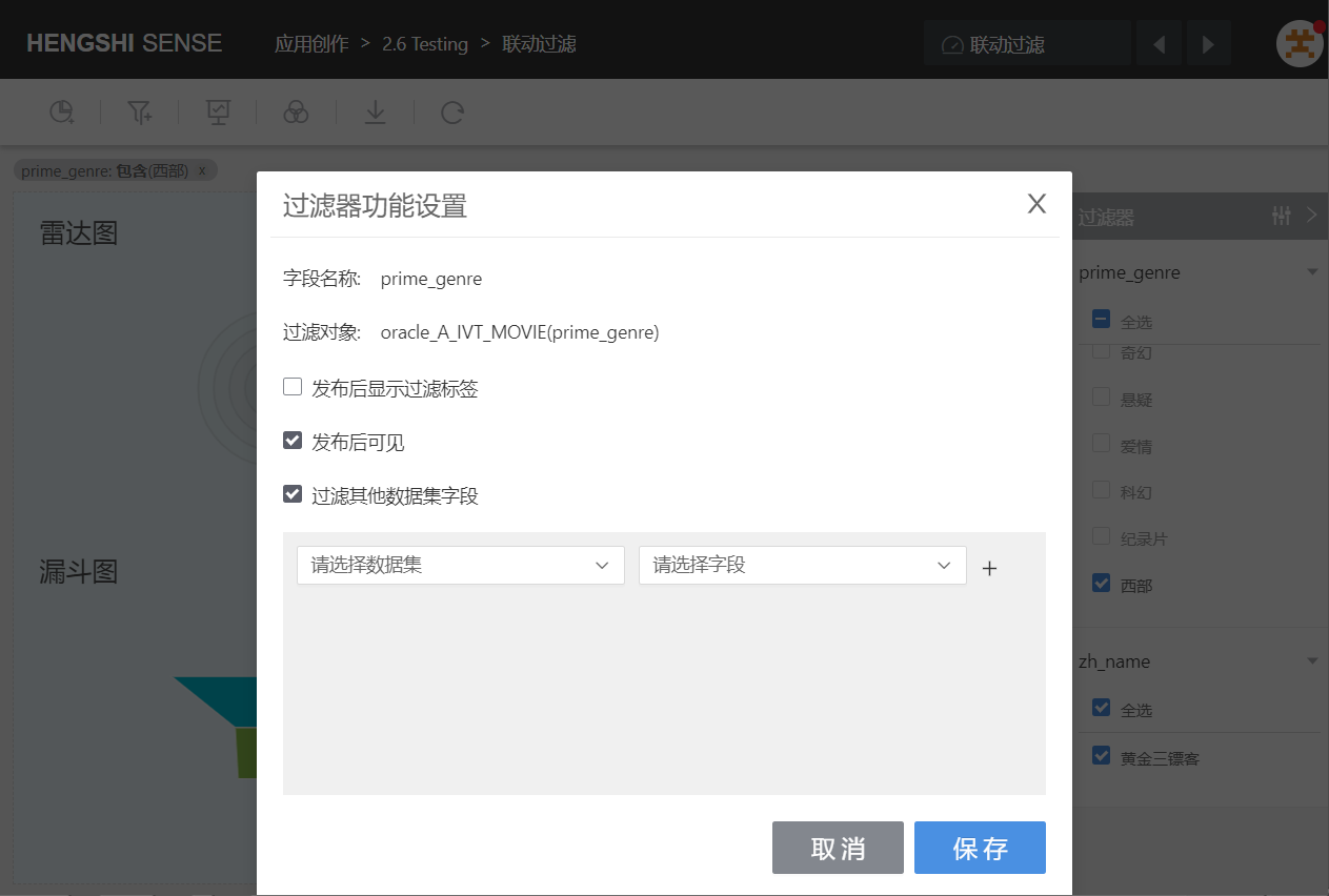
Settings
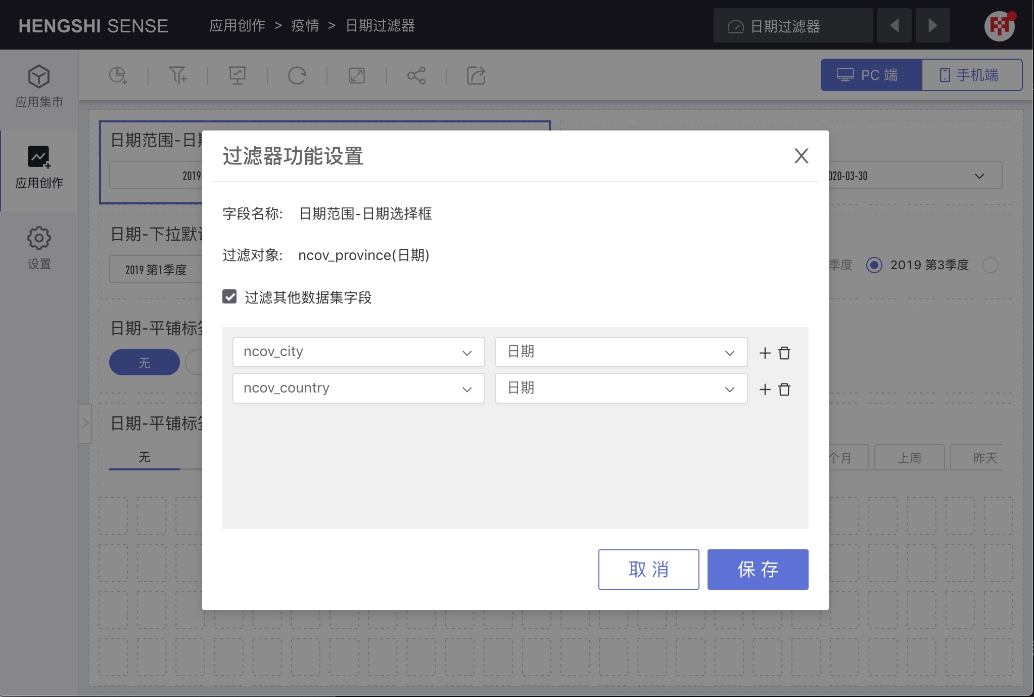
Select Settings from the popup menu to open the filter's Filter Function Settings window.
Filter Other Dataset Fields
Check Filter Other Dataset Fields, and a list of datasets and their corresponding field selection dropdowns will appear below in the window. Select the dataset and its field, and the current filter's range will apply to the selected field.
For example, when the source dataset selects filtering data from the year 2020, it will also filter data from other dataset corresponding fields from 2020.
Delete
The current filter is deleted, and the previously applied filter conditions are cleared.
Sidebar Filters
Global Settings
Same as the Global Settings for the in-canvas filters.
Collapse/Expand
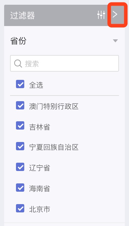
Collapse the sidebar filter. Once collapsed, it can be expanded by clicking.
Move to Canvas
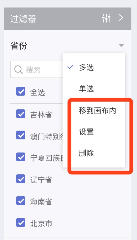
As shown above, click the inverted triangle icon on the right side of the filter to pop up the filter's menu. At the top, the filter type is displayed, which varies with the field type, followed by the menu items:
- Move to Canvas
- Settings
- Delete
Move to Canvas will move the sidebar filter to the canvas for layout settings.
Settings
Select Settings from the popup menu, the Filter Function Settings window pops up:
In this window, you can see the name of the current filter and the dataset and filtering field of the filtering object.
In this window, you can set:
Show Filter Tags After Publishing
Check Show Filter Tags After Publishing, and after the current application is published, the filter conditions of this filter will be displayed in the top left corner of the dashboard in the application market.
Uncheck Show Filter Tags After Publishing, and after the current application is published, the filter conditions of this filter will not be displayed in the application market.
Visible After Publishing
Check Visible After Publishing, and after the current application is published, the filter will be displayed in the dashboard in the application market.
Uncheck Visible After Publishing, and after the current application is published, the filter will be effective in the application market but will not be displayed.
Filter Other Dataset Fields
Check Filter Other Dataset Fields, and a list of datasets and their corresponding field selection dropdowns appears below in the window. Select the dataset and its fields, and the current filter's range will apply to the selected fields.
Delete
The current filter is deleted, and the previously applied filter conditions are cleared.