Hengshi Documentation
Table of Contents generated with DocToc
- Bar Chart
- Clustered Bar Chart
- Grouped Clustered Bar Chart
- Stacked Bar Chart
- Percentage Stacked Bar Chart
- Grouped Stacked Bar Chart
- Percentage Grouped Stacked Bar Chart
- Horizontal Bar Chart
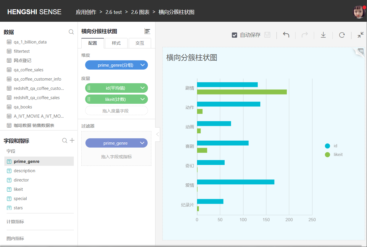
- Horizontal Clustered Bar Chart
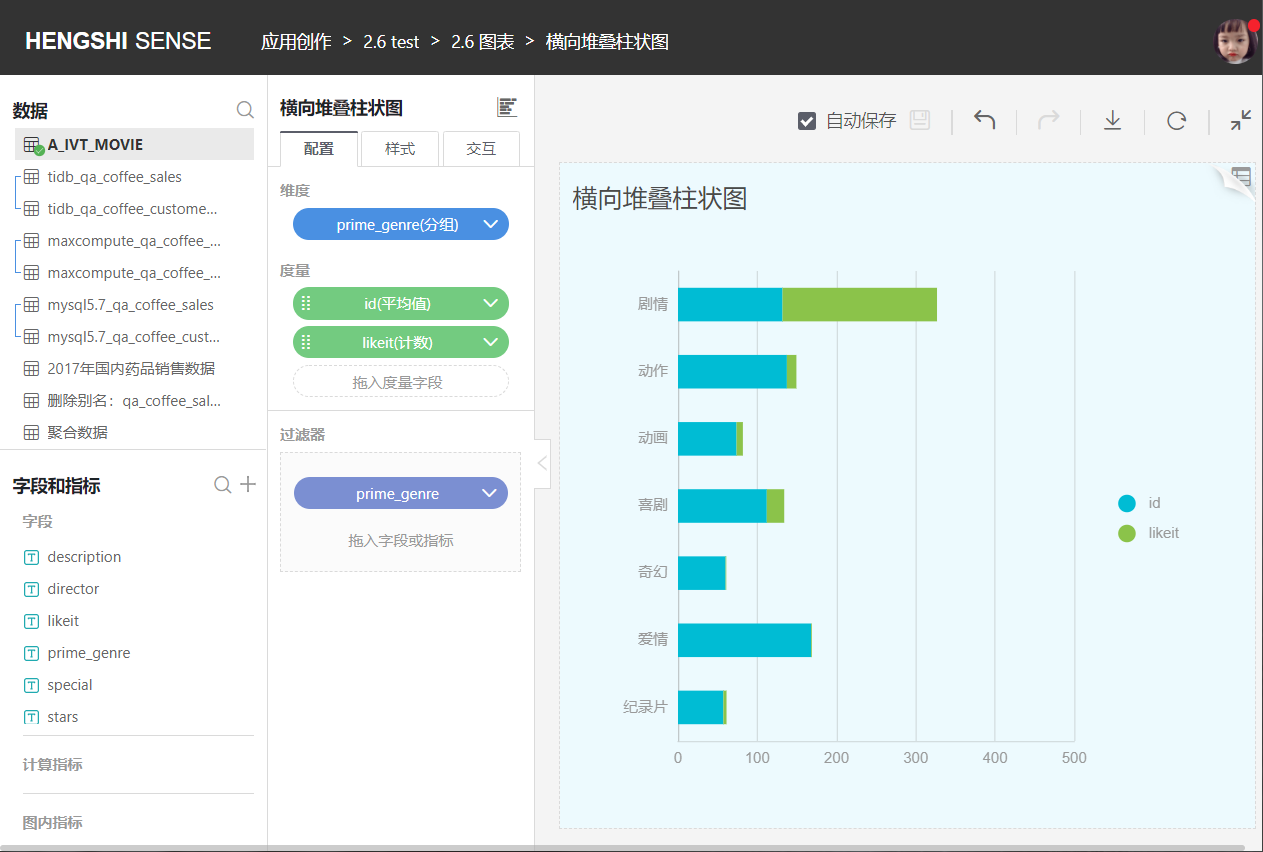
- Horizontal Stacked Bar Chart
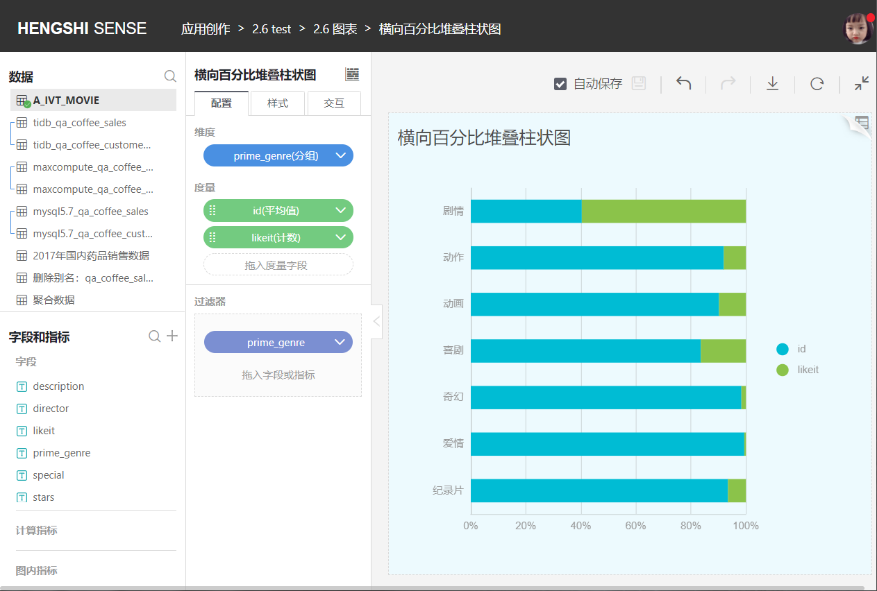
- Horizontal Percentage Stacked Bar Chart
- Circular Bar Chart
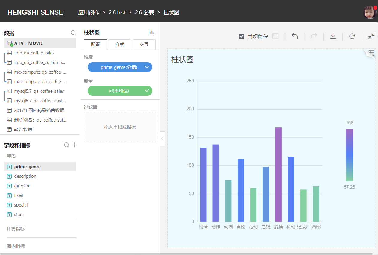
Bar Chart
A bar chart is a statistical chart for discrete type data. Each bar represents a category (dimension), and the length of the bar is the statistical value (metric) of that category. Bar charts offer a convenient sorting function that makes it easy to see the maximum and minimum values.
A typical bar chart is shown below:
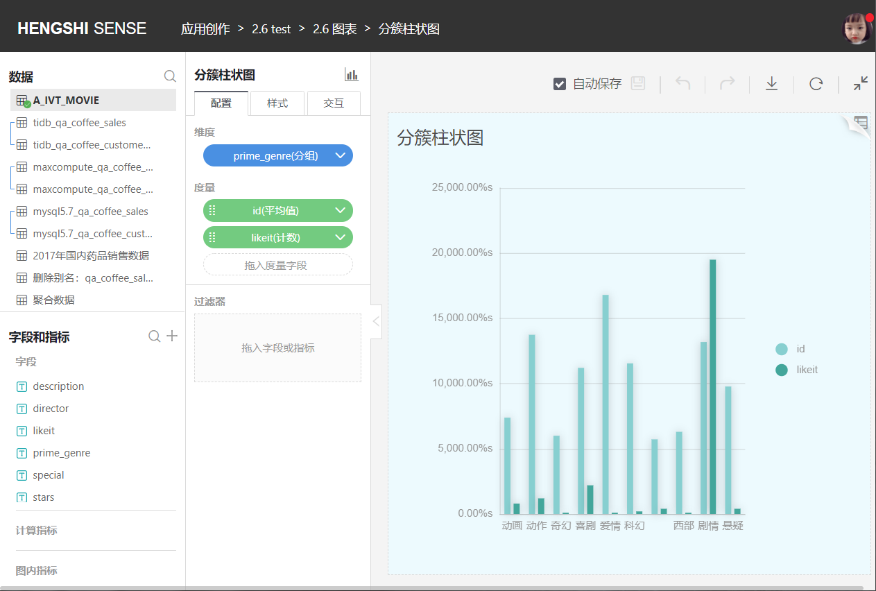
Clustered Bar Chart
Clustered bar charts allow the selection of multiple metrics on the Y-axis to form a comparative relationship. As shown in the following figure:
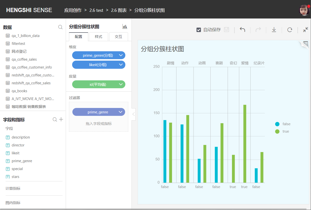
Grouped Clustered Bar Chart
Compared to a bar chart, a grouped clustered bar chart adds an extra layer of grouping, clustering the graphics of the secondary groups for comparative display. As shown in the following figure:
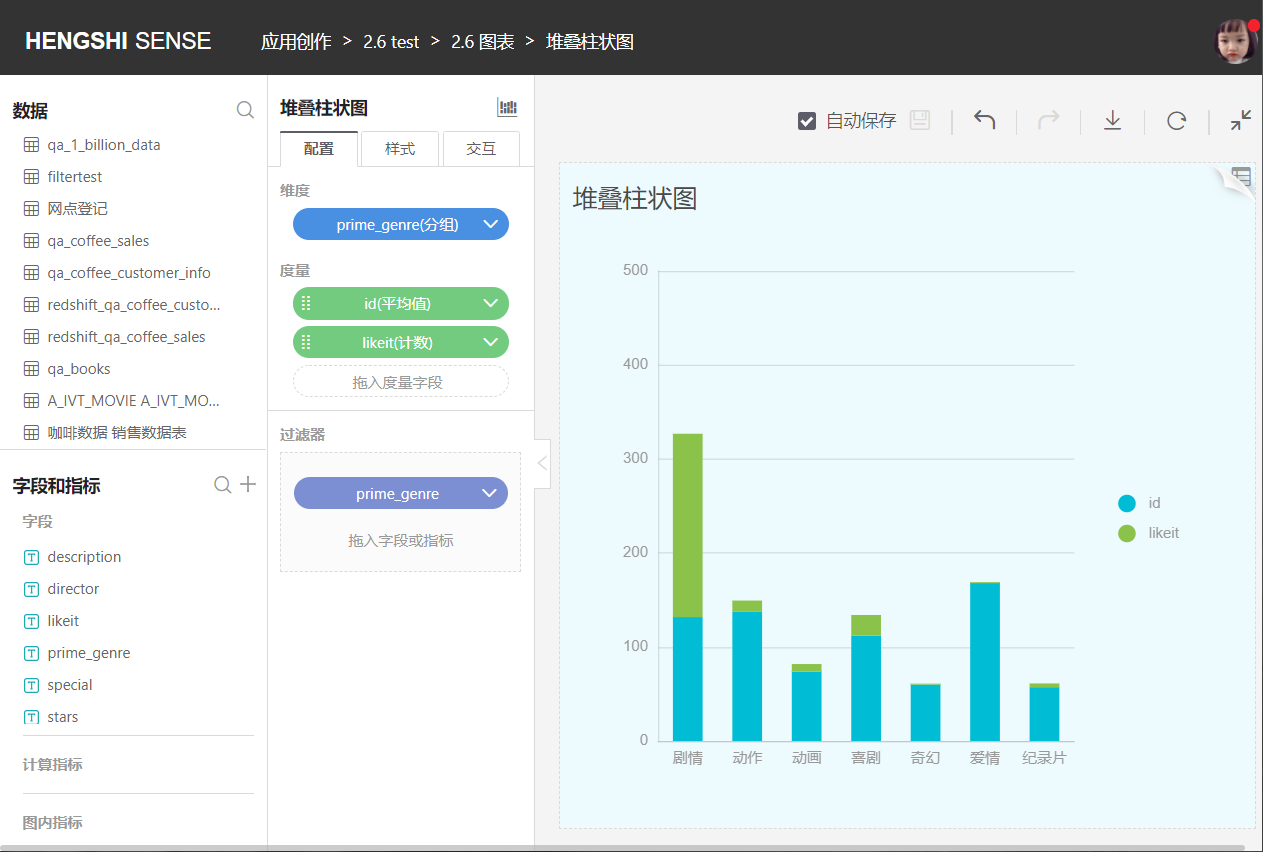
Stacked Bar Chart
Unlike grouped bar charts that display categories side by side, stacked bar charts divide each bar to display the size of each data point under the same category.
Each group of data must be either "positive" or "negative" in nature. If there are both positive and negative numbers, that column will not be displayed in the chart.
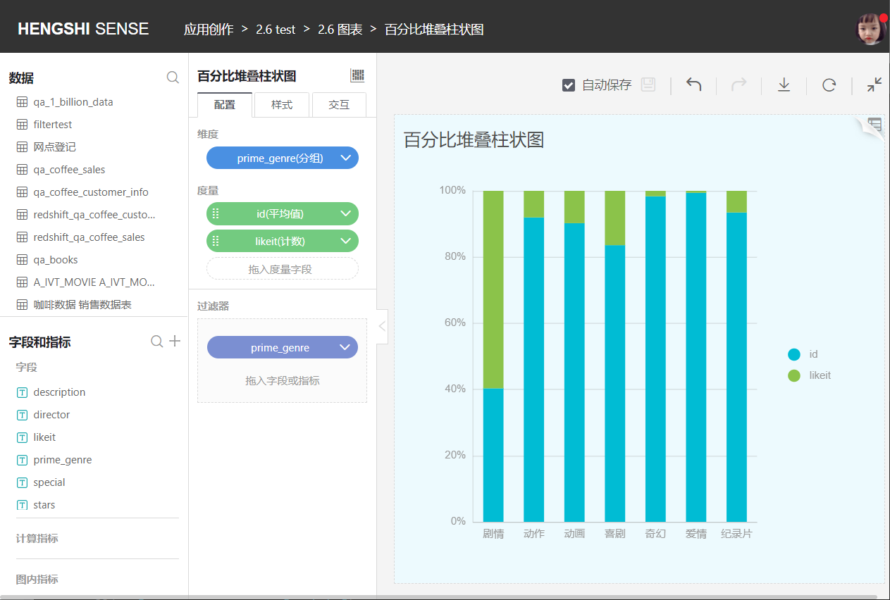
Percentage Stacked Bar Chart
Similar to a stacked bar chart, but each layer of the bar represents the percentage that category data occupies of the total data of that group.
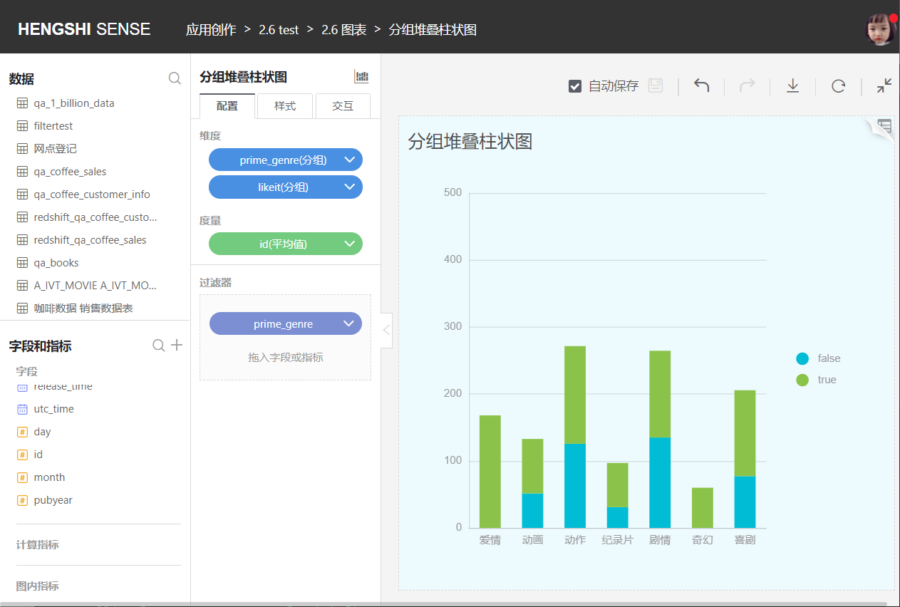
Grouped Stacked Bar Chart
Grouped stacked bar charts differ from grouped bar charts in that each bar is again divided to display the size of data points under the same category.
Grouped stacked bar charts graphically show the data of each small category within a large category and the proportion of each small category. It shows the relationship between individuals and the whole.
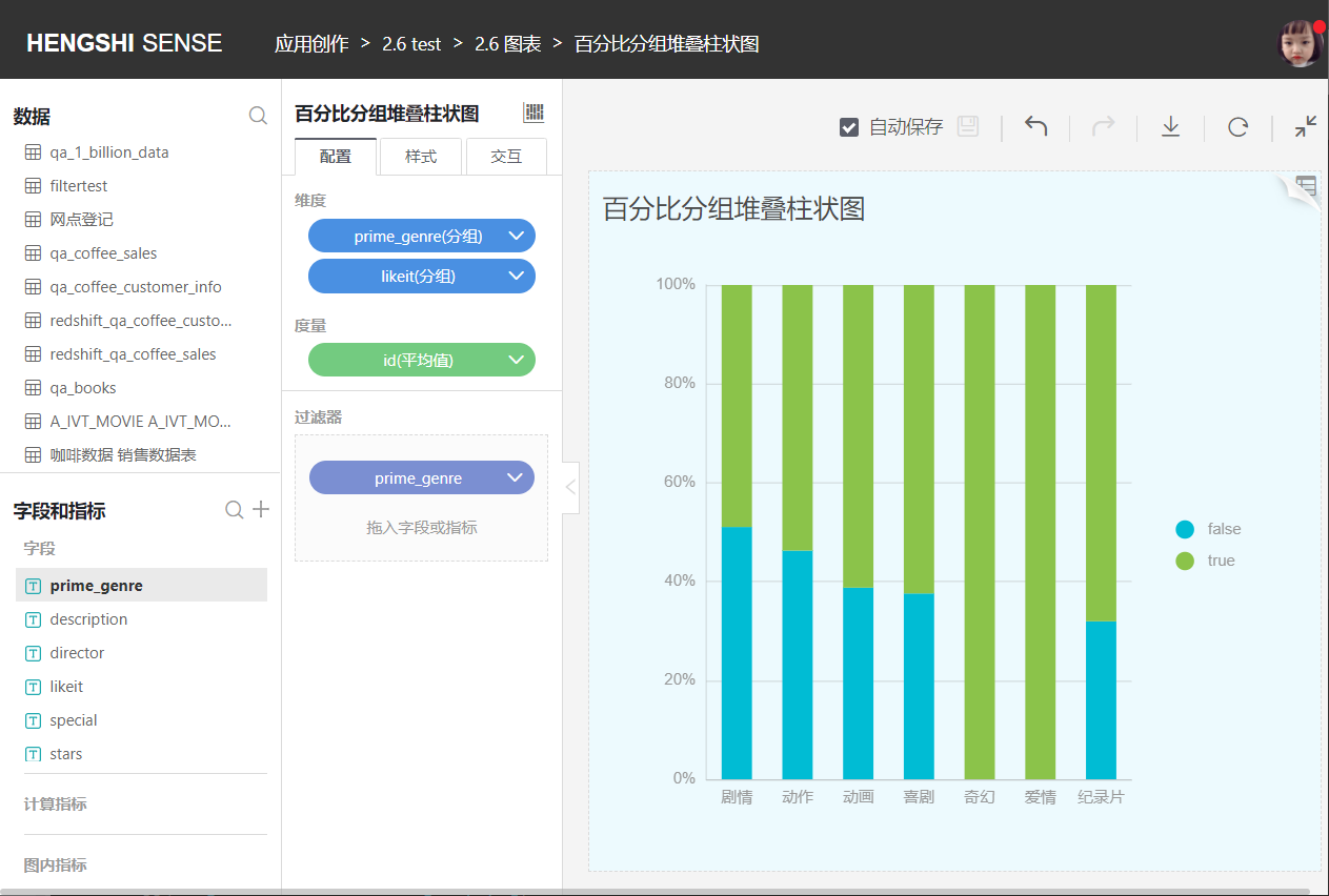
Percentage Grouped Stacked Bar Chart
Similar to the grouped stacked bar chart, but each layer of the bar represents the percentage that category data occupies of the total data of that group.
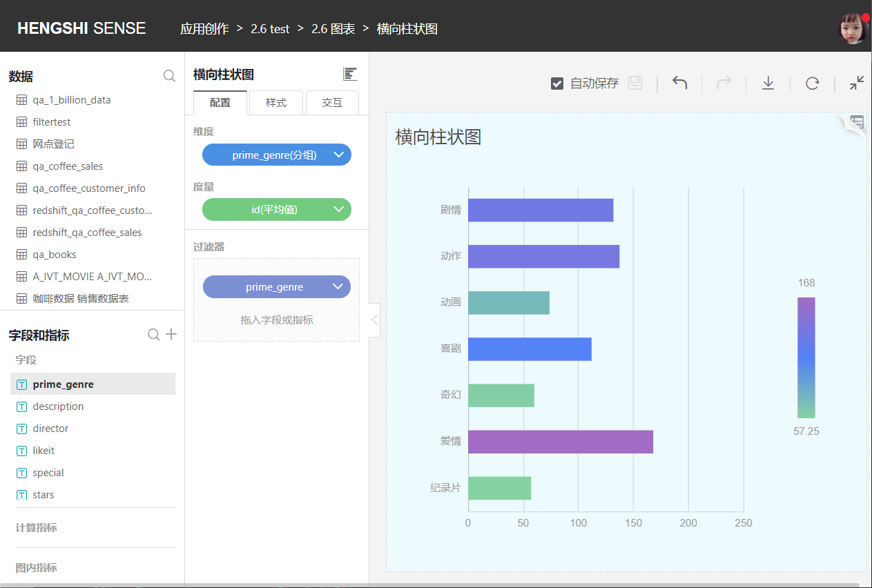
Horizontal Bar Chart
A horizontal bar chart, as the name implies, is formed by switching the X and Y axes of a bar chart.
Horizontal Clustered Bar Chart
You can select multiple metrics to independently display each measure under each category horizontally.
Horizontal Stacked Bar Chart
You can select multiple metrics, which are then horizontally stacked to display all the measures under each category.
Horizontal Percentage Stacked Bar Chart
You can select multiple metrics, which are then horizontally stacked to show the proportion of each component within each dimension.
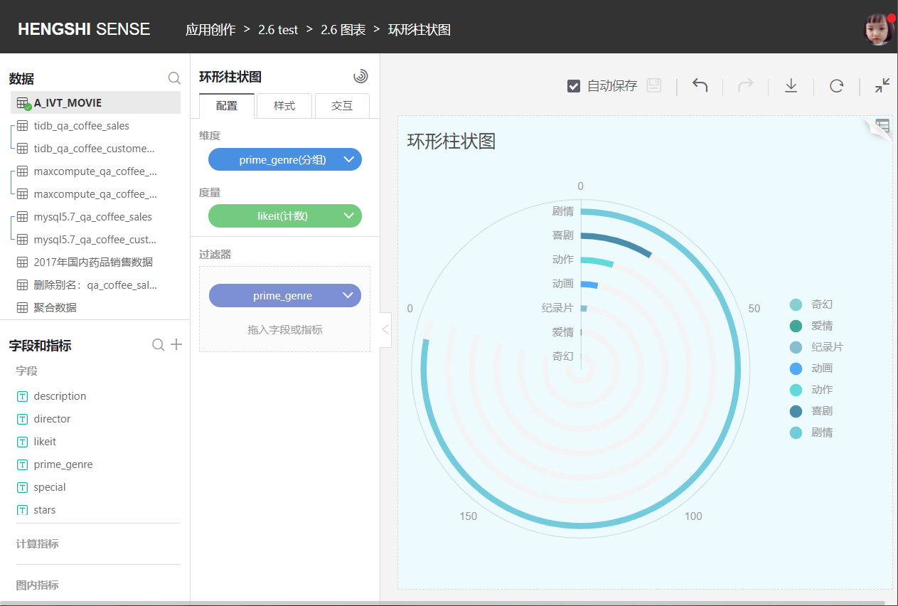
Circular Bar Chart
The circular bar chart is distinguished from a typical bar chart by its circular display style. As shown in the following figure: