Hengshi Documentation
Table of Contents generated with DocToc
- Nightingale Rose Diagram
- Sunburst Chart
- Process Chart
- Tree Diagram
- Treemap
- Waterfall Chart
- Box Plot
- Pareto Chart
- Bubble Chart
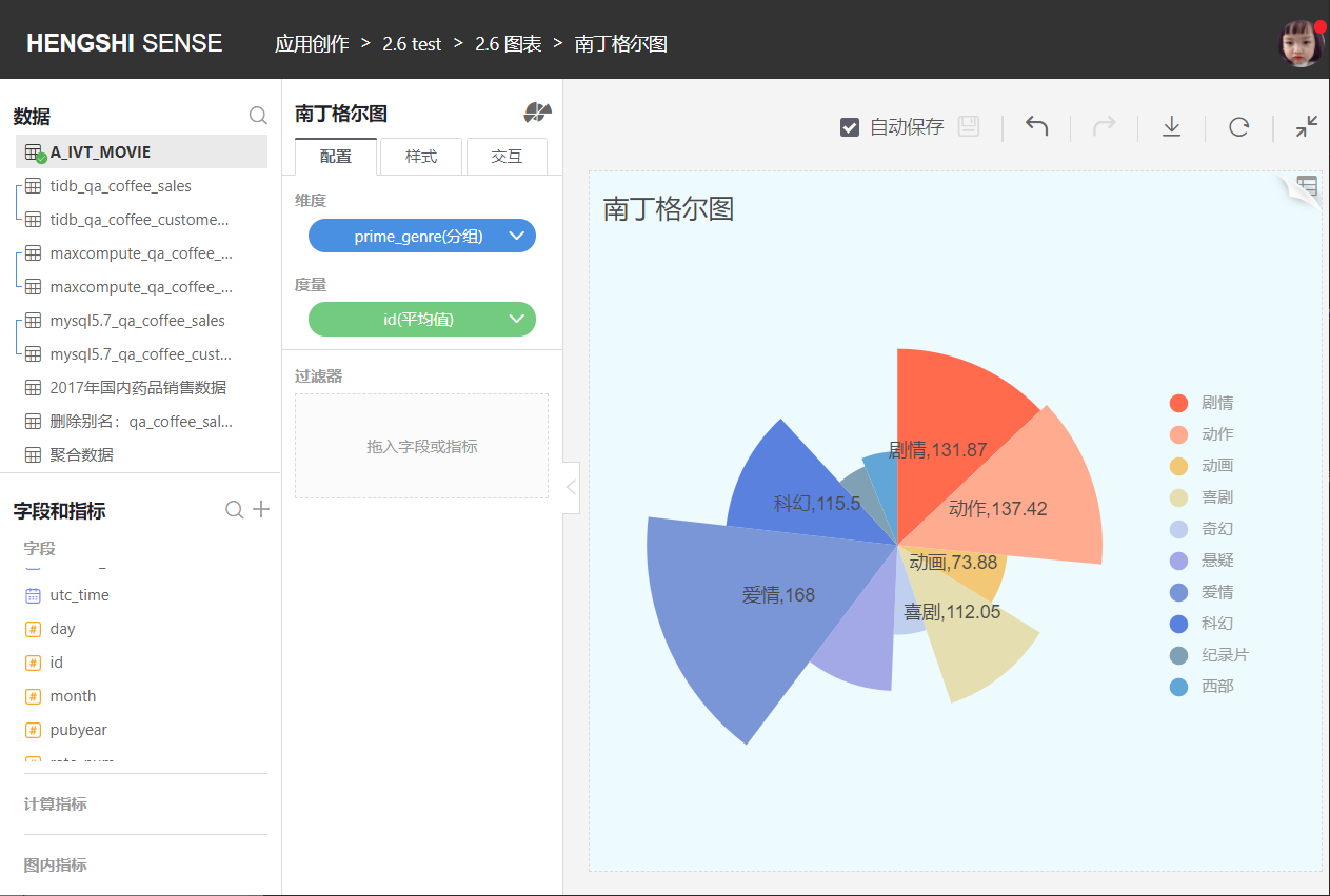
Nightingale Rose Diagram
The Nightingale rose diagram represents the performance of certain indicators classified in one dimension, similar to a bar chart presented in polar coordinates. When there are many categories, it is more intuitive than a pie chart. Due to the circumference of the circle, the contrasts become more apparent (with magnification). Because of the recognizability of angles, typically not more than 30 categories are used.
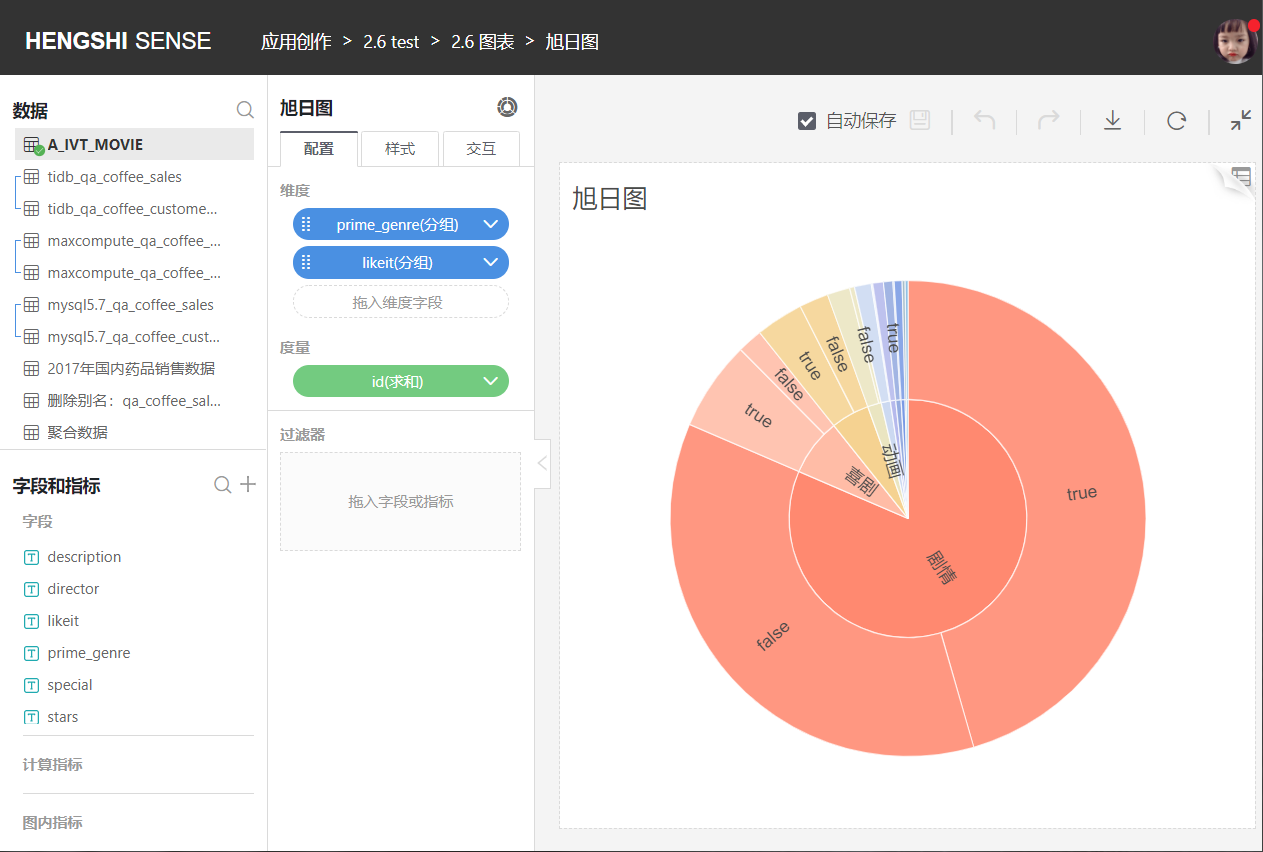
Sunburst Chart
The sunburst chart is a modern pie chart that surpasses traditional pie charts and donut charts by clearly expressing hierarchical and attribution relationships, displaying data composition with a parent-child structure. In a sunburst chart, the closer to the origin point indicates a higher level, with the inner layer including the outer layer in adjacent layers.
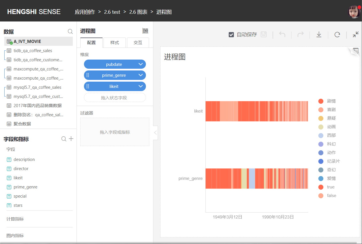
Process Chart
A process chart mainly displays the different states of equipment in a manner similar to a Gantt chart.
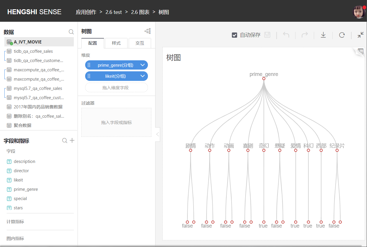
Tree Diagram
The tree diagram starts from one item, branching into two or more branches, then continues to branch from each one, and so on. It has a trunk and multiple branches, so it looks quite like a tree. Tree diagrams are generally used to gradually break down the main categories into many increasingly detailed layers.
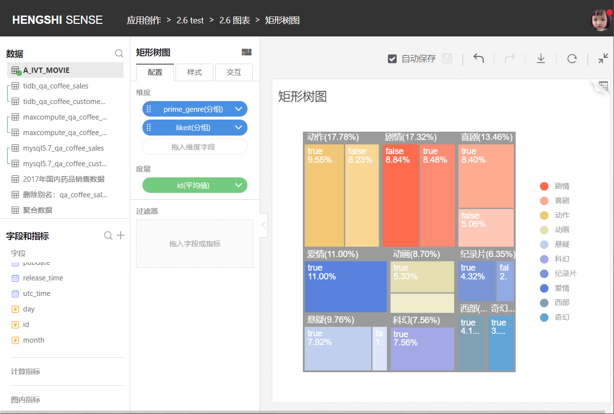
Treemap
The treemap was proposed by Professor Ben Shneiderman of the University of Maryland in the 1990s, initially to find an effective method to understand disk space usage. Treemaps are suitable for displaying hierarchical data and can intuitively reflect comparisons between the same levels. A tree structure is transferred into flat space rectangles, like a map.
A treemap utilizes the hierarchy of the tree, dividing rectangular areas based on the weight of the current child node, and then recursively subdividing rectangles for child nodes. One advantage of treemaps is that compared to traditional tree structure diagrams, treemaps more effectively use space and have a feature to display proportions.
However, the downside of a treemap is that when the category proportions are too small, text placement becomes difficult. Compared to branching tree diagrams, the tree structure in a treemap is not expressed as clearly and explicitly.
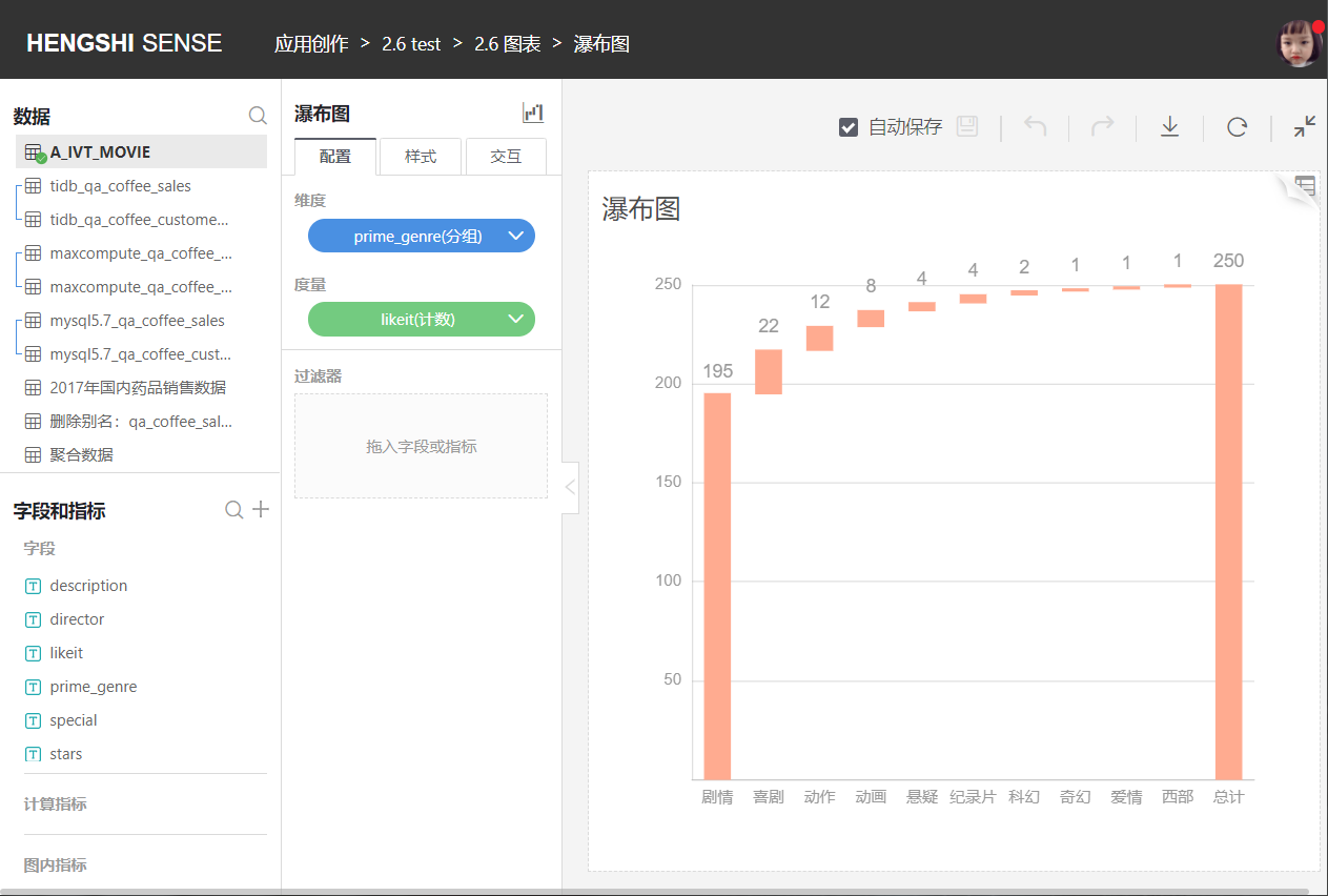
Waterfall Chart
The waterfall chart helps understand the cumulative effect of positively or negatively introducing values in sequence. It is also known as a flying brick chart or Mario chart, as it looks like bricks hanging in the air.
Waterfall charts are typically used to comprehend how an initial value is affected by a series of intermediate positive or negative values.
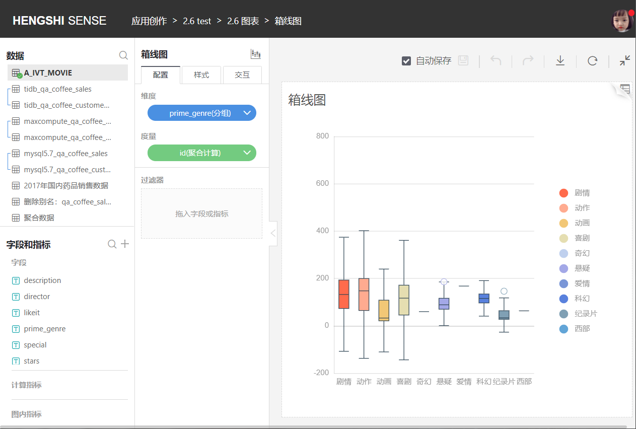
Box Plot
The box plot, also known as a box-and-whisker plot, is a statistical chart used to display the distribution of data.
Currently, data sources that support box plots include: Engine, Postgresql, GreenPlum, and Oracle.
If a dataset contains a categorical variable and one or more continuous variables, you might want to know how the continuous variables change with the different categorical variable levels. The box plot provides a method for this by summarizing the distribution using five numbers, which are the maximum value, minimum value, median, lower quartile, and upper quartile of a set of data. Any outliers in the data set are typically plotted as separate points. Box plots are often used for numeric statistics, and although they are more rudimentary and simpler than histograms and density curves, they do not require much canvas space and have high space utilization, making them highly suitable for comparing the distribution of several groups of data, as shown in the following image:
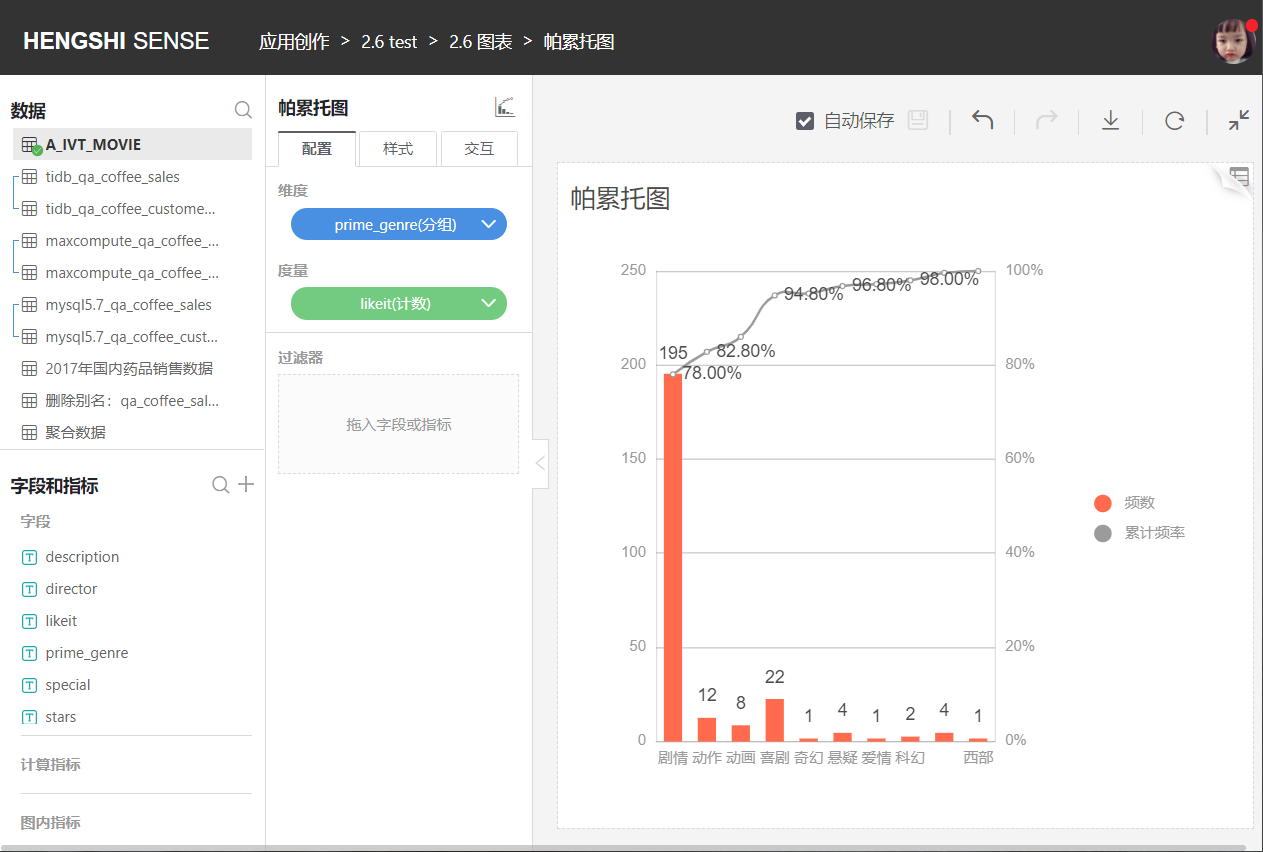
Pareto Chart
The Pareto chart is used to arrange quality issues and quality improvement projects in order of importance. Named after the Italian economist V.Pareto, it is also called an arrangement chart or primary-secondary chart and is a histogram drawn in order of frequency of occurrence. It displays how many results are caused by identified types or categories of causes.
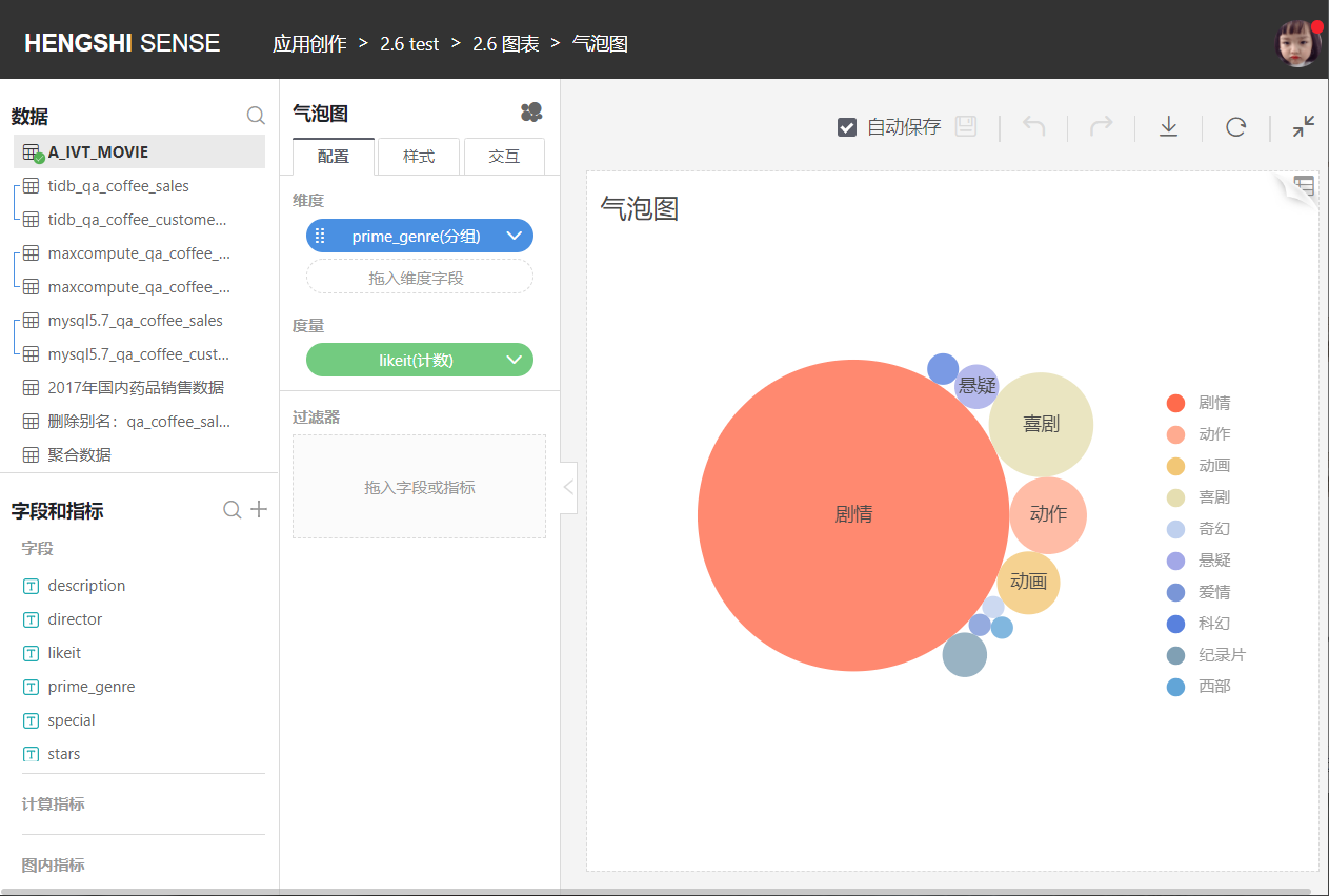
Bubble Chart
Similar to the treemap, it allows the selection of multiple dimensions with one measure, with the size of the bubble reflecting the measure.