Hengshi Documentation
Table of Contents generated with DocToc
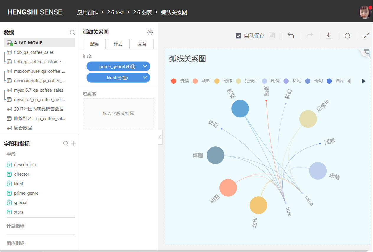
Arc Diagram
Arc diagrams are suitable for illustrating relationships between data points as well as the importance of these relationships.
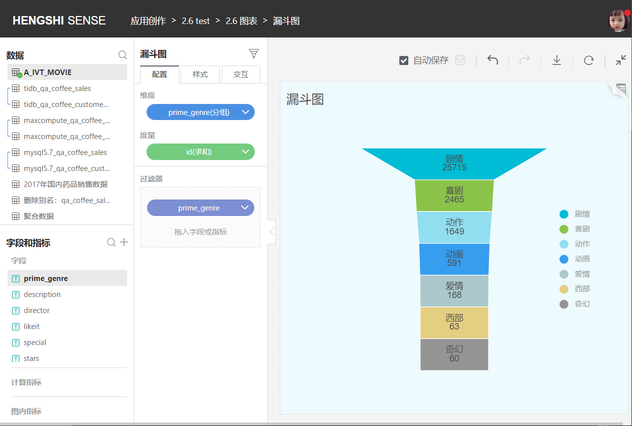
Funnel Chart
Funnel charts are suitable for analyzing single, unidirectional processes in business flows that are standardized, have a long cycle, and involve many stages. By comparing business data at various stages of the funnel, it’s possible to visually identify and explain problematic stages and subsequently make decisions. Funnel charts use trapezoidal areas to represent the difference in business volume between a stage and the previous one. From top to bottom, the funnel chart has a logical sequence and shows the progression towards the completion of business objectives.
Funnel charts are not suitable for data without logical relationships, meaning, if data cannot form a “process,” then the funnel chart should not be used.
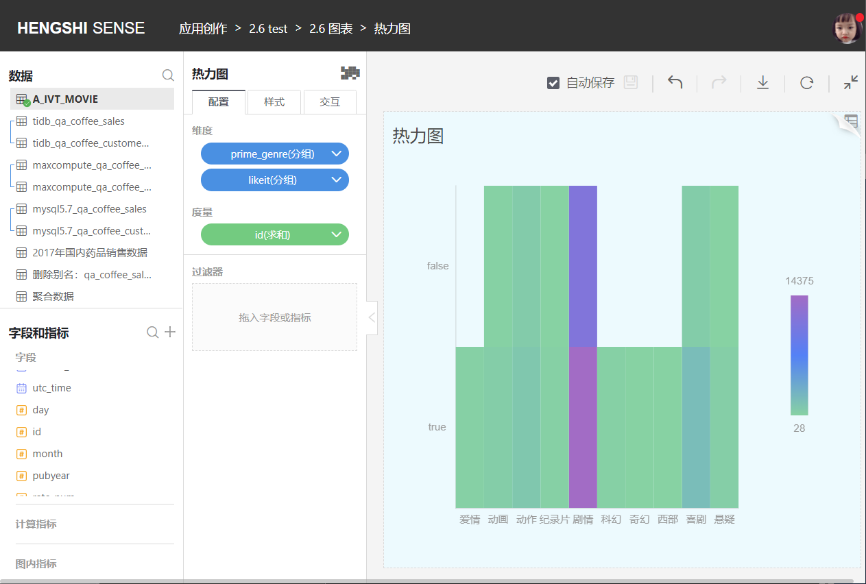
Heat Map
A heat map uses colored coded rectangles defined by two dimensions to represent the distribution of a metric across two variables.
Rectangles established by two discrete categories can be used in cluster analysis.
Additionally, some heat maps require the distribution values to be continuous so that smoothing can be done in the display, often combined with maps. In such cases, colored block diagrams specifically represent discrete distributions, while heat maps specifically represent continuous distributions.
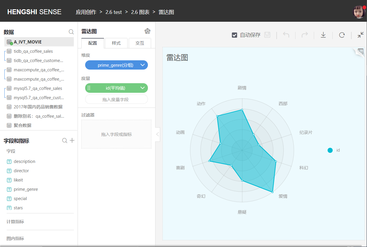
Radar Chart
A radar chart displays a comparison of metrics across multiple dimensions for a given group. To facilitate comparison, the scale of the metrics is normalized. It is only suitable for situations with a relatively small number of dimensions.
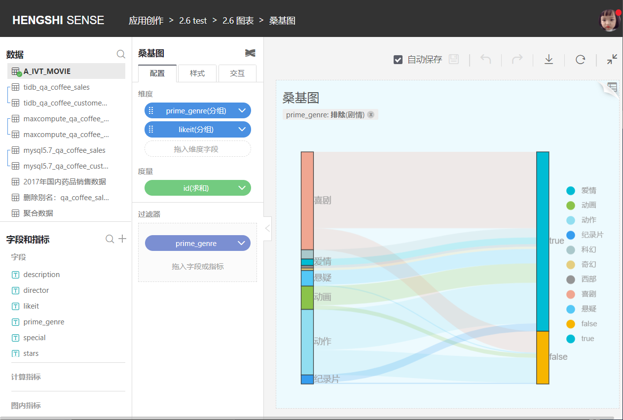
Sankey Diagram
A Sankey diagram is a specific type of flow diagram that illustrates the flow from one set of values to another. It is commonly used in data visualization for energy, material composition, finance, and other analytic areas.
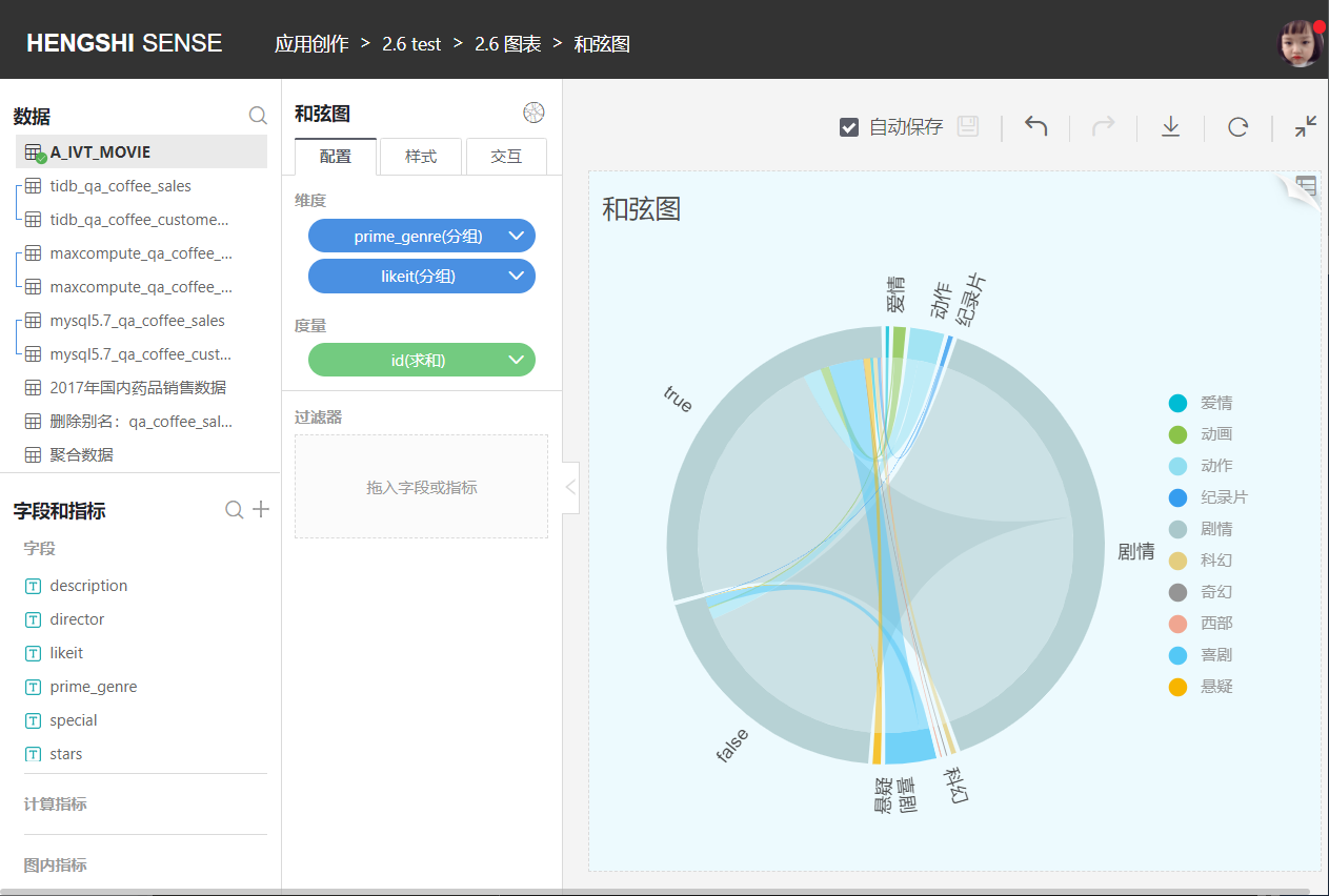
Chord Diagram
A chord diagram is a method of visualizing the relationships between data in a matrix. Nodes are arranged radially around a circle with weighted arcs (having width) connecting them.
Chord diagrams are used to explore relationships between groups of entities. They are widely used in the biological sciences to visualize gene data and have been featured as info graphics in publications such as Wired, The New York Times, and American Scientist.
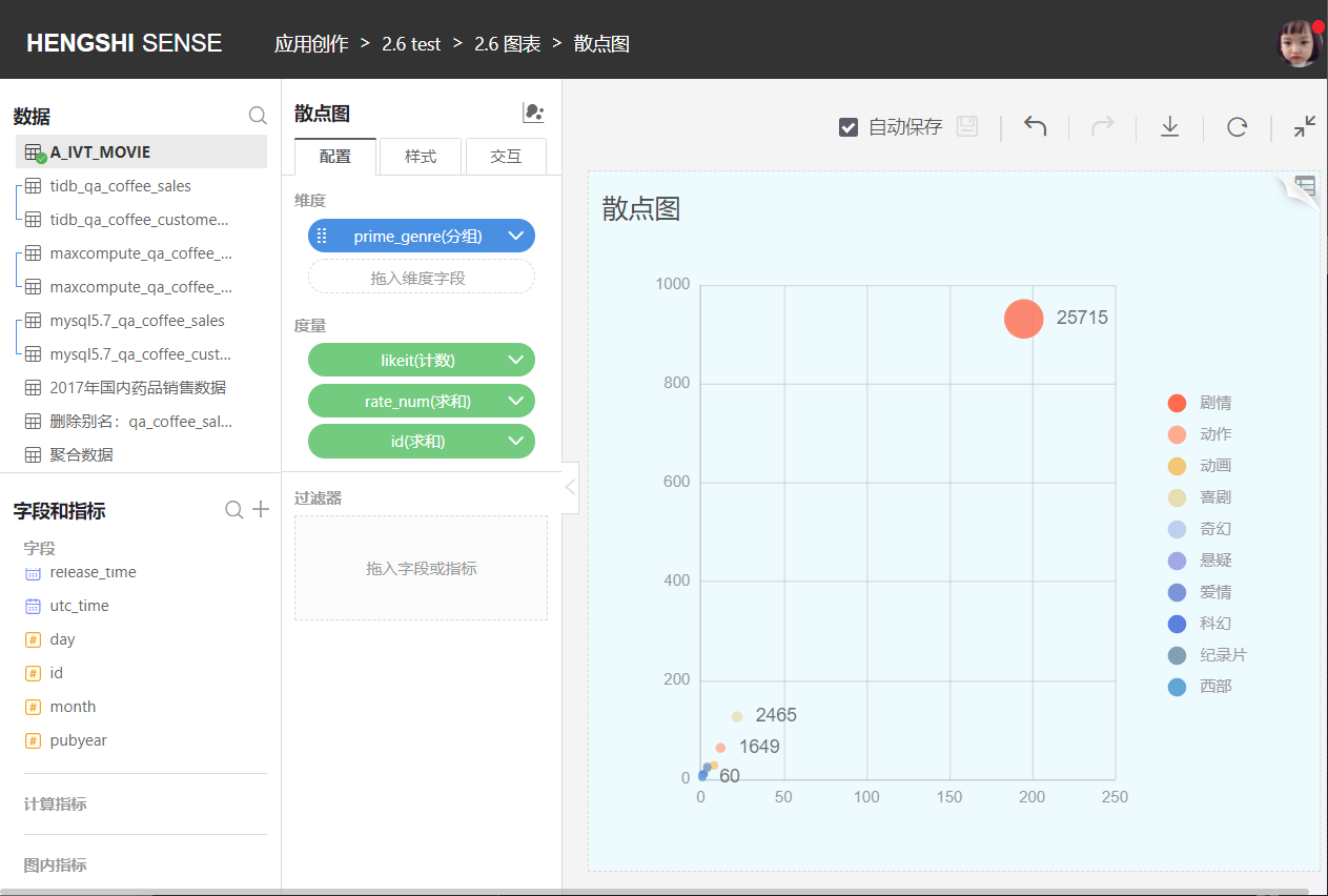
Scatter Plot
Scatter plots are unique in that they use only one dimension for categorization (or grouping), but they can represent three metrics, located on the x-axis, y-axis, and size, respectively. The size metric is optional, making scatter plots particularly suitable for representing concepts like Gartner's Magic Quadrants.